

Sherwin Williams Iron Ore is the vibe you have been looking for. It is the perfect choice for anyone who wants a bold look without the harshness of true black. This color brings a high-end feel to any room in your house. You can use it on your walls, your cabinets, or even the outside of your home. It is a deep charcoal that makes everything look fancy and cool. If you want your neighbors to be jealous, this is the paint for you.
Sherwin Williams Iron Ore: A Sophisticated Charcoal with Personality
Sherwin Williams Iron Ore is a deep charcoal color with a whole lot of soul. It is a smoky shade that sits just a tiny bit lighter than total black. This small difference gives it a much more interesting look in your home. Most people love it because it creates a beautiful space that feels cozy and high-end. It is not just another dark paint color.
The “Mood”
This color is bold but still feels very balanced. It offers a dramatic contrast that never goes out of style. Designers love it because it brings a timeless sophistication to any project. It makes a big statement without being too loud or aggressive. You get all the drama of a dark color with a soft touch.
Why it’s a Designer Favorite
Pro designers reach for Sherwin Williams Iron Ore because it is more “livable” than a flat black. A true black can sometimes feel cold or like a void in the room. Iron Ore has a rich, high-end look that feels substantial and premium. It works perfectly for people who want a luxury aesthetic on a budget. It makes even simple rooms look like they cost a million bucks.
The Science of the Shade: Understanding the Technical Profile
To really get why Sherwin Williams Iron Ore looks so good, we have to look at the numbers. Understanding the technical side helps you predict how it will look in your specific house. Every paint color is made of different parts that change its appearance. Let’s break down the science behind this fan-favorite charcoal.
RGB Values (67/67/65)
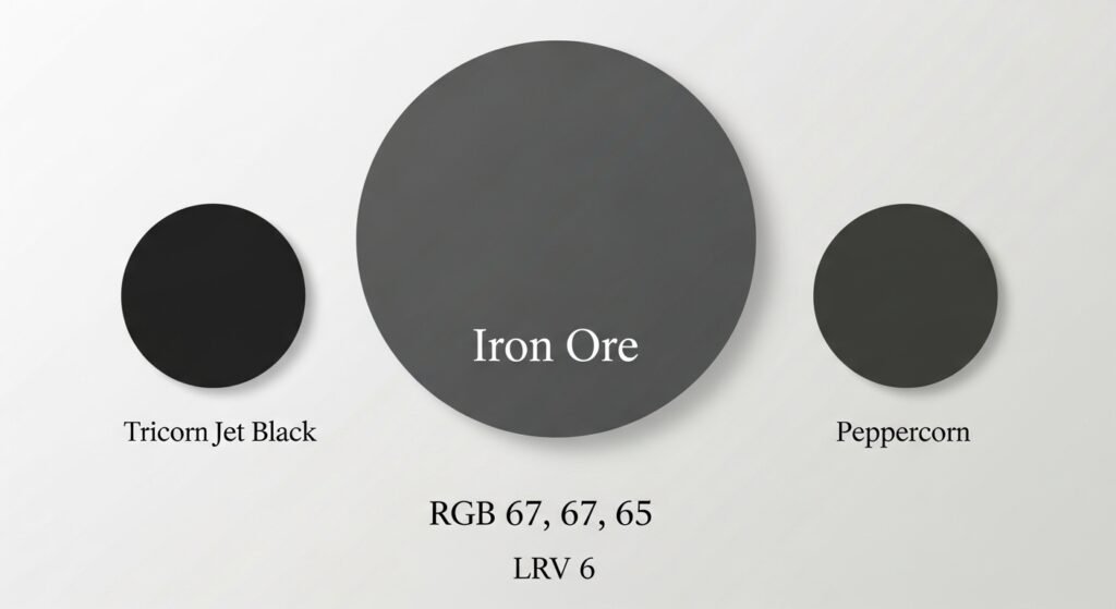
The RGB values tell us how much red, green, and blue are in the mix. For Iron Ore, the numbers are 67 for red, 67 for green, and 65 for blue. This means it has just a tiny bit more warmth from the red and green. Overall, these are very balanced undertones that keep the color neutral. It does not lean too far into one specific color family.
HEX Code (#434341)
The HEX code is #434341, which is super helpful for digital planning. You can use this code to see the color on your computer or phone screen. It is also useful if your local hardware store does not carry Sherwin Williams. You can give them this code to get a custom color match. It makes the color accessible to everyone everywhere.
LRV (Light Reflectance Value) of 6
The LRV is a scale from 0 to 100 that measures how much light a color reflects. A score of 0 is absolute black, and 100 is pure white. Since Iron Ore has an LRV of 6, it is a very dark color with low reflectivity.
- Low Light Reflection: This means the color absorbs most of the light hitting it.
- Not Quite Black: Because it is a 6 and not a 0, it still has some color value.
- Comparison: It is lighter and softer than Tricorn Black, which is much closer to zero.
Color Undertones and Characteristics
Understanding the undertones of Sherwin Williams Iron Ore is the key to matching it. This paint is not just a dark gray; it has layers. These layers change how it feels when you walk into a room. It is important to know what you are getting before you open the can.
Soft Black with Gray Undertones
Iron Ore is a soft black that is full of deep gray undertones. These grays provide a lot of warmth and balance to the overall look. It never feels harsh or flat like some other dark paints. Instead, it feels sophisticated and very inviting to anyone who enters. It is the kind of color that makes you want to sit down and stay a while.
Visual Texture
The muted tone of this paint helps soften the intensity of the darkness. This creates a visual texture that adds depth to your walls or cabinets. It results in an elegant finish that works with many different materials. Whether you have wood, stone, or metal, Iron Ore will make them look better. It acts as a perfect backdrop for your favorite decor.
Sherwin Williams Iron Ore in Different Lighting Conditions
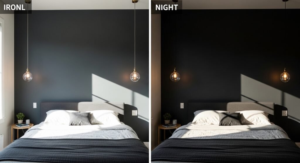
Lighting is the most important thing when choosing a dark paint. Sherwin Williams Iron Ore can look different depending on the sun or your lamps. This is part of what makes the color so cool and dynamic. You should always check the color at different times of the day.
Impact of Direct Sunlight
When the sun hits Iron Ore directly, its charcoal nature really shines. You will see a lot more of those deep gray tones come forward. In bright light, it looks less like black and more like a rich, dark stone. This is a great look for exterior walls or rooms with big windows. It shows off the complexity of the paint formula.
Low Light Environments
In rooms with less light, the color will lean much closer to a true black. It becomes very moody and mysterious in the shadows. This is perfect for a cozy media room or a bedroom where you want to sleep well. Even without much light, it still feels soft rather than cold. The color’s depth really stands out in these darker spots.
Consistency
The good news is that because the LRV is so low, it stays pretty consistent. It can only change so much because it is already so dark. While the gray tones might shift, it will always be a deep, moody charcoal. You don’t have to worry about it suddenly looking blue or green. It is a very reliable choice for any home project.
Where to Use Iron Ore: Interior Applications
There are so many places inside your home where Iron Ore works. It is one of the most versatile dark colors you can find. From the kitchen to the bedroom, it adds a touch of class. Let’s look at some of the best ways to use it indoors.
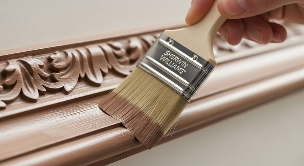
Kitchen Cabinetry: Shaker, Raised, and Slim Shaker
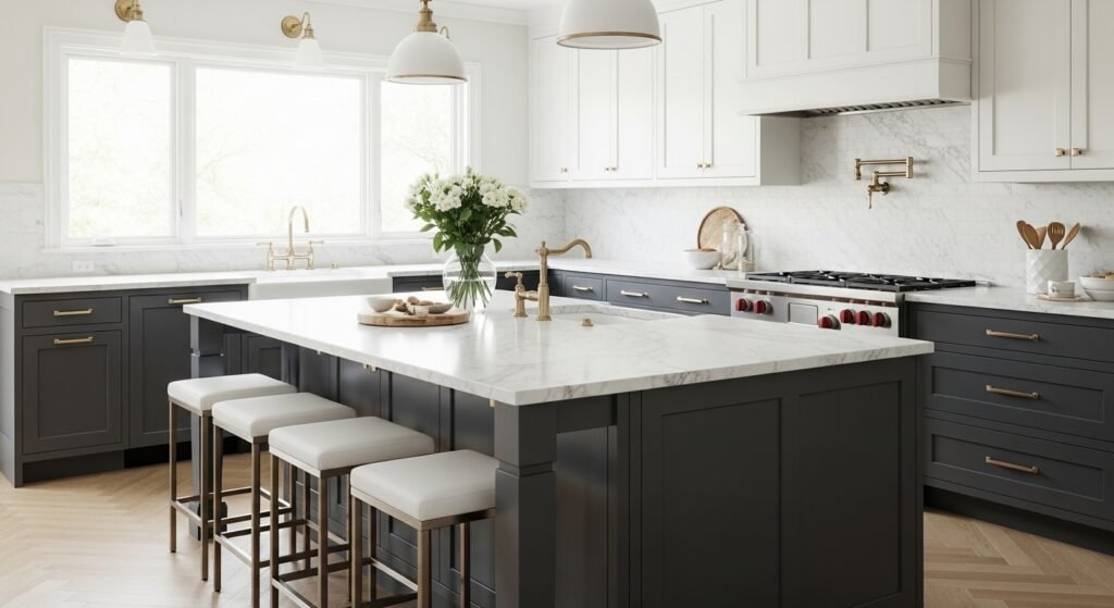
Kitchen cabinets look amazing in Sherwin Williams Iron Ore. It transforms the heart of your home into a high-end space.
- Statement Islands: Use it on just the island to create a bold focal point.
- Full Dark Cabinetry: Go all out for a super luxurious and modern look.
- Two-Tone Kitchens: Pair it with a lighter color on top for a balanced feel.
Interior Architectural Details
You can use Iron Ore to highlight the cool parts of your house. It makes standard features look custom and expensive.
- Trimwork and Molding: Paint your baseboards or crown molding for a modern frame.
- Built-ins and Bookcases: Make your books and decor pop against a dark back.
- Fireplaces: Turn a boring fireplace into a dramatic centerpiece for the room.
Living and Private Spaces
Don’t be afraid to use dark paint in your living areas. It creates a vibe that is hard to get with lighter colors.
- Home Offices: It creates a focused and quiet environment for working.
- Powder Rooms: Use it to make a small bathroom feel like a fancy hotel.
- Interior Doors: Adding Iron Ore to your doors makes them feel heavy and elegant.
Sherwin Williams Iron Ore for Home Exteriors
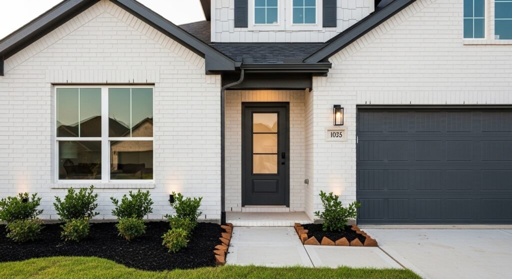
Iron Ore is a superstar for the outside of your house too. It is one of the top choices for modern exterior design right now. It stands up well to the elements and looks great year-round.
Front Doors and Shutters
If you aren’t ready to paint the whole house, start with the door. A front door in Iron Ore is super welcoming and very stylish. You can also use it on your shutters to add some quick curb appeal. It works with almost any siding color you already have. It is a small change that makes a huge difference.
Siding and Brick
Painting your house in Sherwin Williams Iron Ore is a bold, rewarding choice that creates a popular monolithic look. This sleek finish pairs perfectly with modern designs and trendy farmhouses. It can even make an old brick exterior look brand new. Ultimately, this deep shade provides a total transformation for your home.
Mixing Textures
The color looks slightly different on various surfaces, which is cool.
- Lap Siding: Creates clean lines and a smooth, modern appearance.
- Painted Brick: Shows off the natural texture of the brick while looking high-end.
- Stucco: Gives a solid and grounded feel to the entire structure.
Choosing the Right Door Styles for Iron Ore Cabinets
The style of your cabinet doors will change how the color feels. Sherwin Williams Iron Ore works with many different cabinet designs. You should pick the one that matches your overall home style.
- Contour Slim Shaker: This is the best pick for a minimalist and modern kitchen.
- Avalon Raised Panel: Use this if you want a traditional look with extra texture.
- Concord Classic Shaker: This is the most versatile choice for any home design.
Professional Design Pairings: Colors and Materials
No paint color lives alone in a room. You have to pair Sherwin Williams Iron Ore with the right stuff to make it work. Choosing the right partners will make the charcoal look even better. Here are some pro-approved pairings for your project.
Complimentary Paint Colors
Pairing dark and light colors is a classic design trick.
- Alabaster (SW 7008): Use this for that perfect black-and-white high-contrast look.
- Pure White (SW 7005): This gives a very clean and modern edge to the space.
- Agreeable Gray (SW 7029): A great choice for a softer and more neutral transition.
- Dorian Gray (SW 7017): Perfect for a sophisticated, all-gray monochromatic vibe.
- Creamy (SW 7012): Adds a touch of warmth for a more traditional or transitional home.
- Dutch Tile Blue (SW 0031): A great way to add a little bit of color to the palette.
Countertop Selections
Your countertops will sit right against your Iron Ore cabinets.
- White Quartz: This creates a striking look that is very popular in modern homes.
- Marble: The natural gray veins in marble look amazing next to this paint.
- Wood or Butcher Block: This adds an organic warmth that balances the dark gray.
Flooring Recommendations
Don’t forget about what is under your feet.
- White Oak: This is the top choice for adding brightness and warmth.
- Walnut: A rich and dark wood that creates a very classic and high-end feel.
- Gray Tile: This keeps everything looking very contemporary and streamlined.
Hardware and Finish Recommendations
Hardware is like jewelry for your cabinets and doors. The right metal can change the whole look of Sherwin Williams Iron Ore.
- Brushed Brass: This is the most popular choice for a high-end, luxury look.
- Matte Black: Use this if you want a seamless and very modern monochromatic style.
- Polished Chrome/Nickel: This adds a bit of sparkle and brightens up the dark color.
Iron Ore vs. Peppercorn (SW 7674): Which is Right for You?
People often confuse Iron Ore with Peppercorn. While they are both dark grays, they are actually quite different.
- Depth: Iron Ore has an LRV of 6, making it much darker than Peppercorn at LRV 10.
- Undertones: Peppercorn is a more “true” gray, while Iron Ore is a “soft black”.
- Mood: Iron Ore is moodier and more dramatic, while Peppercorn is a bit softer.
Expert Tips for Working with Dark Paint
Painting with dark colors like Sherwin Williams Iron Ore requires a little extra care. If you do it right, the results are incredible. Here are some tips from the pros to help your project go smoothly.
The Importance of Testing
Never buy a whole gallon before you test it.
- Samples: Use peel-and-stick samples like Samplize to save time and mess.
- Timing: Look at the sample in the morning, afternoon, and at night.
- Placement: Put the sample on different walls to see how the light hits it.
Selecting the Right Sheen
The sheen of the paint changes how much it shines.
- Lower Sheens: Flat or Satin finishes usually look better with dark, bold colors.
- Trim Tips: Use Satin instead of Semi-Gloss for trim to avoid a distracting shine.
- Intensity: Lower sheens let the actual color speak for itself without glare.
Preparation
Dark paint shows every little bump and scratch on your walls. You need to make sure your surfaces are super smooth before you start. Take the time to sand and prime properly for the best results. It is worth the extra work to get that perfect, high-end finish.
Why Choose Iron Ore? A Summary of Benefits
Sherwin Williams Iron Ore is a top-tier choice for any home renovation.
- Timelessness: This color will still look great ten years from now.
- Strength and Elegance: It perfectly blends a modern luxury feel with durability.
- Transformation: It is one of the fastest ways to modernize an old space.
If you are looking for a way to make your home stand out, Sherwin Williams Iron Ore is it. Whether you are doing a full renovation or just a weekend DIY project, this color delivers. It is bold, beautiful, and totally timeless. Grab a sample today and see how it transforms your space!
Frequently Asked Questions about Sherwin Williams Iron Ore
Does Sherwin Williams Iron Ore have a blue or green undertone?
Unlike many other dark grays or blacks, this color is remarkably neutral. It lacks the strong blue or green undertones found in colors like Charcoal Blue or Black Fox. While it is a cool-leaning color due to its gray base, it remains very grounded and rarely pulls any unexpected secondary hues even in changing light.
Can Sherwin Williams Iron Ore be used on ceilings?
Yes, using this color on a ceiling is a popular design choice for creating a “limitless” or “infinite” feel in a room. This works exceptionally well in media rooms or bedrooms with high ceilings. When the walls and ceiling are painted in the same dark tone, the corners of the room disappear, making the space feel more expansive and intimate simultaneously.
How does Iron Ore handle scuffs and fingerprints?
Because it is a very dark color, it can show dust, fingerprints, or scuffs more easily than a mid-tone gray. Using a high-quality paint line with a washable finish is essential. Choosing a scrubbable matte or a durable satin finish will allow you to wipe away oils and marks without leaving a shiny “burnished” spot on the wall.
Is Sherwin Williams Iron Ore suitable for a small dark hallway?
It can be, but you must prioritize lighting. In a hallway without natural light, Iron Ore will look like a solid black. To make it successful, use layered lighting such as sconces or recessed cans. This creates a high-contrast, gallery-like feel that makes the transition between rooms feel intentional and high-end.
What is the best primer to use under Iron Ore?
When painting with a color this dark, a gray-tinted primer is highly recommended. Using a standard white primer can make it difficult to achieve full coverage, requiring more coats of the expensive topcoat. A deep gray primer ensures the richness of the charcoal is achieved in fewer passes and prevents white streaks if the paint is ever scratched.
Does this color work for a mid-century modern aesthetic?
Iron Ore is a staple in mid-century modern design. It pairs perfectly with the warm wood tones like teak and walnut that are common in this style. It is often used for exterior accents, beams, or fireplace surrounds to provide a clean, geometric contrast against natural materials.
Can I use Iron Ore on a vinyl exterior?
You must check the Sherwin Williams “VinylSafe” color list before applying dark colors to vinyl siding. Because dark colors absorb more heat, they can cause standard vinyl siding to warp or buckle. If you love the look, ensure you are using a paint specifically formulated for vinyl in a safe color range.
Will Iron Ore make a north-facing room feel too cold?
North-facing light is naturally cool and bluish. While Iron Ore is neutral, it won’t add warmth to the room on its own. To prevent a north-facing room from feeling chilly, pair the color with warm textures like wool rugs, brass hardware, and warm-toned light bulbs (2700K to 3000K).
How does Iron Ore look on a garage door?
It is an excellent choice for garage doors, especially when the rest of the house is a lighter color like white or light gray. It helps “ground” the house and makes the garage feel like a deliberate part of the architecture rather than an eyesore. It is also practical for hiding the inevitable dirt that accumulates near the driveway.
Is Sherwin Williams Iron Ore a good choice for a nursery?
While unconventional, dark nurseries are a growing trend. It creates a very calm, sleep-inducing environment. When paired with light wood furniture, colorful rugs, and bright wall art, it creates a sophisticated space that the child can grow into without needing a repainting session in a few years.
What color of window treatments should I use with Iron Ore walls?
For a high-contrast look, crisp white linen curtains are a beautiful choice. If you prefer a moodier, monochromatic look, choose velvet curtains in a similar charcoal shade. For a natural vibe, woven wood or bamboo shades provide an organic texture that softens the intensity of the dark walls.
Can Iron Ore be used for a “color drenching” technique?
Iron Ore is one of the best candidates for color drenching. This involves painting the walls, trim, doors, and even the ceiling in the same color. This technique creates a seamless, sophisticated look that highlights the furniture and architectural shapes rather than the breaks between the wall and the trim.
How does Iron Ore compare to Urban Bronze?
Urban Bronze is another popular dark color from Sherwin Williams, but it has a very strong brown and green undertone, making it feel much “earthier.” Iron Ore is much more of a true gray-charcoal. If you want a nature-inspired, forest-like dark, go with Urban Bronze; if you want a clean, urban charcoal, stick with Iron Ore.
What is the best light bulb color temperature for this paint?
To keep Iron Ore looking like a rich charcoal, use warm-white bulbs (around 3000K). Bulbs that are too “daylight” or blue (5000K+) can make the color look a bit flatter and colder, whereas very orange bulbs (2200K) might muddy the gray tones.
Is Iron Ore considered a “cool” or “warm” color?
It is technically on the cool side because of its gray base, but its balanced RGB values keep it from feeling icy. It is often described as a “warm charcoal” because it lacks the sharp blue undertones of other blacks, making it feel much softer and more approachable in a residential setting.
Does Iron Ore work well on kitchen islands with stone tops?
It is a fantastic choice for islands. It provides a heavy, furniture-like base that supports the weight of a thick stone slab visually. It looks particularly stunning with white marble or quartz that has gray veining, as the island color pulls the gray tones out of the stone.
Can I use Iron Ore on a deck or fence?
Yes, it is a very popular choice for modern fencing. A dark fence provides a stunning backdrop for green foliage, making plants and flowers appear more vibrant. For decks, it is stylish but keep in mind that dark colors absorb heat and can become very hot to walk on in bare feet during the summer.
How many coats of paint are usually required for Iron Ore?
Even with high-quality paint, you should expect to apply two full coats. Because the pigment load is so high, the first coat may look slightly streaky. The second coat is where the depth and the uniform “velvety” look of the charcoal truly come to life.
Is Iron Ore a good color for a laundry room?
Dark laundry rooms are becoming very popular as they turn a functional chore space into a stylish zone. Iron Ore cabinets or walls paired with a white tile backsplash and gold accents can make a small laundry room feel incredibly high-end and clean.
What is the best way to touch up Iron Ore walls?
Dark colors are notoriously difficult to touch up without “flashing” (where the touched-up spot has a different sheen). To avoid this, always use the same tool (brush or roller) that was used for the original coat, and try to feather the edges out. If the damage is in the middle of a large wall, you may need to repaint the entire wall from corner to corner for a seamless finish.
