
Finding a paint color that feels both fresh and cozy is a real challenge for most homeowners. You want a shade that looks great in the morning but does not turn ugly at night. Quietude Sherwin Williams is a stunning blue-green color that makes any room feel like a high-end spa. It brings a peaceful and serene vibe to your home without feeling too bright or overwhelming. This guide will show you why this specific hue is a top pick for designers and DIY fans alike.
Quietude Sherwin Williams offers a soft look that sits right between a light pastel and a medium tone. It is versatile enough to work in a tiny bathroom or a large master bedroom. Many people love it because it adds a pop of color while still feeling neutral. It keeps your space looking clean and modern for years to come.
Quietude At-A-Glance: The Essential Statistics
Understanding the technical side of paint helps you predict how it will behave on your walls. Quietude Sherwin Williams has a specific formula that gives it a unique personality. These numbers tell a story about how much light it reflects and what colors make it up.
- Color Family: It belongs to the blue-green family with a very balanced mix of both tones.
- RGB Values: The specific mix is R:188, G:204, and B:200.
- Vibe: The overall mood is serene, spa-like, coastal, and very relaxed.
- Primary Usage: This paint is ideal for bedrooms, bathrooms, offices, and cozy corners.
- Hex Code: The digital signature for this color is #BCCAC8.
Understanding the Undertones and Personality of SW 6212
The personality of Quietude Sherwin Williams is often described as chameleonic because it changes so much. It does not stay the same throughout the day as the sun moves across the sky. This shifting quality is what makes it feel special compared to flat, boring colors.
The Blue-Green Balance
Quietude Sherwin Williams sits in a sweet spot between blue and green. It leans slightly more toward green than blue in most living spaces. This balance makes it feel more organic and earthy than a standard sky blue.
The Role of Grey
A soft grey undertone acts as a stabilizing force for this paint. It prevents the color from looking too much like mint candy or neon. The grey makes it feel grounded and more sophisticated for a grown-up home.
Muted Sophistication
Because it is muted, it works as a colorful neutral in your design palette. It adds enough color to be interesting but stays quiet enough to let your furniture shine. It is a smart choice for those who want color without the drama.
Light Reflectance Value (LRV): How Quietude Interacts with Light
Light Reflectance Value, or LRV, tells you how much light a color reflects or absorbs. It is measured on a scale from 0 to 100. Pure black is 0 and pure white is 100.
The Range
Quietude Sherwin Williams has an LRV of approximately 48 to 62 depending on the light. This puts it right in the middle of the range for paint colors. It reflects enough light to keep a room feeling airy and fresh.
Mid-Tone Versatility
Being a mid-tone means it has enough weight to stand out against white trim. It will not look washed out even in a very bright room. It provides a soft presence that feels substantial on the walls.
Perception of Space
In well-lit rooms, Quietude Sherwin Williams makes the space feel bigger and more open. In darker rooms, it takes on a moodier and more muted tone. This adds a sense of coziness and depth to smaller spaces like dens.
The Impact of Lighting Conditions on Quietude
Lighting is the biggest factor in how any paint color looks in your house. Quietude Sherwin Williams is very sensitive to the direction of your windows. You should always test a sample at different times of the day.
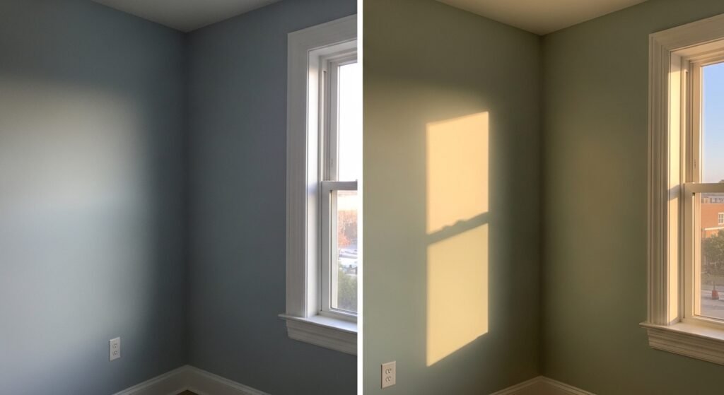
North-Facing Rooms
North-facing rooms usually have cool and bluish light coming in. Quietude Sherwin Williams will lean more into its blue and grey tones here. It can feel very calm and subdued in these spaces.
South-Facing Rooms
South-facing rooms get strong and warm golden light all day long. This light pulls out the green side of the paint. It appears much brighter and more cheerful in these sunny areas.
East-Facing Rooms
East-facing rooms get bright and warm light in the morning hours. The color looks clean and very fresh when you wake up. In the afternoon, it deepens and shows off more of its grey side.
West-Facing Rooms
West-facing rooms get warm and rich light later in the afternoon. This enhances the green tones and makes the color feel very inviting. It creates a gentle glow as the sun starts to set.
Best Rooms for Quietude SW 6212
While you can use it anywhere, some rooms are just a perfect match for this hue. Quietude Sherwin Williams thrives where you want to feel relaxed. It turns a normal room into a quiet retreat.
The Serene Living Room
In a living room, Quietude Sherwin Williams creates a cool and fresh look. It helps the walls reflect light so the entire room feels brighter. It pairs perfectly with cream or white furniture for a clean style.
- Furniture: Use light-colored sofas to keep the room feeling airy.
- Flooring: Medium to light wood tones like oak look great with these walls.
- Rugs: Stick to neutral tones like beige or light gray for a cohesive look.
The Spa-Like Bathroom
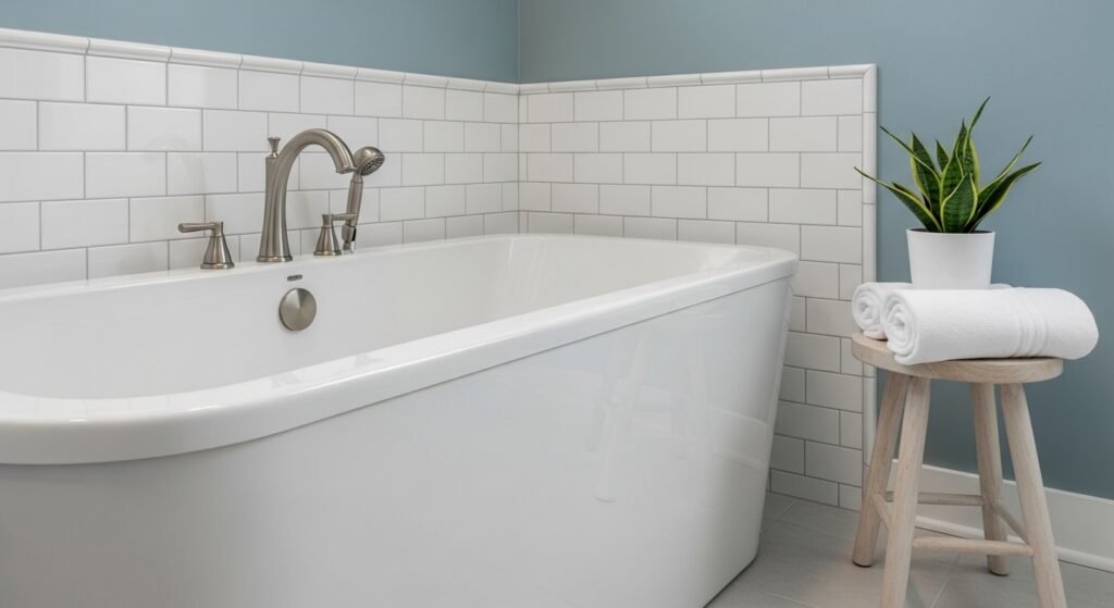
The bathroom is often the best spot for Quietude Sherwin Williams. The blue-green tones match white fixtures and shiny hardware perfectly. It makes even a tiny bathroom feel less cramped and more open.
- Fixtures: White porcelain sinks and tubs make the color pop.
- Tiles: White tile with light gray grout creates a very clean finish.
- Vanities: Dark walnut or light wood cabinets both look stunning here.
The Peaceful Bedroom
Quietude Sherwin Williams offers a truly relaxing background for your sleeping space. It works well in large master suites or small guest rooms. The soft color helps you wind down after a long day.
- Bedding: Use white or cream linens to maintain the peaceful mood.
- Nightstands: White painted furniture or natural wood pieces are great choices.
- Art: Black-and-white photos in simple frames stand out beautifully.
The Productive Home Office
A home office needs to be a place where you can focus. The green tones in this paint help reduce eye strain during work. The blue tones keep the environment calm when things get busy.
Choosing the Right Hardware and Metallic Finishes
The metal finishes you pick will change the vibe of Quietude Sherwin Williams. Some metals make it look modern while others make it feel classic. It is important to match your hardware to the style of the room.
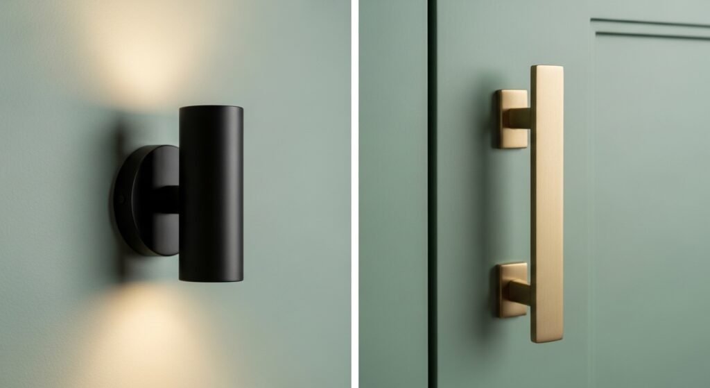
Cool-Toned Hardware
- Brushed Nickel: This is a classic choice that enhances the blue-grey side of the paint.
- Chrome: Shiny chrome looks very fresh and clean against these cool walls.
- Matte Black: This provides a sharp and modern contrast that grounds the soft color.
Warm-Toned Hardware
- Satin Brass: This creates a high-end look that plays well with the green tones.
- Champagne Bronze: A soft gold finish adds a touch of luxury to the space.
- Antique Brass: Use this for a vintage or historic cottage feel in your home.
Flooring Pairings for a Cohesive Look
Floors take up a lot of space and affect how your walls look. Quietude Sherwin Williams is very flexible when it comes to flooring. You can go light for a coastal feel or dark for drama.
Hardwood and Laminate Choices
- Light Oak: This keeps the room feeling airy and very coastal.
- White Ash: Another great light wood that makes the space feel modern.
- Dark Walnut: This creates a striking contrast that makes the walls stand out.
- Honey Tones: Warm woods prevent the room from feeling too cold or sterile.
Tile and Stone Options
- Carrara Marble: The grey veins in the stone match the grey in the paint perfectly.
- White Subway Tile: This is a fail-safe choice for a clean kitchen or bath.
- Slate Tile: Darker stone adds an organic and earthy feel to the room.
- Light Gray Grout: Using a soft grout color keeps the transition smooth.
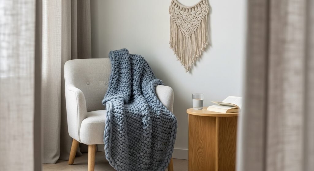
Selecting Fabrics, Curtains, and Textiles
Textiles are the final touch that makes a room feel finished. They allow you to layer different shades of blue and green. The right fabric can soften the look of Quietude Sherwin Williams.
Window Treatments
- Linen Sheers: These allow natural light to filter through and show off the paint.
- Roman Shades: Neutral fabrics in light tones keep the room feeling calm.
- Velvet Drapes: Navy or charcoal velvet adds a bit of luxury and warmth.
- Patterned Curtains: Look for small botanical prints that include the wall color.
Upholstery and Throw Pillows
- Oatmeal Fabric: This is a very popular choice for sofas against these walls.
- Textured Knits: Throw blankets in cream or slate blue add tactile warmth.
- Leather Accents: Cognac or tan leather chairs provide an earthy pop of color.
- Accent Pillows: Use coral or light yellow pillows for a bit of fun.
Pairing Quietude with Trim and Ceilings
The trim color you choose can make Quietude Sherwin Williams look crisp or soft. Most people prefer white trim to make the blue-green color pop. Here are some of the best white paint options.
Top Sherwin Williams White Pairings
- Pure White (SW 7005): This is a favorite because it has a tiny bit of warmth.
- Extra White (SW 7006): Use this for a sharp, modern, and very clean look.
- Alabaster (SW 7008): A creamy white that makes the green tones feel cozy.
Top Benjamin Moore White Pairings
- White Dove (OC-17): A classic soft white with a hint of grey for a relaxed vibe.
- Simple White (OC-117): A bright white that creates a very crisp contrast.
Building a Coordinating Color Palette
To make your whole house look good, you need a plan for other rooms. Quietude Sherwin Williams pairs well with many other shades. You can create a flow that feels professional and intentional.
- Warm Neutrals: SW Shoji White or SW Accessible Beige add softness.
- Monochromatic Shades: SW Sea Salt or SW Jasper Stone create a layered look.
- Bold Contrasts: SW Urbane Bronze adds depth and a bit of drama.
- Natural Elements: Use wood tones and woven baskets to keep things earthy.
Competitive Comparison: Quietude vs. Other Popular Hues
It helps to see how Quietude Sherwin Williams stacks up against other colors. Many shades look similar on a small swatch but different on a wall. Here is how it compares to its main rivals.
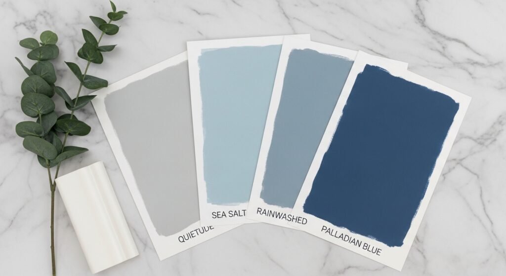
- Vs. Sea Salt (SW 6204): Sea Salt is lighter and can look more green or grey. Quietude has more pigment and holds its color better.
- Vs. Wythe Blue (BM): Wythe Blue has a more formal and historic feel. Quietude is more casual and easier to live with in a modern home.
- Vs. Rainwashed (SW 6244): Rainwashed is much lighter and leans more toward blue. Quietude feels more sophisticated because of its grey undertones.
- Vs. Silver Marlin (BM): Silver Marlin is more of a blue-grey with less green. Quietude feels warmer and more organic.
Application Tips and Practical Advice
Painting your walls with Quietude Sherwin Williams is a straightforward job. Using the right tools will give you the best final result. Here is how to get a professional finish on your own.
- Surface Preparation: Use a primer if you are painting over a very dark wall.
- Roller Choice: A good quality roller works best for a smooth finish on the walls.
- Brush Work: Use a 2-inch brush for all your trim work and corners.
- Number of Coats: Two coats will give you the most accurate color effect.
- Dry Time: Wait at least 4 hours between coats for the best results.
Expert Furniture Layouts for a Room Painted in Quietude Sherwin Williams
The way you arrange your furniture can drastically change how quietude sherwin williams feels in your space. This color is highly responsive to the shadows and light created by the placement of large objects. A well-planned layout ensures that the blue-green walls provide a sense of depth rather than making the room feel enclosed. You should focus on creating paths for natural light to reach the walls to maximize the refreshing qualities of this specific hue.
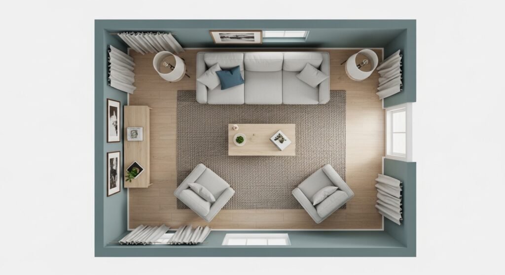
The Open Concept Living Room Layout
In an open living area, quietude sherwin williams acts as a beautiful backdrop that defines the space. You should position your largest seating pieces away from the walls to allow the paint color to breathe. Creating a floating furniture arrangement helps the light circulate and showcases the subtle shifting of the blue and green tones.
- Centralized Seating: Place your sofa in the middle of the room facing a focal point like a fireplace or a window.
- Symmetry with Chairs: Position two matching armchairs across from the sofa to create a balanced and formal look.
- Light Gaps: Leave at least twelve inches between the back of your furniture and the quietude sherwin williams walls.
- Defined Zones: Use a large neutral rug to anchor the seating area and separate it from the dining or entry space.
- Low Profile Pieces: Choose coffee tables and side tables that are lower to the ground to keep the visual line clear.
The Relaxing Master Bedroom Arrangement
For a bedroom, the layout should emphasize the peaceful nature of quietude sherwin williams. The goal is to make the bed the center of a serene sanctuary. You should avoid overcrowding the room with heavy dressers that block the view of the soothing wall color.
- The Bed Placement: Position the headboard against the longest wall for a sense of security and grandeur.
- Nightstand Balance: Use two identical nightstands to create a symmetrical look that feels very orderly and calm.
- Reading Nook: Place a cozy chair in a corner near a window to catch the afternoon light on the green tones.
- Wall Space: Keep the area around the bed relatively clear to let the quietude sherwin williams serve as a restful frame.
- Mirrored Surfaces: Use a large mirror on the wall opposite a window to bounce more light onto the painted surfaces.
The Functional Home Office Setup
A home office painted in quietude sherwin williams should be arranged to promote focus and clear thinking. You should place your desk in a position that takes advantage of the natural light without creating a glare on your screen. This layout helps the room feel professional yet very comfortable for long working hours.
- Desk Orientation: Face your desk toward the door or a window to avoid staring directly at a flat wall all day.
- Storage Placement: Keep tall bookshelves on a side wall so they do not dominate the view when you enter.
- Guest Seating: Add a small chair or a bench for a break area that highlights the soft grey undertones.
- Clear Pathways: Ensure there is plenty of room to move around so the office feels spacious and airy.
- Task Lighting: Position lamps so they illuminate your work without washing out the color of the quietude sherwin williams walls.
The Spa-Style Bathroom Configuration
Even in a small bathroom, the layout of your towels, mirrors, and vanities impacts the quietude sherwin williams vibe. You should aim for a minimalist approach that emphasizes cleanliness and light. This configuration makes the bathroom feel like a high-end retreat rather than just a utility room.
- Vanity Focus: Ensure the vanity area is well-lit with sconces that don’t cast harsh shadows on the blue-green paint.
- Open Shelving: Use floating wood shelves to keep the room feeling open and to display neutral-colored towels.
- Vertical Space: Utilize the height of the walls for hooks and mirrors to draw the eye upward and showcase the color.
- Minimal Clutter: Keep the countertops clear so the calm personality of the walls remains the primary focus.
- Glass Elements: Use clear glass shower doors to prevent visual breaks and keep the quietude sherwin williams color continuous.
Common Pitfalls: What to Avoid
Even a great color like Quietude Sherwin Williams can go wrong if you are not careful. You want to avoid common mistakes that ruin the look of the room. Paying attention to these details will save you a lot of time.
- Too Much Cream: Avoid very yellow beiges as they can make the paint look muddy.
- Low Light Problems: In dark rooms, it might look too grey or dull without testing.
- Stark Whites: Ultra-bright whites can sometimes feel too cold next to this hue.
- Skipping Samples: Always paint a large test patch to see the color shift.
Ultimate Shopping Guide: Furniture and Decor for a Quietude Sherwin Williams Home
Creating a cohesive look with quietude sherwin williams requires selecting pieces that enhance its coastal and spa-like qualities. This shopping guide focuses on textures and tones that prevent the blue-green walls from feeling too cool. You should aim for a balance of organic materials and clean lines to achieve a professional designer look.
Best Furniture Finishes for Living Areas
Selecting the right wood and fabric for your large furniture pieces is the foundation of your room design. Because quietude sherwin williams has a grey undertone, it looks best with woods that have a natural or slightly weathered appearance. You should avoid woods with heavy red or orange stains as they can clash with the green in the paint.
- Light Oak Coffee Tables: These provide a sandy, coastal vibe that mimics the beach.
- Oatmeal Linen Sofas: A neutral, textured fabric adds warmth and comfort to the cool wall color.
- Cognac Leather Armchairs: The rich tan color of the leather provides a beautiful earthy contrast.
- White Wash Sideboards: These keep the room feeling bright and airy while providing necessary storage.
- Woven Rattan Chairs: Adding natural fibers like rattan or wicker introduces a tropical, relaxed feel.
Ideal Textiles and Window Treatments
Textiles are where you can introduce depth and patterns to your quietude sherwin williams space. You should layer different weights of fabric to make the room feel expensive and cozy. Stick to a palette of whites, sands, and deep sea blues to keep the theme consistent.
- Cream Cotton Area Rugs: A light rug helps bounce light back up onto the blue-green walls.
- Jute or Sisal Runners: These rugged textures ground the space and add an organic element.
- Slate Blue Throw Blankets: Using a darker version of the wall color creates a sophisticated monochromatic layer.
- White Linen Sheer Curtains: These allow soft light to enter while maintaining privacy and a breezy look.
- Velvet Navy Pillows: Darker blue accents help anchor the room and add a touch of luxury.
Decorative Accents and Finishing Touches
The small details are what truly bring the quietude sherwin williams aesthetic to life. You should look for items that reflect nature and water to reinforce the serene atmosphere. Avoid clutter and choose a few high-quality pieces that stand out.
- Ceramic Vases in Matte White: These look crisp and clean against the muted blue-green background.
- Black and White Landscape Photography: Simple frames and monochromatic art allow the wall color to be the star.
- Brushed Brass Floor Lamps: The warm gold metal adds a glow that complements the green undertones.
- Seagrass Storage Baskets: These are functional and add a lovely honey-colored texture to corners.
- Live Greenery and Indoor Palms: Real plants thrive visually next to the organic green-blue of Quietude.
Final Verdict: Is SW 6212 Quietude Worth It?
Quietude Sherwin Williams is a fantastic mood setter for any home. It brings a sense of peace that few other colors can match. Whether you want a coastal bedroom or a spa bathroom, this color delivers. It is a versatile and timeless choice that will make you love your space again. If you want a home that feels like a retreat, this is the paint for you.
Frequently Asked Questions About Quietude Sherwin Williams
Does quietude sherwin williams look too green in a room with many plants?
When you have a lot of indoor greenery, the walls can pick up the pigment from the leaves. In a sunroom or a space filled with plants, the green side of quietude sherwin williams will become much more prominent. This creates a very lush and organic jungle vibe that feels like an extension of your garden.
Can I use this color on the exterior of my home?
While it is primarily used indoors, quietude sherwin williams can work on shutters or a front door. In direct bright sunlight, the color will look much lighter and more like a soft seafoam. It provides a welcoming and coastal look for cottage-style homes or beach houses.
Is quietude sherwin williams a good choice for a kitchen?
This color is excellent for kitchens, especially if you have white cabinetry. It provides a clean and refreshing backdrop that feels sanitary yet cozy. It looks particularly high-end when paired with white marble countertops and brass faucet fixtures.
How does this color affect the resale value of a house?
Neutral colors are usually best for resale, and quietude sherwin williams is considered a safe colorful neutral. Most buyers find the blue-green tones peaceful and non-offensive. It can help a house feel more updated and move-in ready compared to old-fashioned beige.
What is the closest Benjamin Moore match to this color?
The most common comparison in the Benjamin Moore line is Palladian Blue (HC-144). While not an exact replica, it shares the same airy, watery quality that people love about quietude sherwin williams. Palladian Blue is slightly more blue, while Quietude has a bit more green and grey.
Does quietude sherwin williams work in a laundry room?
Laundry rooms are often small and windowless, making them a great candidate for this refreshing shade. It makes the chore of doing laundry feel a bit less stressful. Pair it with bright white appliances to keep the small space looking crisp.
Should I paint my ceiling the same color?
If you want a fully immersive, cozy experience, you can paint the ceiling in quietude sherwin williams. This is often called color drenching and works best in small bedrooms or bathrooms. If the room is large, a white ceiling is usually better to prevent the room from feeling too heavy.
What color of light bulbs should I use with these walls?
The temperature of your light bulbs will change the paint color significantly. Use 3000K bulbs (soft white) if you want to bring out the warmth and the green tones. If you prefer the blue and grey side to show, opt for 4000K (daylight) bulbs.
Can I use quietude sherwin williams on kitchen cabinets?
Yes, it is a very popular choice for lower cabinets or a kitchen island. It looks sophisticated when paired with white upper cabinets and a simple backsplash. It creates a furniture-like look for your cabinetry that feels very custom.
Is this color too dark for a small hallway?
Because it has an LRV in the middle range, it can work in a hallway if you have good lighting. If the hallway is completely dark, you might want to go one shade lighter on the color strip. Always ensure you have bright overhead lighting to keep the color from turning muddy.
Does quietude sherwin williams show scuffs and marks easily?
The durability depends more on the finish (sheen) than the color itself. However, because it is a mid-tone, it hides dust better than very dark colors and hides scuffs better than pure white. Use a satin or eggshell finish for easy cleaning in high-traffic areas.
What is the best primer to use under this paint?
A simple white primer is usually sufficient for quietude sherwin williams. If you are covering a very dark red or navy wall, a grey-tinted primer can help you achieve full coverage faster. This ensures the blue-green pigment looks true to the swatch.
Is quietude sherwin williams suitable for a nursery?
This is one of the top choices for a gender-neutral nursery. It is much more sophisticated than standard baby blue or mint green. It creates a calm environment that helps both the baby and the parents feel relaxed.
How does this color look with gold frames?
Gold or gilt frames look exceptionally beautiful against quietude sherwin williams. The warmth of the gold makes the cool blue-green tones feel more expensive. This is a great way to add a traditional touch to a modern paint color.
Can I use it in a room with a lot of black furniture?
Black furniture provides a very sharp and grounded contrast to these walls. It prevents the room from feeling too “beachy” and gives it a more modern, urban edge. This combination works well in home offices or contemporary living rooms.
Does quietude sherwin williams lean toward teal?
While it is in the same family, it is much more muted and grey than a true teal. It does not have the high saturation or “brightness” that people associate with teal. It is a much softer and more understated version of a blue-green.
Is this color a good choice for a ceiling in a porch?
Many people use a light blue for porch ceilings (known as Haint Blue), and quietude sherwin williams is a great variation of this tradition. It adds a bit more depth and interest than a pale sky blue. It feels very classic and southern.
What color of flooring should I avoid with this paint?
You should generally avoid orange-toned wood or bright red cherry floors. These warm tones can make the blue in the paint look a bit “electric” or clash unpleasantly. Neutral, cool, or very dark floors are much safer bets.
Does it look good with stone fireplaces?
Quietude sherwin williams looks amazing with natural stone that has grey or tan flecks. It pulls out the organic colors in the stone and makes the fireplace a natural focal point. It works equally well with stacked stone or traditional brick.
Is it okay to use this color in a basement?
You can use it in a basement, but you must be careful with your lighting. Basements often lack natural light, which can make quietude sherwin williams look like a flat grey. Use plenty of warm artificial light to keep the color feeling alive.
1 Comment
Pingback: The Ultimate Guide to the Best Accessible Beige Paint SW 7036 – decorarenvoate.com