
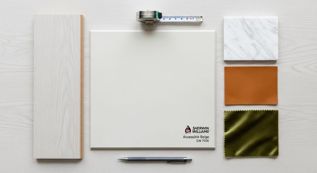
Choosing the right paint color can feel like a total nightmare. You want something that looks fresh but stays cozy. This is where the famous accessible beige paint comes into play. It is a legendary pick from Sherwin Williams. Many people call it the perfect neutral for any home. We are going to dive deep into why this color wins every time. You will learn how to use it like a pro designer. Let’s get into the details of SW 7036.
Introduction to Sherwin Williams Accessible Beige
- A Modern Classic: This shade has been a top seller for many years. It stays popular because it works in almost any room. Most designers consider it a staple in their toolkit. It never really goes out of style.
- The Greige Pioneer: It perfectly sits between a warm beige and a cool gray. This mix is what people call greige. It offers the best of both worlds for your walls. It creates a balanced look that feels very current.
- The Misleading Name: The name says beige but don’t let that fool you. It is actually a warm gray with specific undertones. It does not look like the old yellow-beige from the nineties. It feels much more sophisticated and clean.
- The Trend Shift: People are moving away from cold and sterile grays. They want homes that feel inviting and organic. Accessible beige paint provides that much-needed warmth. It makes a space feel like a real home.
The Science of the Shade: Technical Specifications
Understanding the numbers helps you predict how the paint behaves. Every color has a DNA profile. For accessible beige paint, the specs are quite interesting. These details ensure you get the right vibe.
- Light Reflectance Value (LRV): The LRV of this color is 58. This means it reflects a good amount of light. It is not too dark but not stark white either. It sits right in the sweet spot for most rooms.
- RGB Values: The red, green, and blue values are 209, 199, and 184. You can see that red is the highest value here. This explains why the color feels so warm. The balance keeps it neutral rather than colorful.
- HEX Code: The digital code for this color is #D1C7B8. You can use this for digital mockups or matching. It helps designers visualize the room on a screen. It is a handy tool for your renovation plan.
- The Depth of Color: This shade has a medium level of saturation. It provides enough pigment to stand out against white trim. It does not wash out easily in bright sun. It maintains its character in various environments.
Understanding the Complex Undertones
Undertones are the hidden colors that pop out in certain lights. They can make or break your design. Accessible beige paint has a very specific personality. You need to know what to expect on your walls.
- The Green-Gray Base: The primary undertone in this paint is green-gray. This is what makes the color feel so earthy. It keeps the beige from looking too orange or pink. It gives the room a very natural and calm feel.
- The Chameleon Effect: This color is famous for being a chameleon. It changes based on what is around it. In some lights, it looks like a soft gray. In others, it leans more toward a creamy beige.
- The Ratio Factor: The perfect mix of gray prevents it from looking muddy. Some beiges can look dirty in low light. The gray content in SW 7036 keeps it looking fresh. It maintains a clean appearance throughout the day.
The Role of Lighting in Color Transformation
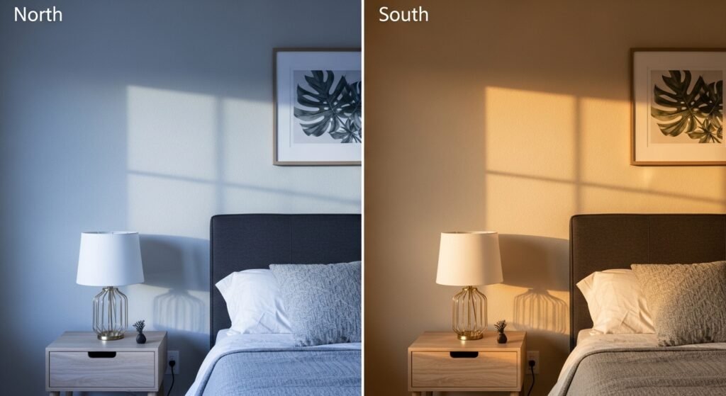
Lighting is the most important factor for any paint. It can change the way accessible beige paint looks entirely. You should always check the light in your specific room. Here is how different light sources affect this shade.
- North-Facing Rooms: These rooms get cool and bluish light. This light will pull out the gray side of the paint. It might look a bit cooler or even slightly violet. The warmth of the beige helps balance that cold light.
- South-Facing Rooms: These spaces are flooded with warm, yellow sun. This brings out the true beige qualities of the color. It will look glowing and very cozy in these rooms. It is often the favorite choice for sunny living areas.
- Artificial Lighting Impact: Your light bulbs matter just as much as the sun. Warm LED bulbs will make the color look more golden. Cool or daylight bulbs will make it look more like a flat gray. Choose your bulbs carefully to get the look you want.
- The Importance of Sampling: You must test this color before you buy it. Use large swatches on different walls. Look at them in the morning and late at night. This prevents a very expensive mistake later on.
Can SW Accessible Beige Work in Every Home?
While it is a universal favorite, it isn’t magic. Some homes might not be the right fit for it. You need to look at your architecture and layout. Let’s see where it truly shines.
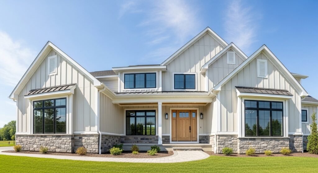
- Interior vs. Exterior Applications: This color is great for both inside and out. On the exterior, it looks like a soft, sandy stone. Inside, it creates a seamless flow from room to room. It is a very versatile choice for any project.
- The Limitation of Small Spaces: In tiny rooms with no windows, it can feel heavy. The medium LRV might make a dark room feel a bit closed in. You might need a lighter color for very cramped spaces. Always consider the size of your room first.
- The Influence of Fixed Elements: Your floors and counters are fixed elements. If you have very cool or blue-toned tiles, it might clash. It looks best with warm wood or earthy stones. Make sure it talks nicely to your existing finishes.
Comparative Analysis: Accessible Beige vs. Similar Shades
It helps to see how this color stacks up against others. Comparing them reveals the true undertones. You might find a different shade fits your vibe better.
BM Shelburne Buff (HC-28)
- Gold-Beige Undertones: This Benjamin Moore color is much more golden. When you put it next to SW 7036, you see the green in the beige. Shelburne Buff is more traditional and much warmer. Accessible beige paint is more modern and muted.
Sherwin Williams Sundew (7688)
- Yellow Undertones: Sundew is a very sunny and yellow-based color. In contrast, SW 7036 looks much more like a gray. If you want a “happy” yellow feel, go with Sundew. If you want a calm neutral, stay with the beige.
Sherwin Williams Modern Gray (7632)
- Clean vs. Muted: Modern Gray is lighter and has a cleaner look. SW 7036 is more muted and has more depth. Modern Gray can sometimes look a bit “thin” in big rooms. Accessible beige paint feels more grounded and solid.
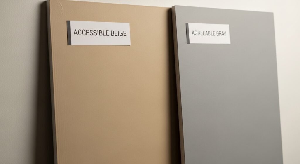
Sherwin Williams Agreeable Gray (7029)
- The Big Rival: These two are the biggest rivals in the paint world. Agreeable Gray is definitely more gray and slightly cooler. Accessible beige paint is the warmer cousin of the two. If your house feels cold, pick the beige.
Sherwin Williams Skyline Steel (1015)
- The Stone Gray: Skyline Steel leans much harder into the green-gray side. It can look like a cool stone in some lighting. Accessible beige paint stays much more inviting and soft. Skyline Steel is better for a very modern, edgy look.
Benjamin Moore Revere Pewter
- The Greige Battle: This is another legendary greige color. Revere Pewter is a bit darker and more saturated. It often shows more of a muddy green in dark corners. SW 7036 stays a bit lighter and more predictable.
Strategic Pairings: Coordinating Colors and Whites
A great paint color needs the right friends. Coordinating colors make the main shade look better. Accessible beige paint works with many different palettes.
Best Coordinating White Paints
- Sherwin Williams Pure White (SW 7005): This is the ultimate trim color for this beige. It is a very clean white without being too cold. It provides a crisp contrast that makes the walls pop. It is a fail-safe combo for any home.
- Sherwin Williams Alabaster (SW 7008): This is a softer, creamier white. It creates a very gentle transition from wall to trim. It is perfect if you want a cozy, cottage-style feel. It makes the whole room feel wrapped in warmth.
Complementary Accent Colors
- Smoky Blue and Navy: Dark blues look incredible with this shade. They bring out the cool gray side of the paint. It creates a very classic and high-end appearance. Try it in a dining room or office.
- Pewter Green: This earthy green is a natural partner. Since the beige has green undertones, they harmonize perfectly. It gives the home a very organic and forest-like vibe. It is great for a calming bedroom.
- Earth Tones: Think of colors like terracotta, ochre, and rust. These warm tones play off the beige beautifully. They make the space feel grounded and connected to nature. It is a very trendy look right now.
Professional Application and Design Tips
How you apply the paint is just as important as the color. You want a professional finish for your renovation. Here are some secrets from the experts.
- The Prime Your Walls Rule: You should always prime your walls first. This is especially true if your old color was a dark gray. Priming stops the old color from changing your new one. It ensures the accessible beige paint looks exactly right.
- The Risk of Cutting Paint Colors: Some people ask to “cut” the color by 50 percent. This is a very bad idea for this specific shade. It changes the chemical ratio and the undertones become weird. If you want it lighter, just find a different color.
- Trim and Millwork Strategy: Try painting your trim the same color as the walls. Just use a different finish like semi-gloss for the trim. This “monochromatic” look makes small rooms feel much larger. It is a very sophisticated design trick.
Room-by-Room Recommendations
Every room has a different purpose and light. You can use accessible beige paint everywhere, but with a plan. Here is how to handle each space.
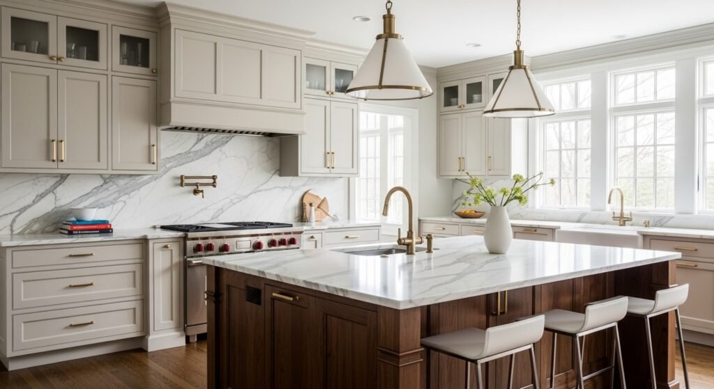
- Kitchens: This is a top pick for kitchen walls or even cabinets. It looks stunning with white quartz or marble counters. It brings warmth to a space that can often feel too cold. It hides minor splatters better than pure white.
- Living Rooms: This is where the color really lives its best life. It provides a neutral backdrop for any furniture style. Whether you like modern or traditional, it just works. It makes the living area feel cohesive and large.
- Foyers and Entryways: First impressions matter a lot in a home. This color is very welcoming and soft for an entry. It flows well into almost any other room color. It sets a calm tone the moment you walk in.
- Bathrooms and Cabinets: It is a great choice for a bathroom vanity. It creates a spa-like feel when paired with natural stone. It looks great against white tile and chrome fixtures. It makes a small bathroom feel more upscale.
Selecting Suitable Hardware and Metal Finishes
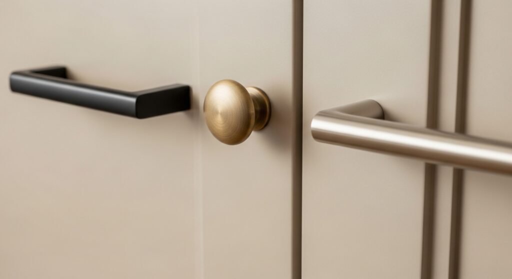
Hardware is the “jewelry” of your home. The right metal can make your paint color sing. Accessible beige paint is very flexible with finishes.
- Champagne Bronze and Satin Brass: These warm golds are a match made in heaven. They highlight the warmth of the beige beautifully. It creates a very luxury and high-end feel in a room. Use these for cabinet pulls or light fixtures.
- Copper and Antique Brass: If you want a more vintage look, go with these. They add a lot of character and history to the space. They feel very grounded against the green-gray undertones. It is a great choice for a rustic kitchen.
- Matte Black: This is the best choice for a modern home. Black provides a very sharp and clean contrast. it makes the greige walls look more like a designer gray. It is a very popular look for farmhouse styles.
- Polished Nickel: This is a warmer version of silver or chrome. It has a slight yellow tint that matches the beige. It looks much more expensive than standard chrome. It is perfect for a classic bathroom or kitchen.
Flooring and Surface Considerations
The floor is the largest “color” in your room. It will reflect its own color onto your walls. You must coordinate accessible beige paint with your flooring.
- Light Oak and White Oak: These are the most popular floors right now. They have a very light and organic feel. They pair perfectly with the green-gray base of the paint. It creates a very airy and modern look.
- Dark Walnut: High contrast is a very classic design move. Dark floors make the beige walls look even brighter. It feels very formal and solid. Just make sure the room has enough light to handle the dark wood.
- Warning on Red Oak: Be careful with very red or orange wood. The red in the wood can make the green in the paint pop. Sometimes this looks okay, but it can also look clashing. Always test a sample next to your specific floor.
- Travertine and Limestone: These natural stones are usually very beige. They share the same earthy DNA as the paint. This creates a very calm and continuous look. It is great for entryways or hearths.
- Carrara Marble: This stone has a lot of cool gray veins. The warmth of the paint helps the marble feel less cold. It is a very sophisticated combination for a bathroom. It balances the warm and cool tones perfectly.
Furniture and Textile Integration
Your furniture shouldn’t just sit in the room. It should work with the walls to create a story. Accessible beige paint is the ultimate backdrop for textiles.
- Linen and Oat Fabrics: Creating a monochromatic room is very chic. Use fabrics that are just a shade lighter or darker than the walls. This layering makes a room feel very expensive and soft. It is the key to a cozy living space.
- Leather Textures: Warm leathers like cognac or tan are amazing here. They bring out the rich, warm side of the paint. A leather sofa against these walls feels very high-end. It adds a natural element that feels very durable.
- Velvet Curtains: If you want drama, use a dark velvet. An olive green or navy blue curtain will look stunning. The weight of the fabric looks great against the soft walls. It adds a touch of luxury to any window.
- Sheer White Linens: For a breezy look, use sheer white curtains. They let the natural light wash over the beige walls. It keeps the space feeling very fresh and open. This is perfect for a bedroom or sunroom.
- Jute and Sisal Rugs: These natural fiber rugs are a perfect match. They have the same organic, sandy tones as the paint. They add texture without adding too much color. It is the base of any good neutral room.
- Persian or Oriental Rugs: These rugs often have many colors. The neutral walls allow the pattern of the rug to be the star. The red or blue in the rug will change how the paint looks. It is a very classic and timeless way to decorate.
Purchasing and Color Matching
Once you decide on the color, you have to go buy it. There are a few things to keep in mind when shopping. Don’t just grab the first can you see.
- Where to Buy: You can find this color at any Sherwin Williams store. Some big-box stores might have the formula too. It is always best to buy from the source for the best match. They know their own colors the best.
- Color Matching Accuracy: If you use a different brand, use the HEX code. Most stores can scan it and make a custom color. Be warned that every brand uses different bases. The final result might be slightly off in some lights.
- Paint Finish and Quality: Don’t go cheap on the paint itself. A high-quality paint will have better coverage. This means you might only need two coats instead of three. It will also be easier to clean later on.
Final Verdict: Is Accessible Beige Right for You?
We have covered a lot of ground today. This color is truly a powerhouse in the design world. But is it the right move for your specific house?
- The Pros: It is a universal neutral that works with most styles. It balances warm and cool tones perfectly. it has a high resale value for your home. It makes spaces feel inviting and updated.
- The Cons: It can look muddy in very dark rooms. The green undertone can be tricky with some wood floors. It is not a “true” beige if that is what you want. It requires careful lighting consideration.
- Avoiding Costly Mistakes: The biggest tip is to always sample first. Never buy gallons based on a tiny paper swatch. Paint a large area and live with it for a few days. This ensures you will love your new home for years to come.
FAQs About Accessible Beige Paint
What is the LRV of Sherwin Williams Accessible Beige?
The Light Reflectance Value (LRV) of this specific shade is 58. This number indicates that it is a mid-tone color that reflects a healthy amount of light without being as bright as an off-white. It sits in a perfect range to provide depth in bright rooms while still maintaining its color in dimmer spaces.
Does Accessible Beige look pink or peach?
One of the best things about accessible beige paint is that it rarely shows pink or peach undertones. Because it is rooted in a green-gray base, it stays very neutral. If you see pink, it is likely a reflection from a red rug or very warm cherry wood floors nearby.
Is Accessible Beige lighter than Agreeable Gray?
Actually, Agreeable Gray has an LRV of 60, making it slightly lighter than Accessible Beige at 58. However, because Accessible Beige is warmer, it can sometimes feel “brighter” or more “sun-filled” in a room. Agreeable Gray feels more like a soft shadow, while Accessible Beige feels like soft sand.
Can I use Accessible Beige on my ceiling?
Yes, you can definitely use it on a ceiling for a cozy, “envelope” effect. If you want the room to feel taller, stick with a bright white like Pure White. If you want a moody and intimate vibe in a bedroom or office, painting the ceiling with accessible beige paint looks very high-end.
What is the best Benjamin Moore equivalent to SW 7036?
The closest match in the Benjamin Moore collection is Edgecomb Gray (HC-173). Both colors are popular greiges with similar warmth. Edgecomb Gray is just a tiny bit lighter and can sometimes lean a little more “creamy” compared to the slightly more “stony” feel of Accessible Beige.
Does this color work for a basement with no windows?
It can be tricky in a windowless basement. Without natural light to balance the green-gray undertone, it can sometimes look a bit muddy or flat. If you use it in a basement, make sure you have high-quality artificial lighting with a 3000K to 3500K color temperature to keep it looking fresh.
Is Accessible Beige a good color for selling a house?
It is widely considered one of the best colors for home staging and resale. It is neutral enough to appeal to almost everyone but warm enough to make the house feel lived-in. It hides minor wall scuffs well and makes the home look updated and well-maintained.
What color should I paint my interior doors?
If your walls are accessible beige paint, you have two great options for doors. You can go with a crisp white like SW Pure White for a traditional look. For a modern and bold statement, many designers are painting doors in a dark charcoal or matte black to contrast against the beige walls.
How does Accessible Beige look on kitchen cabinets?
On cabinets, this color looks sophisticated and timeless. It is a great alternative for those who find white cabinets too stark. It pairs beautifully with gold hardware and white marble countertops. It also hides fingerprints and kitchen grease much better than a pure white cabinet would.
Can I use this color for a monochromatic look?
Yes, it is perfect for a monochromatic color scheme. You can use it on the walls and then use a color like SW Mega Greige (which is on the same color strip) for an accent wall or built-in shelving. This creates a layered, professional look without introducing too many different colors.
Does Accessible Beige look yellow?
While it is warm, it rarely looks “yellow” in the way traditional beiges do. The gray content acts as a stabilizer. If your room has very yellow light bulbs (2700K), any paint will look more yellow. Switching to “soft white” bulbs will keep the color looking like a true greige.
Is it okay to use Accessible Beige in a bathroom?
It is a fantastic choice for bathrooms. It creates a spa-like atmosphere that feels clean but not cold. It looks particularly good with wood-look tile or natural stone. Because bathrooms are often small, just ensure your lighting is bright enough to keep the color from feeling too heavy.
What sheen should I choose for accessible beige paint?
For most walls, an eggshell or satin finish is best. It provides a soft glow and is easy to wipe down. For bathrooms or kitchens, you might want to move up to a semi-gloss for better moisture resistance. For ceilings, always use a flat finish to hide any imperfections in the drywall.
Does it look good with cool-toned marble?
Surprisingly, it does. The warmth of the paint provides a nice balance to the cool grays found in Carrara or Statuary marble. It prevents the marble from making the room feel like an ice box. It creates a very balanced and “expensive” look in kitchens and baths.
How does it compare to Repose Gray?
Repose Gray is much more of a “true” gray with blue and violet undertones. It is much cooler than accessible beige paint. If you want a room to feel airy and cool, go with Repose. If you want it to feel sun-drenched and welcoming, stick with Accessible Beige.
Can I use Accessible Beige on my home’s exterior?
It is a very popular exterior color. In the bright outdoor sun, it will look like a very light, off-white stone. It is a great choice for siding or trim. It pairs well with dark bronze gutters and wood-stained front doors for a modern farmhouse or craftsman look.
Will it clash with honey oak cabinets?
Accessible beige paint is one of the few colors that can actually help tone down the orange in honey oak. Because it has a green-gray base, it acts as a neutralizer. It won’t make the oak disappear, but it will make the room look much more modern than a stark white or a blue would.
What is the best color for a nursery?
Accessible beige paint is a great “gender-neutral” choice for a nursery. It provides a calm and soothing environment for a baby. You can easily add pops of pink, blue, or green through blankets and wall art. It is a color that can grow with the child into their teenage years.
Does Accessible Beige look good with black accents?
It looks incredible with black accents. Black picture frames, light fixtures, or window panes provide a sharp “anchor” for the soft beige walls. This high-contrast look is a hallmark of modern interior design and keeps the beige from feeling too traditional or “boring.”
Is it a good color for a dark hallway?
In a hallway with no windows, it can feel a bit dim. Since hallways are transitional spaces, you can usually get away with it if your overhead lighting is strong. If the hallway feels too cave-like, you might want to try its lighter cousin, SW Aesthetic White, instead.