
When you want a perfect neutral, Benjamin Moore Tapestry Beige (OC-32) is a total classic that you need to check out. This color is super famous because it is versatile and has a timeless look. It is a warm and light tan that looks great in almost any room. Many homeowners love it because it feels cozy but still looks very high-end. If you are tired of whites that feel too cold, this shade might be your new best friend. It works in many different lighting conditions which makes it a safe bet for many projects. This guide will dive deep into everything you need to know about this fan-favorite paint color.
Overview of Benjamin Moore Tapestry Beige
Benjamin Moore Tapestry Beige is a soft and muted beige color. It is a light tan that brings a lot of warmth to a space. Even though it is a beige, it sits in a special spot on the color wheel. It leans a bit toward taupe or greige, but it is not cold at all. It has a warm base that keeps it feeling very inviting. This makes it a great choice for people who want a modern look without the “clinical” feel of some grays.
Defining the Aesthetic
The aesthetic of Benjamin Moore Tapestry Beige is all about being understated and elegant. It does not scream for attention but instead creates a calm backdrop for your life. This feels organic and natural, like linen or soft sand. It is the kind of color that makes a room feel finished without being overwhelming. Many designers use it when they want a space to feel expensive and curated. It has a way of making architectural details stand out quietly.
The Greige Spectrum
In the world of paint, people talk a lot about “greige,” which is a mix of gray and beige. Benjamin Moore Tapestry Beige fits into this spectrum because it has enough gray to keep it modern. However, it is definitely more on the beige side than many popular greiges. It is not as cool as a true gray, which is why people call it a “warm neutral”. This balance is why it works so well in homes that have both modern and traditional elements.
Benjamin Moore’s Description
Benjamin Moore officially calls this color a soft and muted beige with subtle warm undertones. They highlight that it is a versatile shade that adapts well to its surroundings. The brand places it in their “Off-White Collection,” which shows how light and airy it can feel in the right room. They suggest it for people who want a sophisticated look that won’t go out of style next year. It is one of those colors that has stayed popular for decades for a reason.
Understanding the Complex Undertones of Tapestry Beige
One of the most important things to know about Benjamin Moore Tapestry Beige is its undertones. Most beige paints have either a pink, yellow, or green base. Knowing which one you are dealing with helps you avoid a “color disaster” later. Tapestry Beige is unique because its undertones are quite complex compared to a simple cream.
The Primary Green Undertone
Tapestry Beige is known for having a faint green undertone. This is a very big deal because it changes how the color looks next to other things. Because of this green base, it can sometimes feel a bit cooler than beiges with a pink or red base. In some rooms, you might not see the green at all. In other rooms, it might look like a very pale khaki or olive.
Comparing Warm vs. Cool Neutrals
- Cool Neutrals usually have blue or purple bases and can feel a bit crisp or icy.
- Warm Neutrals like Tapestry Beige have yellow or green bases and feel cozy.
- Tapestry Beige is special because it feels warmer than gray but cooler than a “fleshy” pink-beige.
- Versatility is higher with this green-base beige because it doesn’t clash with as many things.
The Hidden Taupe Influence
While it is mostly a beige, there is a hint of taupe in there too. Taupe usually has a bit of violet or gray in it. In Benjamin Moore Tapestry Beige, this muted quality keeps the color from looking too yellow or “golden.” This is why it looks so good in modern homes that use a lot of black or white accents. It has just enough “muddiness” to look sophisticated and high-end.
LRV (Light Reflectance Value) and Its Impact
LRV stands for Light Reflectance Value, and it tells you how much light a color reflects. It is measured on a scale from 0 to 100. A score of 0 is pure black, and 100 is pure white. This number is a huge clue for how a paint will actually behave on your walls.
Analyzing the Score (LRV 66)
The LRV for Benjamin Moore Tapestry Beige is 66. This means it reflects a moderate amount of light. It is not a super bright white, but it is definitely not a dark color either. A score of 66 puts it right in the sweet spot for many interiors. It has enough “meat” to it that it looks like a real color, not just an off-white.
The Wash-Out Factor
In a room with a ton of windows and bright sun, light colors can “wash out.” This means they end up looking plain white. Because Benjamin Moore Tapestry Beige has an LRV of 66, it holds its color pretty well. Even in bright light, you will still see that it is a warm tan. It won’t disappear on you when the sun comes out.
Spatial Perception
- Reflectance helps smaller rooms feel a bit more open because it bounces light around.
- Depth is still present, so large rooms won’t feel like a big empty box.
- Balance is the key word here; it is cozy but still feels airy and light.
- Consistency is better with a mid-range LRV like 66 compared to very dark or very light shades.
Lighting Conditions and Color Shifting
Lighting is the “secret ingredient” that changes how paint looks. Benjamin Moore Tapestry Beige is a “shifter,” which means it looks different throughout the day. You have to pay attention to which way your windows face before you buy those gallons.
North-Facing Rooms
North-facing rooms get cool, bluish light all day. This kind of light can be tricky for beige paints. In these rooms, the green undertones in Benjamin Moore Tapestry Beige can become much more obvious. It might look a bit moodier or cooler than you expected. It is still beautiful, but it won’t feel as “warm” as it does in a photo online.
South-Facing and West-Facing Rooms
South-facing rooms get warm, golden light. This light is a perfect match for Tapestry Beige. It makes the color look like a creamy, warm tan and hides the green undertones. West-facing rooms are similar, especially in the afternoon. When the sun starts to set, this color will glow with a very cozy and inviting warmth.
The Role of Artificial Lighting
- Soft White bulbs (2700K) have a yellow glow that makes the beige feel even warmer and creamier.
- Daylight bulbs (5000K) are very blue and will likely make the green undertone pop out.
- LED lighting can vary a lot, so you should check your samples with your lights turned on at night.
- Shadows in the corners of the room will make the color look a few shades darker than the LRV suggests.
Where Tapestry Beige Works Best in the Home
This shade is incredibly versatile, which is why so many people choose it. It can work in almost any room if you style it right. Here are the best places to use it according to design pros.
Living Rooms
In a living room, Benjamin Moore Tapestry Beige creates a very welcoming vibe. It pairs beautifully with soft white trim and natural wood elements. It makes the space feel grounded and comfortable for guests. If you have a fireplace with stone or brick, this color usually complements those natural materials very well.
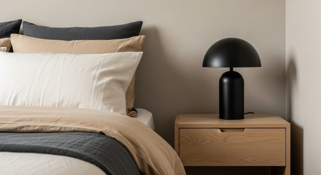
Bedrooms
Because it has calming undertones, it is a great choice for a bedroom. It works well as a neutral backdrop for bedding and pillows. It looks especially nice if you have white oak furniture or light-colored floors. It helps create a “sanctuary” feeling that isn’t too stark or cold.
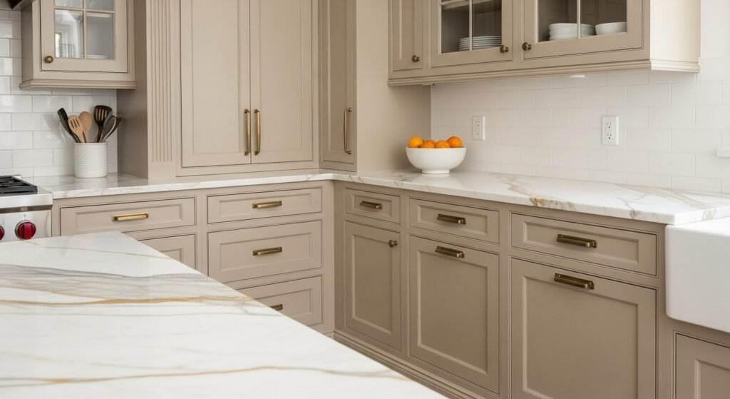
Kitchens
You can use Benjamin Moore Tapestry Beige on kitchen walls to warm up white cabinets. It also looks great as a cabinet color itself if you want a “mushroom” or light taupe kitchen. It pairs very well with marble or quartz countertops that have gray or gold veining. It is a nice break from the “all-white” kitchen trend that can feel a bit boring.
Hallways and Entryways
Tapestry Beige is a “safe” choice for hallways because it handles different lighting well. Since hallways often don’t have windows, the 66 LRV helps keep them from feeling like a cave. It provides a smooth transition between rooms that might be painted in bolder colors. It is also great for entryways where you want to make a warm first impression.
Home Offices
For a home office, you want a color that is sophisticated but not distracting. Benjamin Moore Tapestry Beige provides a clean, professional look that still feels “homey.” It looks great on a Zoom call background because it is neutral and flattering. It helps keep the space feeling bright enough to work in without causing eye strain from glare.
When to Avoid Tapestry Beige
Even a great color has its limits. There are a few times when you might want to skip Benjamin Moore Tapestry Beige. If you ignore these “red flags,” the color might end up looking “off” or even “dirty.”
Clashing with Pink-Beige Fixed Elements
This is the most important rule to remember. Tapestry Beige has green undertones, so it does not play well with pink-toned beiges. If you have pink-beige tiles, countertops, or carpets, Tapestry Beige will likely look like a “mistake”. The green and pink will fight each other, and neither will look good. Always check your fixed elements before you commit.
Red and Orange Woods
Be careful if your home has a lot of cherry or reddish-orange wood floors. Because green and red are opposites on the color wheel, they “enhance” each other. This means red floors will make the green undertone in Benjamin Moore Tapestry Beige stand out much more. If you don’t like green, you might hate how it looks next to your red-toned wood.
Open Concept Caveats
In a house with an open floor plan, you see many walls at once. You should avoid putting Tapestry Beige next to popular pink-based neutrals like BM Pashmina or BM Muslin. When you see them in the same “viewshed,” the undertones will clash and make the house feel disjointed. Try to stick to one “family” of undertones for your main living areas.
Flooring Pairings for Tapestry Beige
Your floors take up a huge amount of visual space, so they have to work with your walls. Since Benjamin Moore Tapestry Beige is an earthy color, it loves organic flooring materials.
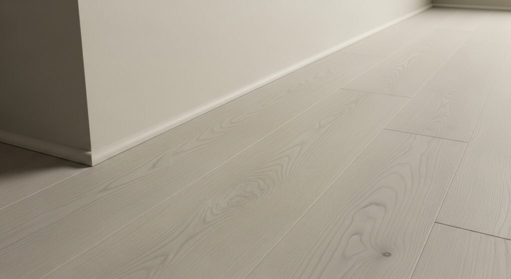
Hardwood Selections
- White Oak is the absolute best match for this paint because its natural tones are very similar.
- Light Maple also works well and keeps the room feeling very airy and modern.
- Dark Walnut creates a beautiful contrast that feels very high-end and traditional.
- Espresso floors can work, but make sure you have enough light so the room doesn’t feel too heavy.
Carpeting and Area Rugs
- Jute and Sisal rugs are perfect because they share that earthy, tan vibe.
- Seagrass adds a bit of texture that plays into the natural look of Tapestry Beige.
- Off-white wool rugs create a soft and luxurious feel that is very “quiet luxury.”
- Avoid oatmeal carpets that have pink or purple flecks in the weave, as they will clash with the wall’s green base.
Tile and Stone
- Travertine often has the right warm tones to match the beige perfectly.
- Carrara Marble works because the gray veins in the stone pick up the muted quality of the paint.
- Slate floors in a dark gray or charcoal create a grounded, rustic look.
- Limestone is another great choice that feels very organic and high-end next to this color.
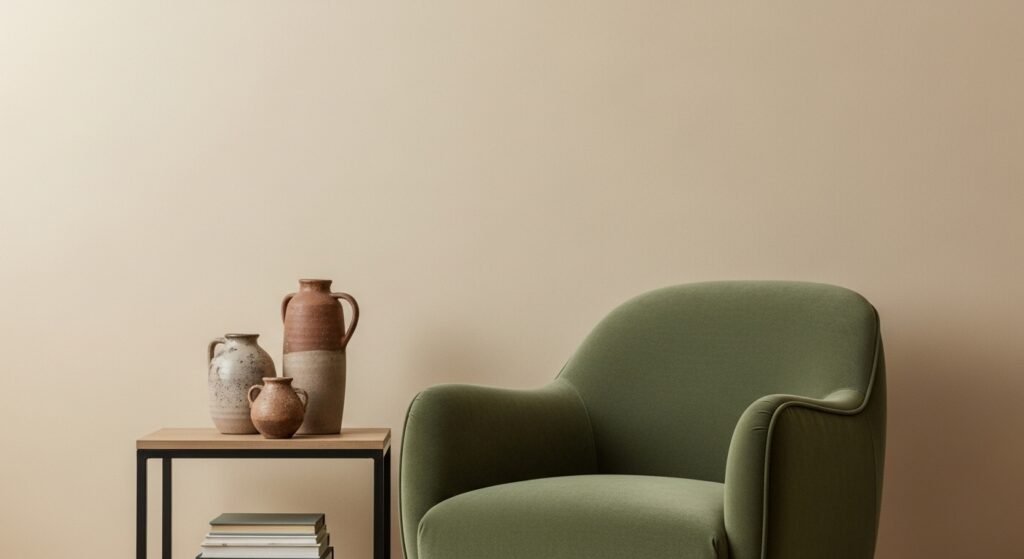
Furniture and Fabric Coordination
Once the walls are painted, you need to fill the room. The right fabrics can make Benjamin Moore Tapestry Beige look like a million bucks.
Upholstery Choices
- Linen and Flax fabrics are a “no-brainer” for this color; they look effortless and elegant.
- Navy Blue velvet or cotton creates a stunning, classic contrast that feels very “East Coast.”
- Charcoal furniture helps modernize the beige and makes the space feel more current.
- Creamy whites work well, but make sure they aren’t too “yellow” or they might make the walls look green.
Leather Tones
- Cognac Leather is a fantastic pairing because the orange-brown tones pull out the warmth of the paint.
- Tan Leather creates a “tone-on-tone” look that is very popular in modern design.
- Avoid Burgundy leathers, as the red tones will likely make the green in the paint stand out too much.
- Black Leather can work if you want a more industrial or masculine feel in the room.
Accent Textures
To keep a beige room from feeling boring, you need texture. Think about using bouclé chairs or chunky wool throws. Woven cotton pillows in different shades of cream and tan add depth. These layers make the room feel “designed” rather than just “painted.”
Hardware and Metal Finishes
The “jewelry” of your room—your hardware—can really change the mood of Benjamin Moore Tapestry Beige.
Aged Brass and Gold
Warm metals like aged brass or gold are the most popular choices for this color. They complement the warmth of the tan and look very high-end. This combination is great for kitchens or bathrooms. It creates a classic, “timeless” look that won’t go out of style.
Matte Black
If you want a modern farmhouse or industrial look, matte black is the way to go. The sharp black lines create a big contrast against the soft beige walls. This helps “ground” the room and gives it a bit of an edge. It is a very clean and trendy look.
Polished Nickel vs. Chrome
- Polished Nickel has a warm, yellow-ish undertone that looks beautiful with beige.
- Chrome is very blue and “cold,” which can sometimes fight with the warmth of Tapestry Beige.
- Satin Nickel is a safe middle ground if you want a silver look without the “ice” of chrome.
- Warmth in your metals usually leads to a more cohesive look with this specific paint color.
Oil-Rubbed Bronze
Oil-rubbed bronze is a very traditional choice. It has a dark, heavy weight that looks great in older or historical homes. It provides a nice contrast without being as “harsh” as matte black. It feels very grounded and permanent.
Cabinetry and Millwork Applications
Benjamin Moore Tapestry Beige isn’t just for walls. It is a fantastic choice for wood surfaces too.
The “All-Beige” Kitchen
If you are tired of white kitchens but aren’t ready for bold colors, try beige cabinets. Tapestry Beige looks sophisticated on cabinets and feels very European. It is softer than white and hides dirt a little better too. It pairs beautifully with wood islands or brass hardware.
Built-in Bookshelves
Painting built-ins the same color as the walls is a great trick. If you use a satin finish on the shelves and matte on the walls, it looks very high-end. It creates a “library” feel that is very cozy. It also makes your books and decor the stars of the show.
Wainscoting and Board and Batten
You can use Tapestry Beige for architectural details like wainscoting. It looks great when the wall above it is a slightly different shade, or even the same color. This adds depth and “character” to a plain room. It is a simple way to make a house look like it has more history.
Benjamin Moore Tapestry Beige for Exterior Applications
Using this color outside is a bit different than using it inside. The sun changes everything.
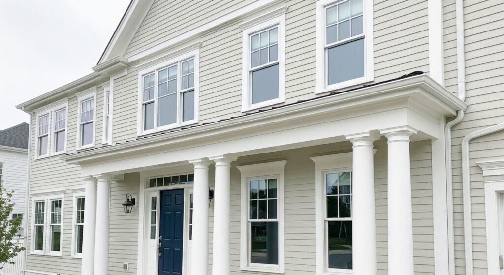
The Exterior Light Rule
The sun is much stronger than any indoor light bulb. It will “eat” the color and make it look much lighter. A color that looks dark on a sample chip might look like plain white on your house. You always have to go a bit darker than you think for exteriors.
The “Mistake” Zone
With an LRV of 66, Tapestry Beige falls into a tricky zone for exteriors. It is often too dark to be a “crisp white” but too light to be a “real color”. Sometimes it can end up looking like a “dirty white” or a pale green in the sun. Designers often recommend skipping it for main siding and choosing something with more depth instead.
Tone-on-Tone Exterior Styling
If you really love it, you can do a “tone-on-tone” look. This means painting the siding and the trim the same color. It is a very classic look for New England style homes. You can also pair it with a very stark white trim to make the beige “pop” a little more.
Heat Retention and Durability
Because it is a light color, it doesn’t absorb as much heat as dark navy or black siding. This can help keep your cooling bills a bit lower in the summer. Light colors also tend to show less “fading” from the sun over time. It is a practical choice for longevity.
Which Whites Go With Tapestry Beige?
Picking the right trim color is the “make or break” moment for your room. You want a white that highlights the beige without clashing with the green undertone.
Clean and Modern Whites
- Benjamin Moore Simply White (OC-117) is a warm, crisp white that looks great with almost anything.
- Benjamin Moore Chantilly Lace (OC-65) is a very “true” white with no obvious undertones, providing a clean look.
- Brightness of these whites will make the Tapestry Beige look a bit darker and more defined.
- Modernity is the goal with these choices; they keep the beige feeling fresh.
High Contrast Options
If you want the beige to really stand out, use a very bright white. Sherwin Williams Extra White is a great choice for this. It creates a big “jump” between the wall and the trim. This makes the architecture of the room look very sharp.
The Designer’s Favorite
Most designers love Benjamin Moore White Dove (OC-17) with this color. White Dove is a soft, creamy white that isn’t too stark. It offers plenty of contrast without feeling cold or “clinical”. It is a very “seamless” transition that feels sophisticated.
Coordinating with Warm Fixed Elements
- BM Mascarpone (AF-20) is perfect if you have yellow-toned floors or counters.
- SW Dover White (SW-6385) works well if your home has orange-toned wood or brick.
- Creaminess is key here; you want a trim that shares the “warmth” of the room’s elements.
- Harmony is achieved when the trim doesn’t “fight” the dominant tones in the floor.
Comprehensive Comparison with Other Popular Neutrals
Seeing how Benjamin Moore Tapestry Beige stacks up against its “rivals” helps you decide if it’s the one.
Tapestry Beige vs. BM Edgecomb Gray
Edgecomb Gray is another huge favorite. It has an LRV of 63, so it is a tiny bit darker. Edgecomb Gray has a bit more of a purple/pink undertone, whereas Tapestry Beige is firmly green. If your room looks too “pink” with Edgecomb, Tapestry Beige might be the fix.
Tapestry Beige vs. BM White Sand
White Sand is a very similar light beige, but it has a rosy or pink undertone. When you put them side by side, you can really see the green pop in Tapestry Beige. White Sand feels “prettier” and warmer, while Tapestry Beige feels more “organic” and cool.
Tapestry Beige vs. SW Repose Gray
Repose Gray is a true greige that leans more toward gray. It is much cooler than Tapestry Beige. If you want a room that feels “modern and cool,” go with Repose. If you want a room that feels “earthy and cozy,” Tapestry Beige is the winner.
Tapestry Beige vs. BM Revere Pewter
Revere Pewter is the “king of greige,” but it is much darker and “muddier” than Tapestry Beige. Revere Pewter has a stronger green undertone and can sometimes look a bit heavy. Tapestry Beige is like a lighter, airier version of that same sophisticated vibe.
Tapestry Beige vs. BM Collingwood
Collingwood is a “cousin” to Tapestry Beige because it also has an LRV in the mid-60s. However, Collingwood is much more gray and cool. Tapestry Beige will always feel more like a “tan” while Collingwood feels like a “light gray.”
Recommended Color Palettes and Pairing Suggestions
Don’t just paint one wall; plan the whole room. These palettes are “fail-proof” with Benjamin Moore Tapestry Beige.
The Earthy/Organic Palette
- BM Sage Mountain (2138-40) is a muted green that looks amazing as an accent wall.
- BM Hampshire Gray (HC-101) is a deep, dark brown with green tones for a moody look.
- Nature-inspired tones always work because they “speak the same language” as the beige.
- Harmony is the result of using these organic, forest-like colors together.
The Moody/Modern Palette
- SW Honed Soapstone is a trendy dark green that makes the beige look very crisp.
- BM Nantucket Gray is another great green option that feels very “designer”.
- SW Muddled Basil is a rich, dark “chocolate-green” for a high-contrast look.
- Depth is added to the room when you pair the light beige with these dark, “inky” colors.
The Sophisticated Warm Palette
- BM Raleigh Tan is a muted peach/tan that adds a touch of complexity.
- BM White Drifts (LRV 73) is an off-white that helps create a “tone-on-tone” look.
- Softness is the goal here; everything should feel calm and blended.
- Warmth is boosted by using these subtle, complex tan shades together.
Practical Tips for Testing and Application
Don’t just buy the paint and start rolling. You need a plan to make sure it looks perfect.
The Importance of Large Swatches
Small 2-inch paint chips are useless. You need to use “peel-and-stick” samples that are at least 12 inches big. Move them around the room at different times of day. This is the only way to see if the green undertone is going to bother you.
Sample Placement
Don’t just stick the sample in the middle of a white wall. Put it right next to your flooring and your trim. See how it looks against your sofa. You want to see how the paint interacts with the things that aren’t moving.
The Two-Coat Rule
Light neutrals like Benjamin Moore Tapestry Beige need two full coats to show their true color. One coat often looks streaky and “thin.” The second coat is what brings out that rich, sophisticated 66 LRV depth.
Selecting the Right Finish
- Matte or Flat is best for walls to hide bumps and give a high-end, “velvety” look.
- Eggshell is a good “all-around” finish for living areas because it is easy to wipe down.
- Satin or Semi-Gloss should be used for trim, doors, and cabinets for durability and a bit of shine.
- Ceilings should usually be a flat white to keep the room feeling tall and bright.
Final Verdict: Is Tapestry Beige Right for Your Space?
At the end of the day, Benjamin Moore Tapestry Beige is a fantastic color, but it isn’t for everyone.
Summary of Strengths
- Versatility is top-tier; it works in almost any room in the house.
- Sophistication is high; it looks much more expensive than a basic cream paint.
- Timelessness means you won’t need to repaint in three years because the trend died.
- The cozy vibe makes a house feel like a home without being too dark.
Summary of Weaknesses
- The Green undertone can be a surprise if you aren’t prepared for it.
- Clashing with pink-based beiges is a major risk in many homes.
- Exterior risks mean it might not be the best choice for your siding.
- Lighting sensitivity means it can look quite different from morning to night.
Concluding Design Advice
If you love organic, earthy tones and have light-colored wood in your home, Benjamin Moore Tapestry Beige is a “home run.” It is a “designer-grade” neutral that brings a lot of class to a space. Just remember to test it against your “fixed elements” like floors and counters before you start. If you do that, you will likely love the results. It is a classic for a reason, and it is ready to make your home feel beautiful.
Frequently Asked Questions About Benjamin Moore Tapestry Beige
What is the hexadecimal code for Benjamin Moore Tapestry Beige?
The hex code for this specific color is #D6D0C1. This digital code is useful if you are trying to match the paint color for graphic design projects or digital room mockups. It represents the specific mix of red, green, and blue that creates the tan-green hue.
Is Benjamin Moore Tapestry Beige considered a cool or warm color?
It is technically a warm color because it is a beige with a tan base. However, it feels much cooler than many other beiges because of its green undertone. Many designers call it a bridge color because it balances warmth and coolness perfectly.
Does Benjamin Moore Tapestry Beige look good with gray furniture?
Yes, it can look great with gray furniture if the gray has a warm or green undertone. Avoid using it with very blue-toned grays, as the contrast might make the walls look muddy. Warm charcoal and deep slate grays are usually the best furniture matches.
Can I use Benjamin Moore Tapestry Beige in the bathroom?
This color is an excellent choice for bathrooms because it feels clean and organic. It mimics the look of natural stone or sand, which creates a spa-like atmosphere. Pair it with white towels and brushed nickel hardware for a high-end look.
What is the closest Sherwin Williams equivalent to Tapestry Beige?
The closest match in the Sherwin Williams catalog is usually considered to be Urban Putty (SW 7532) or Relaxed Khaki (SW 6149). While they are not identical, they share a similar LRV and a slight green-beige undertone. Always test a sample first as the bases differ between brands.
Does this color work well for a nursery?
Tapestry Beige is a popular choice for gender-neutral nurseries. It provides a calm and soothing environment that grows with the child. It works well with both colorful toys and muted, boho-style nursery decor.
Will Tapestry Beige make my room look yellow?
Unlike many traditional beiges, Tapestry Beige rarely turns yellow. The green and gray components in the paint keep the yellow tones in check. This makes it a great choice for people who hate “butter” or “mustard” looking walls.
How does Tapestry Beige perform in basement apartments?
In basements with little natural light, the green undertone will become much more dominant. It can feel a bit heavy in low-light areas if you don’t have good artificial lighting. Make sure to use warm-toned LED bulbs to keep it looking like a beige.
Is Benjamin Moore Tapestry Beige a good color for staging a house?
Professional stagers often use this color because it is more interesting than plain white but still very neutral. It helps buyers visualize their own furniture in the space. It photographs very well, which is important for online real estate listings.
Can I use Tapestry Beige on my ceiling?
You can use it on a ceiling if you want a “cozy envelope” effect in a room with very high ceilings. For standard eight-foot ceilings, it is usually better to stick with a lighter off-white. Using it on the ceiling can make a large room feel more intimate.
Does it hide scuffs and fingerprints well?
Because it is a mid-tone neutral, it hides daily wear and tear much better than bright white. It is a practical choice for homes with children or pets. Using an eggshell or washable matte finish will further help with maintenance.
What color front door goes with a Tapestry Beige exterior?
A deep navy blue, a forest green, or a classic black door looks stunning against this color. Since the beige is light, a dark door provides a necessary focal point. It also looks beautiful with a natural wood-stained front door.
Can I use Tapestry Beige for a “Modern Farmhouse” look?
Absolutely, it is a great alternative to the overused grays in farmhouse design. It pairs perfectly with reclaimed wood, black metal accents, and white slipcovered furniture. It adds a layer of warmth that gray sometimes lacks.
How does it look with gold frames and mirrors?
Gold and brass are the best metallic partners for this paint. The gold pulls out the hidden warmth in the beige and makes the room feel luxurious. It is a classic combination often found in traditional or transitional design.
Is it too dark for a small laundry room?
If the laundry room has no window, it might feel a bit dark. However, if you have bright white appliances and cabinets, the contrast will be beautiful. It makes a utilitarian space feel much more styled and intentional.
Does Tapestry Beige work with granite countertops?
It works beautifully with many granites, especially those with green, brown, or gold flecks. It is a common choice for kitchens with “earth-toned” stone. Avoid it if your granite has a lot of pink or purple quartz in it.
Can I get Tapestry Beige mixed in other paint brands?
Most paint stores can “color match” Benjamin Moore colors, but the result may vary. Each brand uses different tints and bases which can affect the undertone. For the most accurate green-beige balance, it is best to buy the original Benjamin Moore product.
What color curtains should I use with Tapestry Beige walls?
White or cream linen curtains are the most popular choice for a breezy, light look. For more drama, try olive green or navy blue drapes. Earthy textures like velvet or heavy cotton work best with this muted wall color.
Does this color look good in a kitchen with oak cabinets?
It is one of the few colors that actually looks good with “honey oak” cabinets. The green in the paint helps neutralize the orange in the wood. It makes the oak look more intentional and less dated.
Is Tapestry Beige considered a “Historical” color?
While it is not officially part of the Benjamin Moore Historical Collection, it is frequently used in historic home restorations. Its earthy, muted quality fits perfectly with the palettes used in the 18th and 19th centuries. It feels authentic in older homes.