 Skip to content
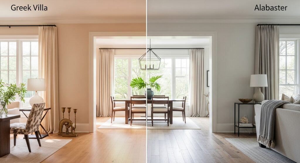
Picking the right paint can feel like a total nightmare. You want that perfect, warm white that makes your home look like a million bucks. Sherwin-Williams Greek Villa and Alabaster are the heavy hitters in the paint world. People love them because they bring life to a room without making it look like a hospital. This guide breaks down the Greek villa vs alabaster showdown so you can pick a winner for your space.
Introduction to Sherwin-Williams’ Top Off-Whites
Greek Villa (SW 7551) and Alabaster (SW 7008) are basically the kings of off-white paint. They show up in almost every home renovation show and designer portfolio. These shades are popular because they strike a perfect balance of warmth and brightness. You get a clean look that still feels super cozy and inviting.
Choosing the perfect white is often the most difficult design decision you will ever make. If you pick a white that is too cool, your room feels cold and uninviting. If you go too warm, your walls might end up looking accidentally yellow. Greek Villa and Alabaster stay right in that sweet spot where most people feel comfortable.
The “Warm White” category is all about adding a tiny bit of pigment to a white base. This extra color prevents the paint from reflecting harsh blue or gray light. Instead, these colors bounce back a soft glow that feels natural and earthy. They are the go-to choice for creating a home that feels lived-in but still very fresh.
The History and Popularity of the Colors
The Rise of Alabaster: 2016 Color of the Year
Alabaster exploded in popularity when it was named the 2016 Color of the Year. It became the backbone of the “Modern Farmhouse” movement made famous by TV designers. Everyone wanted that crisp, clean look that paired perfectly with black hardware and wood beams. It was the ultimate safe choice for anyone scared of bright white.
Since then, it has transitioned from a hot trend to a total timeless neutral. It is no longer just for farmhouses; you see it in high-end modern condos and traditional suburban homes alike. It has proven that it can handle different styles without losing its charm. It remains one of the top-selling paints because it is so incredibly reliable.
The Emergence of the Greek Villa as a Designer Favorite
Greek Villa has been gaining ground as the world moves toward more “organic” modernism. Designers are looking for colors that feel a bit more creamy and rich than standard whites. Greek Villa is often called the “hidden gem” of the Sherwin-Williams Emerald collection. It offers a slightly different vibe that feels very high-end and custom.
It is the perfect choice if you want your home to feel a bit more sun-drenched. While Alabaster is soft, Greek Villa has a certain radiance that is hard to beat. It feels intentional and sophisticated, like a color you would find in a luxury villa in Europe. It is quickly becoming the new favorite for those who find Alabaster just a bit too safe.
Understanding the Technical Profiles
Light Reflectance Value (LRV) Comparison

LRV stands for Light Reflectance Value, and it is a scale from 0 to 100. A value of 0 is absolute black, while 100 is the purest white possible. This number tells you how much light the paint will reflect back into the room. It is a huge factor in how bright or dark your space will feel.
- Greek Villa’s LRV of 84: This number means it is quite bright and reflects a lot of light. It is a great tool for making small, dark spaces feel much larger than they are.
- Alabaster’s LRV of 82: This color is just a tiny bit darker and denser than Greek Villa. It still feels very white, but it has a bit more “body” to it when painted on a wall.
- Visual Difference: In a room with tons of windows, you might not notice the 2-point difference at all. However, in a hallway with no windows, Greek Villa will definitely feel a bit more energetic.
Undertone Analysis
Undertones are the secret colors hiding inside your paint. They are the reason a white paint can suddenly look blue, green, or pink once it is on the wall. Understanding these is the key to winning the Greek villa vs alabaster debate.
- Greek Villa: This shade has a distinct “orange-beige” DNA. This makes it feel very warm and sunny without looking like a lemon.
- Alabaster: This color is often called a “chameleon” because it has a “gray-yellow” nature. The gray helps tone down the yellow, making it look more like a soft off-white.
- Shifting Tones: These colors look different on a large wall than on a tiny swatch. On a big surface, the undertones become much more obvious as the light hits them.
Comparing the Color Temperature and Mood
The Warmth of a Greek Villa
Greek Villa is all about creating an inviting and radiant atmosphere. It has a glow that makes a room feel like it is constantly bathed in sunlight. It is the opposite of a sterile, clinical white that makes you feel like you are in a lab. It feels very natural and welcoming for guests.
It avoids looking stark because of its rich, creamy base. This makes it lean into a cozy, traditional feel that works great with soft fabrics. If you want your home to feel like a warm hug, Greek Villa is a strong contender. It is the kind of color that makes you want to curl up with a book.
The Softness of Alabaster
Alabaster is famous for its tranquil and serene aesthetic. It does not demand attention; it just sits quietly in the background. It has a very stable quality, meaning it does not shift wildly as the day goes on. This makes it a great choice for people who want a consistent look.
It is widely considered the “Goldilocks” of whites. It is not too warm, yet it is definitely not too cool either. This balance makes it incredibly versatile for almost any room in your house. It provides a soft backdrop that lets your furniture and decor take center stage.
Lighting Impact: How the Environment Changes the Color
North-Facing Rooms (Cool, Bluish Light)

North-facing rooms are notorious for having flat, cool, and bluish light. This kind of light can make many white paints look gray and depressing. Greek Villa is a total “problem solver” here because its beige tones cancel out the blue. It adds the warmth that the sun is not providing.
Alabaster also holds up well in these conditions, though it can look a bit more muted. Because it has that hint of gray, it maintains its neutrality instead of turning “cold”. However, if your North-facing room is very dark, Alabaster might feel a bit heavy. Greek Villa usually wins in these specific lighting situations.
South-Facing and West-Facing Rooms (Warm, Golden Light)
South-facing rooms get blasted with warm, golden light all day long. This light intensifies the warmth already present in the paint. There is a risk that Greek Villa might look a bit “too yellow” in this intense sun. You have to be okay with a very creamy, buttery look.
Alabaster handles this intense natural brightness like a pro. The gray in its undertone helps keep the yellow in check. It looks like a perfect, clean white even when the sun is at its strongest. For West-facing rooms, Alabaster is often the safer bet to avoid a “scorched” look in the evening.
Artificial Lighting and Evening Effects
The light bulbs you use will totally change how these paints look. 3000K bulbs are warm and will make both colors look much more yellow. 4000K bulbs are cooler and will make them look closer to a true white. You should always check your paint samples under the lights you actually use.
In the evening, Greek Villa takes on a beautiful “incandescent glow” that feels very high-end. Alabaster tends to stay a bit more grounded and soft as the sun goes down. The Color Rendering Index (CRI) of your bulbs also matters. High CRI bulbs will show the true beauty of these off-whites much better than cheap ones.
Interior Application Guide
Kitchen Cabinets and Islands

Alabaster is a massive designer favorite for kitchen cabinetry. It is bright enough to look clean but soft enough to hide minor daily wear and tear. It looks amazing with black hardware for a high-contrast, modern look. It is a “fail-proof” choice for a kitchen remodel.
Greek Villa is a killer choice if you are using brass, gold, or bronze hardware. The warm tones in the paint and the metal play off each other beautifully. It is also great for kitchens with lots of warm wood accents or butcher block. It makes the whole space feel sun-drenched and happy.
Living Rooms and Open Floor Plans
In large living rooms, Greek Villa can bridge the gap between your walls and ceiling. If you use it on both, the room feels unified and expansive. It creates a bright, airy feeling that is perfect for hosting friends and family. It makes a big room feel less empty and more intentional.
Alabaster is the king of creating flow in open-concept homes. Because it is so stable, you can use it in the kitchen, dining, and living areas. It ties everything together without making any one area feel out of place. It acts as a cohesive thread that runs through your entire main floor.
Bedrooms and Bathrooms
For bedrooms, Alabaster is a top-tier choice for promoting rest. Its muted tones create a headspace that feels uncluttered and peaceful. It works well with soft linens, plush rugs, and neutral bedding. It is the ultimate “zen” color for your private sanctuary.
Greek Villa is a secret weapon for windowless or tiny bathrooms. Since it reflects so much light, it can make a cramped powder room feel much bigger. It pairs beautifully with marble or light-colored tile. It gives the bathroom a “spa-like” radiance that feels very refreshing.
Architectural Styles: Which White Fits Your Home?
Modern Farmhouse and Industrial
Alabaster is basically the official color of the Modern Farmhouse style. It is the quintessential choice for shiplap walls and big, open spaces. It pairs perfectly with matte black accents and reclaimed wood beams. If you want that “Fixer Upper” vibe, this is your paint.
Mediterranean and Coastal Interiors
Greek Villa has a natural synergy with Mediterranean and Coastal designs. It looks incredible against white-washed wood, terracotta tiles, and light linens. It mimics the look of sun-bleached walls found in seaside villas. It feels breezy, light, and very relaxed.
Traditional and Colonial Homes
In traditional homes, you often want a color with a bit more “weight” to it. Greek Villa maintains historical integrity because it feels more like a classic cream. It looks great with ornate trim, antique furniture, and heavy drapes. It keeps the home feeling warm and established.
Minimalist and Scandi-Chic
Alabaster is a key player in achieving the cozy “Hygge” look of Scandi design. Its balanced softness fits the minimalist lifestyle perfectly. It creates a clean canvas that doesn’t feel cold or empty. It is the perfect backdrop for simple, functional furniture.
Exterior Applications and Curb Appeal

Facing the Sun: How Brightness Washes Out Color
When you put paint outside, the sun is incredibly powerful. It can “wash out” a color, making it look much brighter than it did inside. This means undertones usually become way less noticeable outdoors. Both of these colors will look like a very clean, bright white on your siding.
Greek Villa is a fantastic choice for shaded porches or North-facing exteriors. It keeps its warmth even when the sun isn’t hitting it directly. It ensures your home doesn’t look “cold” from the street. It provides a welcoming look even on cloudy days.
Trim and Shutter Pairings
- Dark Accents: Both colors look amazing with high-contrast trims like Sherwin-Williams Iron Ore or Black Magic. This creates a sharp, modern look that pops.
- Tone-on-Tone: Using these colors as the primary siding and trim can look very elegant. It creates a seamless, monochromatic look that is very popular right now.
- Soft Contrasts: If you want something less harsh, try pairing them with soft grays or sage greens. This gives the home a more cottage-like, approachable feel.
Stone and Brick Coordination
Greek Villa is a match made in heaven for limestone and warm-toned masonry. It picks up the beige tones in the stone and creates a unified look. It makes the stone look like an intentional part of the design.
Alabaster is a great tool for modernizing old red brick exteriors. If you are painting your brick, Alabaster provides a soft, clean finish. It doesn’t look too “stark” against the natural textures of the home. It is a very safe way to give an old house a fresh start.
The Best Trim and Ceiling Coordinates

Creating Contrast with White Trim
Pairing your off-white walls with a crisp trim like SW Extra White (SW 7006) is a classic move. This creates a visible border that makes the wall color “pop”. It helps the eye distinguish where the wall ends and the ceiling begins.
You can also try a “Tone-on-Tone” approach for a very high-end look. This means using the same color on the walls and the trim. You just use a different finish, like flat for walls and semi-gloss for trim. This makes the room feel much taller and more modern.
Coordinating with High Reflective White
High Reflective White is the purest white Sherwin-Williams offers. Using it for trim will make the Greek Villa look much more “beige” by comparison. It highlights the warmth in the paint very clearly. This is a great choice if you really want to lean into that creamy look.
With Alabaster, the contrast with High Reflective White is a bit more subtle. It creates a very soft, layered look that feels very sophisticated. It is perfect for a clean, minimalist aesthetic where you don’t want harsh lines. It is all about those tiny, refined details.
Compatibility with Other Colors and Textures
Pairing with Wood Tones
Greek Villa works wonders with warm oaks, walnuts, and honey-toned woods. The beige undertones in the paint pull out the richness of the wood grain. It makes the wood feel like a core part of the room’s warmth.
Alabaster is a bit more flexible with different wood types. It looks great with reclaimed wood or even cooler-toned gray flooring. It doesn’t fight with the wood; it just lets it exist. It is a very forgiving color for houses with multiple wood finishes.
Coordinating Paint Palettes
- Neutral Companions: Both colors love greige, taupe, and sandy tones. These create a layered, neutral palette that is very soothing.
- Bold Accents: Don’t be afraid to go dark with your accents. Navy blues, forest greens, and deep charcoals look incredible against these whites.
- Earth Tones: Terracotta, mustard yellow, and olive green are perfect for a Greek Villa. They lean into its warm, organic nature perfectly.
The Psychology of Off-Whites
The colors we choose for our walls have a huge impact on our mood. Warm whites like Greek Villa can actually make a room feel physically warmer to the occupants. This “glow” can help boost your mood on a cold, dreary day. It makes a space feel high-energy and positive.
Alabaster plays a different role in creating a “mindful” headspace. Because it is so soft and stable, it helps reduce visual clutter. It is a great choice for high-stress areas like home offices or bedrooms. It encourages you to slow down and breathe.
Troubleshooting Common Problems

Avoiding the “Yellow” Trap
One of the biggest fears with warm whites is that they will look yellow. If the Greek Villa looks too buttery in your space, check your light bulbs first. Swapping warm bulbs for cooler ones can fix the problem instantly. Also, look at your flooring.
Sometimes, warm wood or orange-toned rugs “bounce” their color onto the walls. This makes the paint look much warmer than it actually is. If this is happening, you might need a more neutral white like Alabaster. Always test a large sample near your floor to see the interaction.
The “Dingy” Dilemma
Alabaster can sometimes look a bit gray or “muddy” in very dark rooms. This happens because it lacks the high reflectance of the Greek Villa. If your room feels “dingy,” try increasing the sheen of the paint. A Satin finish reflects more light than a Matte finish.
If Alabaster still feels too dark, you might need to jump up to the Greek Villa. That extra 2 points of LRV can make a world of difference in a gloomy space. Don’t be afraid to change colors if the first one doesn’t feel right. It is much cheaper to change a sample than a whole room.
Side-by-Side Comparison Summary
Key Similarities
- Product Lines: Both are available in Sherwin-Williams’ top-tier Emerald and Duration lines. This means you get great coverage and durability.
- Off-White Category: Neither is a “True White”. They both have added pigment to create a softer, more livable look.
- Resale Value: Both are absolute winners for residential resale value. Buyers love these colors because they look clean and move-in ready.
Distinct Differences
- Brightness: Greek Villa is slightly brighter with an LRV of 84 vs Alabaster’s 82.
- Undertones: Greek Villa leans toward beige, while Alabaster leans toward gray-yellow.
- Predictability: Alabaster is generally more consistent across different lighting conditions. The Greek Villa is more dynamic and shifts more with the sun.
Which Color Should You Choose?
Choose Greek Villa If:
- You want a “glowy” interior: You love that sun-drenched, radiant feeling.
- You have cool, natural light: Your North-facing room needs a boost of warmth.
- You prefer a traditional look: You want something that feels classic and established.
Choose Alabaster If:
- You want a safe, “fail-proof” white: You aren’t sure what to pick and want something that always works.
- You prefer a modern aesthetic: You love the clean lines of Modern Farmhouse or Scandi-chic.
- You want total consistency: You want the color to look mostly the same in every room.
Final Tips for Testing
Never, ever pick a paint color just from a tiny paper swatch. You need to see it on a large scale in your actual home. Using peel-and-stick samples like Samplize is the easiest way to do this. You can move them around the room and see how they look in different corners.
Test the samples against your existing flooring and countertops. These are the biggest “fixed” elements in your home and won’t change. Observe the color for at least 24 hours. See how it looks in the morning, the afternoon, and at night under your lamps. This is the only way to be 100% sure before you commit to the Greek villa vs alabaster decision.
Frequently Asked Questions
Is Greek Villa more yellow than Alabaster?
Greek Villa has a beige undertone that can appear creamier or more “buttery” in certain lights. Alabaster has a hint of gray that helps neutralize the yellow, making it look a bit more like a soft, true white.
Does Alabaster look gray?
In very low light or rooms with North-facing windows, Alabaster can take on a slightly grayish or “muddy” cast. This is due to its lower LRV and the gray present in its undertone.
Can I use Greek Villa on the ceiling?
Yes, Greek Villa is a popular choice for ceilings, especially if the walls are the same color. It creates a seamless, airy look that can make a room feel taller.
Which white is better for dark hallways?
Greek Villa is generally better for dark hallways because it has a higher LRV of 84. It reflects more of the limited light available, helping the space feel brighter and less cramped.
Does Greek Villa go with gray floors?
While the Greek Villa is very warm, it can work with warm-toned grays. However, Alabaster is usually a safer bet for gray flooring because its own gray undertone provides a natural connection.
What is the difference between Greek Villa and Alabaster in terms of saturation?
Greek Villa has slightly more color saturation due to its beige-orange base. Alabaster is more desaturated and gray, which makes it look “whiter” in bright light.
Can I use Greek Villa and Alabaster together in the same house?
You can use them in different rooms if you want slight mood shifts. Using them in the same room is not recommended as they are too similar and will look like a mistake.
Which color is better for a nursery or a child’s room?
Alabaster is often preferred for nurseries because it creates a calming, neutral backdrop. Greek Villa works well if you want a sunny, high-energy playroom vibe.
Does Alabaster look green in certain lighting?
Alabaster rarely looks green, but it can pick up a greenish tint if you have heavy foliage or trees right outside the window. This is due to the light bouncing off the leaves.
Is Greek Villa a good choice for a ceiling color?
Yes, Greek Villa is an excellent ceiling choice for rooms with warm-toned walls. It feels less stark than a standard ceiling white and adds a luxurious touch.
Which color pairs better with Carrara marble?
Alabaster typically pairs better with Carrara marble because the marble has cool gray veins. Greek Villa can sometimes look too yellow against the crispness of the marble.
How do these colors look with black window frames?
Alabaster is the classic choice for black window frames in modern farmhouse designs. Greek Villa creates a softer, less aggressive contrast that suits Mediterranean styles.
Which color should I use for a dark basement?
Greek Villa is the winner for basements because of its higher light reflectance value. It works harder to bounce the little light available and keeps the space from feeling cold.
Are these colors available in different paint brands?
Sherwin-Williams owns these specific formulas. While other brands can try to color-match, the result is often slightly off because the base chemicals differ.
Does the Greek Villa look good on a fireplace?
Greek Villa looks stunning on brick or stone fireplaces. It gives the masonry a clean, updated look while maintaining the natural warmth of a hearth.
Which color is better for selling a home?
Alabaster is widely considered the safest paint color for resale. It is neutral enough to appeal to almost every buyer while still feeling high-end and fresh.
How does Greek Villa handle artificial yellow light?
Greek Villa will look very yellow or creamy under warm 2700K light bulbs. It is best to use 3000K or 3500K bulbs to maintain its true off-white character.
Is Alabaster too bright for a south-facing exterior?
In direct southern sun, Alabaster can look very bright, almost like a true white. It stays soft enough that it rarely causes a blinding glare for neighbors.
What is the best finish for Greek Villa on walls?
A flat or eggshell finish is best for the Greek Villa to show off its creamy texture. Higher sheens can make the beige undertones look a bit more reflective and shiny.
Does Alabaster work with cool gray furniture?
Alabaster can work with cool grays because of its own gray undertone. However, the contrast might make Alabaster look warmer than it does in a vacuum.
Which color is better for a kitchen with dark granite countertops?
Alabaster provides a nice bridge between dark granite and bright cabinets. Its gray-yellow base coordinates well with the flecks of color often found in granite.
Can I use Greek Villa as an accent wall?
Neither color is strong enough to be a traditional accent wall. They are meant to be foundational colors that cover an entire room or floor.
Does Greek Villa look like Swiss Coffee?
Greek Villa is quite similar to Benjamin Moore’s Swiss Coffee, though Swiss Coffee is generally a bit creamier and has a slightly different undertone.
How do these colors react to red or brown flooring?
Red and brown floors will emphasize the warmth in both colors. Greek Villa will lean more into its orange-beige side, while Alabaster will look more yellow.
Which white is better for a hallway with no windows?
Greek Villa is better because it is more reflective. It helps prevent the “tunnel” feeling that can happen in dark, windowless hallways.