Finding the ideal art size above the king bed is a game changer for your room. It turns a boring wall into a masterpiece. Your bed is the biggest thing in your room. It is the main focal point that draws every eye. If the art is too small, it looks like a tiny island lost at sea. If it is too big, it can feel like it is crushing the bed. You want that perfect sweet spot for a cozy vibe. This guide helps you nail the scale and style every single time.
Introduction to Bedroom Art Selection
Getting your bedroom decor right is all about visual harmony. You want a space that feels calm and put together. The bed is the star of the show in any master bedroom. Everything else should support that star. Art acts as the crown for your headboard. It completes the look and adds a touch of your own soul.
Psychology plays a big part in how we sleep. A messy or poorly scaled room can cause visual tension. When art is sized right, the room feels stable and safe. This balance helps your brain relax for a better night of rest. You are not just decorating a wall. You are creating a sanctuary for your mind.
Assessing Your Space and Existing Decor
Before you grab a hammer, look at your whole room. You need to see how much wall space you actually have. Sometimes we buy art first because we love it. Other times, we finish the room and then look for art. Both ways work if you plan ahead. Most folks pick art last to match their pillows and rugs.
Visual balance is the goal for every interior designer. You want to fill the void without making it feel cluttered. Think about the other furniture in the room. Your nightstands and lamps also take up visual weight. The art should fit within these elements comfortably. It should feel like it belongs there naturally.
The Order of Decoration
Deciding when to buy art is a personal choice. Some people find an original painting and build the room around it. This lets the art dictate the color palette. However, choosing art last is often easier for most home decorators.
- Art First: This lets the painting be the true inspiration for everything.
- Art Last: This ensures the piece complements your existing contemporary furniture.
- Flexibility: Don’t be afraid to swap things out as your style changes.
Creating Visual Balance
Balance is about how heavy things look to your eyes. A king bed has a lot of visual weight because it is wide. Your art needs enough size to hold its own against that weight. If the art is thin or tiny, the bed will look way too big.
- Proportions: Ensure the art doesn’t look like a solitary floating island.
- Harmony: Match the mood of the art to the vibe of your room.
- Symmetry: Use shapes that mimic the lines of your furniture.
The Concept of Symmetry
Symmetry makes a room feel formal and very organized. Since a king bed is a big horizontal shape, your art should follow suit. You can use one long canvas or a set of matching prints. This creates a mirrored effect that is very pleasing to look at.
Defining Your Style
Your style is shown through textures and colors. A minimalist room might need one simple abstract piece. A maximalist room might love a huge gallery wall. Look at your headboard material. A wooden headboard looks great with landscapes. A velvet headboard might need something modern and sleek.
The Golden Rules of Art Scaling and Proportions
There are a few “math” rules that make decorating easier. You don’t need to be an expert to use them. These rules keep the art from looking awkward. They ensure the ideal art size above king bed is achieved every time.
The Goldilocks Rule
This rule is all about finding the size that is just right. Most people pick art that is way too small. Small art makes a big wall look empty and unfinished. It loses its power as a conversation starter. You want the art to feel significant.
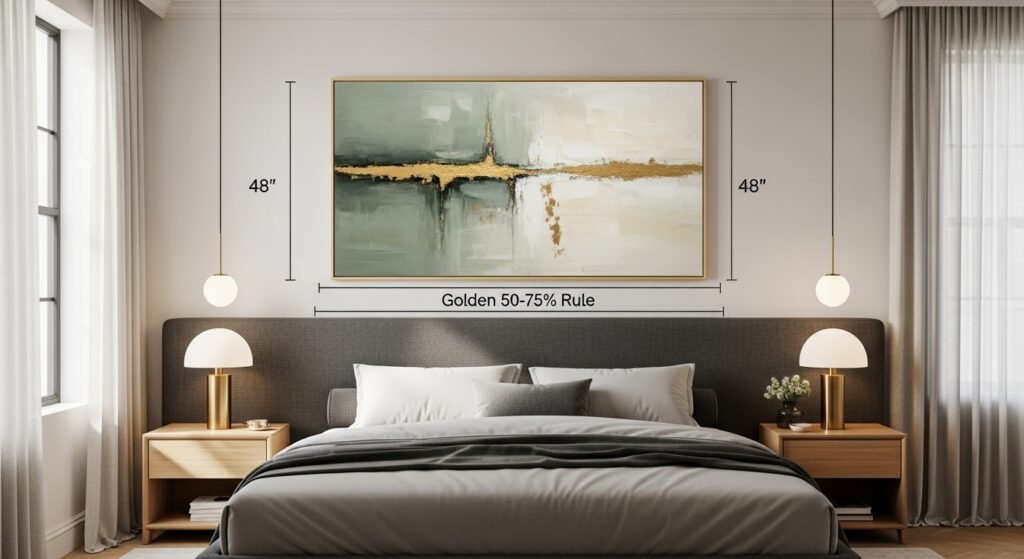
The 50-75% Rule
This is the most important rule for width. Your art should take up 50% to 75% of the bed’s width. For a king bed, this means a total width of about 40 to 60 inches. This range ensures the art is wide enough to look intentional. It creates a cohesive look that connects the art to the bed.
The Headboard as the Anchor
Always measure your headboard width first. The headboard is the actual visual anchor for the wall. Some headboards are wider than the mattress itself. Use the widest part of the headboard to calculate your art size. This keeps the vertical interest aligned with the furniture.
Weight and Mass
Visual weight isn’t about how much the frame weighs. It is about how much space it seems to fill. Dark colors and heavy frames feel heavier. Light colors and thin frames feel lighter. Balance a heavy headboard with art that has a strong presence.
Height and Vertical Placement Guidelines
Where you hang the art is just as vital as the size. Hanging it too high is a common mistake. You want the art to feel like it is part of the bed’s “story”. It should not look like it is trying to escape toward the ceiling.
Spacing Above the Headboard
The sweet spot for height is 6 to 8 inches above the headboard. This gap is small enough to keep the art connected to the furniture. If you go higher than 12 inches, the art starts to look disconnected. It begins to float away and loses its impact.
Ceiling Clearance and Tension
You also need to watch the space near the ceiling. Leave at least 6 to 18 inches of room below the ceiling. If the art gets too close to the top, it creates visual tension. It makes the room feel “top-heavy” and cramped. You want some breathing room at the top.
Using Window and Curtain Lines
Look at your windows for clues. The top of your art should usually stay below the curtain rod line. Using the horizon line of your windows helps the room feel level. It creates a smooth flow across the walls.
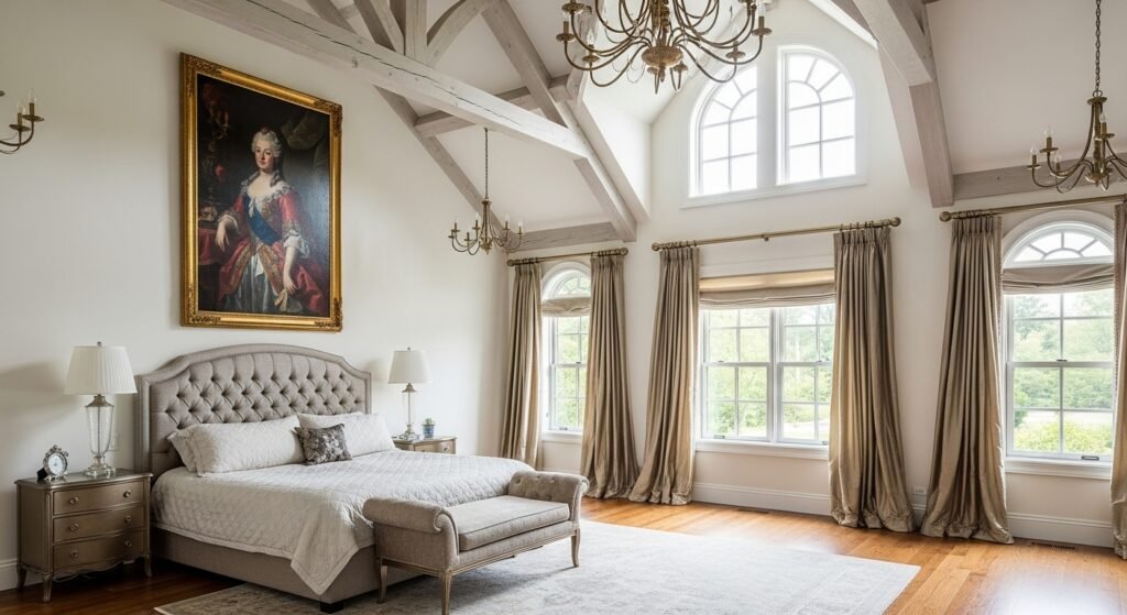
Addressing High Ceilings
If you have very high ceilings, don’t panic. You might be tempted to hang art at eye level. In a bedroom, the bed is more important than eye level. Keep the art anchored to the bed. You can use taller art to fill the vertical space, but keep the bottom close to the headboard.
Perfect Art Dimensions for a King-Size Bed (76″–80″ Width)
A standard king bed is about 76 inches wide. Some headboards can reach 80 inches. This is a massive amount of space to fill. You need big pieces or smart groupings to make it work.
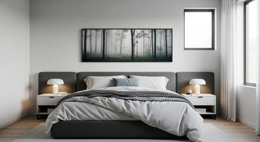
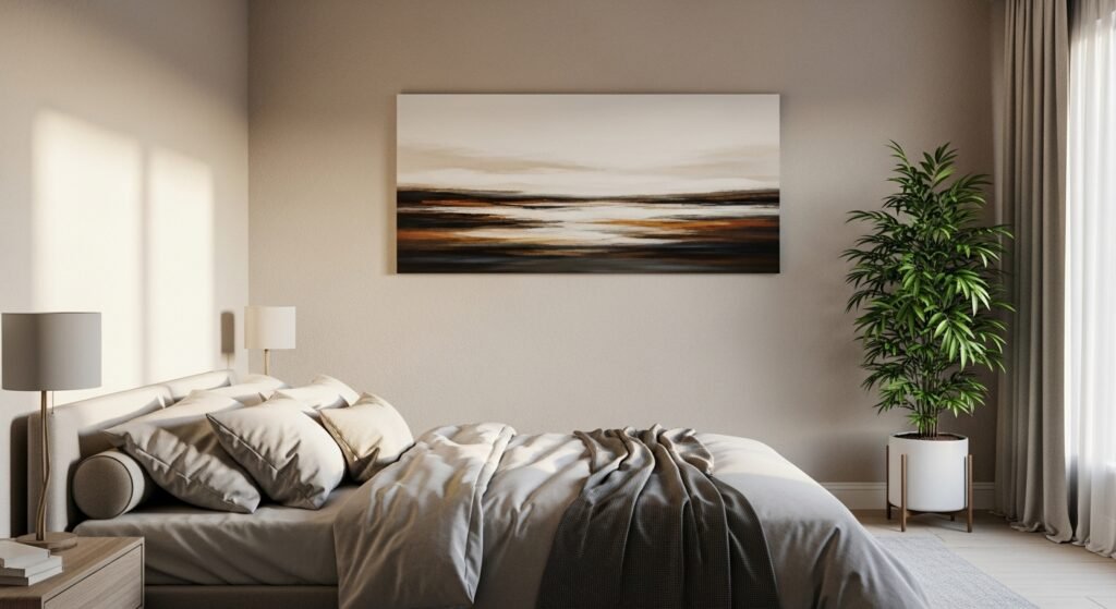
Single Large-Scale Canvas Options
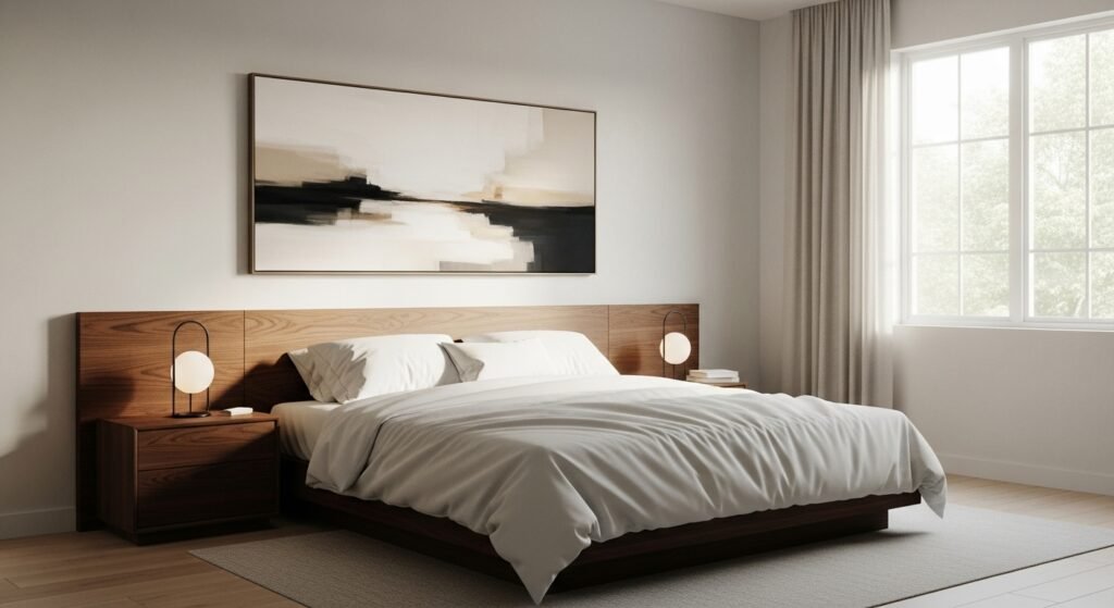
A single canvas is a clean and modern choice. It acts as a bold centerpiece for the master bedroom.
- 48” x 36”: This is often considered the max size for a single piece. It covers enough width to look great without crowding your curtains.
- 48” x 30” and 48” x 24”: These sizes offer a landscape orientation. They feel very elongated and sleek. They are great for an accent piece that doesn’t dominate the whole wall.
- 40” x 30”: This is the minimum size for a single painting on a king bed. Anything smaller will look lost.
- 36” x 36”: A square artwork is a fun alternative. It leaves more bare walls on the sides, which can act as a natural frame.
Multiple Artwork Arrangements for King Beds
Using more than one piece can be very stylish. It breaks up the space and adds more visual interest.
- Set of Two (24” x 30”): These provide a balanced and symmetrical look. When placed side by side, they fill the width perfectly.
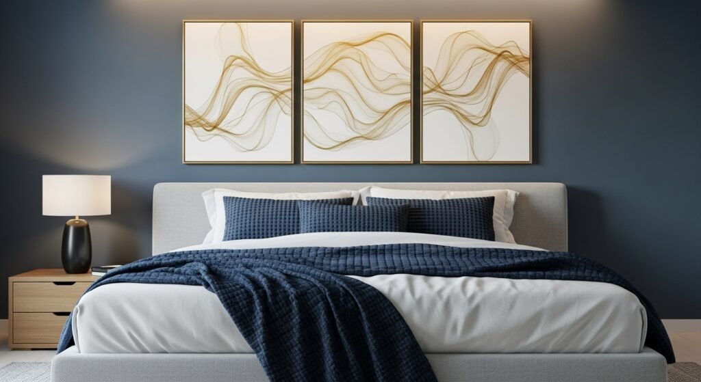
- Set of Three (16” x 20”): This creates a panoramic effect. It draws the eye across the entire width of the bed.
Art Sizing for Queen, Full, and Twin Beds
Not everyone has a king bed, but the rules stay similar. You just scale the numbers down to fit the furniture.
Queen Size Bed (60”–64” Width)
A queen bed is very common in guest rooms and smaller master bedrooms.
- Ideal Width: You want art that is 30 to 48 inches wide.
- Single Canvas: A 36” x 24” or 40” x 30” piece works wonders.
- Sets: Try two 18” x 24” prints for a clean look.
Full Size Bed (54”–58” Width)
Full beds are great for teens or smaller apartments.
- Ideal Width: Look for 27 to 43 inches of total width.
- Single Canvas: A 30” x 24” piece is a solid choice.
- Sets: Use two 14” x 18” prints to maintain the scale.
Twin Size Bed (38”–42” Width)
Twin beds are usually for kids’ rooms or very tight spaces.
- Ideal Width: Keep the art between 20 and 31 inches wide.
- Single Canvas: A 24” x 18” print is plenty of size.
- Sets: Two 11” x 14” prints look very cute and proportional.
Multi-Piece Arrangements and Gallery Walls
Gallery walls are a great way to show off your personality. They allow you to mix and match different styles. However, they require more planning to avoid a cluttered look.
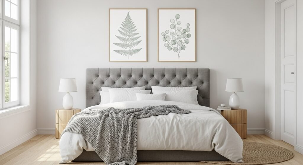
The Art of the Pair
Hanging two pieces is a classic move. It feels very calm and organized.
- Spacing: Leave about 5 inches of space between the two frames.
- Consistency: Use the same frame style for both to keep it cohesive.
- Balance: Ensure they are level with each other to avoid visual tension.
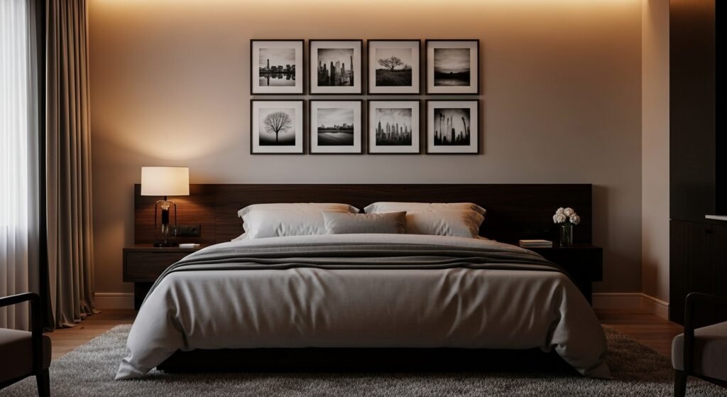
The Grid System (Set of Four)
A grid of four pieces creates a very strong visual anchor. You can use four 16” x 20” prints in a square or a row. A horizontal row usually feels less crowded than a tall grid.
The Gallery Wall Approach
For a large wall, you can go even bigger. Six 11” x 14” prints can fill the space above a king bed beautifully. This creates a mini gallery wall that is very engaging.
Consistent Spacing
Spacing is the secret to a professional-looking wall. If the frames are too far apart, they look like separate islands. If they are too close, they look messy. Aim for 2 to 5 inches of space between every frame. This makes the whole group read as one single unit of art.
Maintaining a Restful Atmosphere
In a bedroom, you want to avoid chaos. Stick to a clean grid or a single row. This keeps the vibe restful and helps you unwind. Avoid “busy” layouts that feel too energetic for a sleeping area.
Overcoming Common Design Challenges
Sometimes your room doesn’t follow the “standard” rules. You have to adapt your strategy to fit your unique home.
Decorating without a Headboard
If you don’t have a headboard, the art has to do more work. It acts as a “faux” headboard to define where the bed is. Hang the art slightly lower than usual to ground the bed. This creates a visual boundary that the room needs.
Low Ceilings vs. Vaulted Ceilings
Ceiling height changes how art feels. In a room with low ceilings, use landscape orientation to keep things from feeling cramped. In a room with vaulted ceilings, you can use taller pieces to draw the eye up. Just remember to keep the art anchored to the bed first.
Dealing with Off-Center Beds
If your bed isn’t centered on the wall, don’t center the art on the wall. Always center the art over the bed. This keeps the bed and art as one cohesive group. You can use a nightstand or a tall plant on the other side of the wall to balance the extra space.
Impact of Bold Colors vs. Neutrals
Colors change our perception of size. A very bold, bright painting will feel larger than a soft neutral one of the same size. If you pick a loud piece, you might want to go slightly smaller. If you pick a soft landscape, you can go bigger without it feeling overwhelming.
Choosing the Perfect Art Style and Color Palette for Your Bedroom
Selecting the right style and colors is the final step in creating your personal sanctuary. While the size creates balance, the style and palette create the mood. Here is how to choose a look that reflects your personality while keeping the room restful.
Neutral and Earthy Palettes for Relaxation
If your goal is to create a peaceful retreat, look for art that uses soft, muted tones. Colors like sage green, sandy beige, warm taupe, and slate blue are naturally calming. These shades mimic the outdoors and help lower your heart rate before sleep.
- Best Styles: Impressionist landscapes, watercolor abstracts, or botanical sketches.
- Why it Works: These colors don’t demand your attention; they provide a gentle backdrop for rest.
Bold and Vibrant Styles for Energy
Some people prefer a bedroom that feels inspiring and full of life. If you have neutral bedding, a bold piece of art can serve as the primary source of color in the room. Look for deep emeralds, rich navy, or even warm terracotta tones.
- Best Styles: Modern geometric abstracts, pop art, or high-contrast photography.
- Why it Works: It adds a “designer” feel to the room and makes the space feel more curated and energetic.
Monochromatic Black and White Photography
For a timeless and sophisticated look, black and white photography is a classic choice. It removes the distraction of color and focuses on texture, light, and shape. This style works exceptionally well with almost any existing bedroom color scheme.
- Best Styles: Architectural photography, close-up nature shots, or vintage film stills.
- Why it Works: It adds a touch of “cool” and elegance without clashing with your pillows or rugs.
Textured and Minimalist Art
Texture is a huge trend in bedroom decor. Art that features heavy brushstrokes, layered plaster, or woven fabric adds a 3D element to the wall. Minimalist line art is another popular choice that provides a clean, airy feeling.
- Best Styles: Plaster canvas art, minimalist line drawings, or textile wall hangings.
- Why it Works: It focuses on the “feeling” of the space rather than a specific image, making the room feel more like a luxury spa.
Matching Art to Your Bedding and Furniture
To make the room feel professional, pull one or two colors from your favorite duvet cover or throw pillows and look for those colors in the art. You don’t want a perfect match, but a “color echo” makes the design feel intentional.
- Warm Tones: Match gold frames with warm wood furniture or brass lamps.
- Cool Tones: Match silver or black frames with grey bedding or white furniture.
- Consistency: Try to keep the frames within the same color family as your nightstands for a seamless look.
Summary and Final Checklist for Bedroom Art
Finding the ideal art size above the king bed is a journey of balance. Use these dimensions as your guide for a perfect master bedroom.
| Bed Type | Headboard Width | Ideal Art Width (50-75%) | Recommended Layouts |
| King | 76″ – 80″ | 40″ – 60″ | 48×36 single, two 24×30, or gallery wall |
| Queen | 60″ – 64″ | 30″ – 48″ | 36×24 single or two 18×24 prints |
| Full | 54″ – 58″ | 27″ – 43″ | 30×24 single or two 14×18 prints |
| Twin | 38″ – 42″ | 20″ – 31″ | 24×18 single or two 11×14 prints |
Measure Twice: Always double-check your headboard and wall dimensions.- Use Mock-ups: Use painter’s tape or paper templates to “see” the size on the wall before buying.
- Safety First: Use proper hardware to ensure the art stays secure above your head.
- Personal Connection: Choose art that makes you happy every time you wake up.
Following these steps will make your bedroom look like it was styled by a pro. You will have a space that is balanced, beautiful, and ready for relaxation.
Frequently Asked Questions
What is the best type of frame for artwork above a king bed?
The best frame depends on your headboard material. If you have a wooden headboard, try a metal or painted frame to create contrast. For upholstered headboards, a natural wood frame adds warmth and texture. Slim frames look modern and sleek, while chunky frames add traditional weight and importance to the piece.
Should art above the bed match the nightstand lamps?
It does not need to match perfectly, but it should coordinate in style. If your lamps are tall and thin, choose art that is wider to balance the vertical lines. If your lamps have colorful bases, consider picking up one of those colors in the artwork to create a cohesive color story across the entire wall.
Is it safe to hang heavy glass-framed art above a headboard?
Safety is the top priority when hanging anything over a sleeping area. Avoid heavy glass if possible; choose acrylic or plexiglass which is lighter and won’t shatter. Always use heavy-duty wall anchors or screw directly into wall studs rather than relying on simple nails or adhesive strips.
How do I handle a wall with a window off to one side?
Balance the window by treating the art and the bed as one unit. Center the art over the bed regardless of where the window is. You can then use a floor plant or a floor lamp on the opposite side of the window to create a sense of equilibrium on the wall.
Can I use a rug as wall art above my king bed?
Textiles like rugs or tapestries are excellent for bedrooms because they absorb sound and add softness. Follow the same width rules as framed art, ensuring the textile covers about 50% to 75% of the headboard width. Use a decorative rod to hang it so it looks intentional and straight.
Does the art have to be a rectangle or square?
Round or oval art pieces are great for breaking up the many straight lines found in a bedroom. A large circular mirror or a round weaving can soften the look of a rectangular headboard. When using round art, center it and ensure its widest point is at least half the width of the bed.
How do I choose art for a bedroom with very bold wallpaper?
If your wallpaper has a busy pattern, choose artwork with a large “white space” or a simple, clean subject. A wide white mat around a simple sketch can help the art stand out against the pattern. Avoid art that is as busy as the wallpaper, or they will compete for attention.
Can I lean art on the headboard instead of hanging it?
Leaning art is popular in “lived-in” or boho styles, but it requires a headboard with a flat top ledge. Ensure the piece is secured with museum putty at the bottom so it doesn’t slide. This works best with smaller pieces layered in front of each other rather than one giant canvas.
Should I use a landscape or portrait orientation for a king bed?
Landscape orientation is generally better because it mimics the wide shape of the king bed. However, if you have very high ceilings, a tall portrait-oriented piece can help fill the vertical void. If using portrait orientation, consider a set of two to ensure you still cover enough width.
What is the best way to light the art above my bed?
Sconce lights mounted on either side of the art create a high-end hotel look. Alternatively, you can use a “picture light” that attaches to the top of the frame. Ensure the light is soft and warm; harsh white light can make the bedroom feel clinical instead of cozy.
How do I decorate above a bed that is tucked into a corner?
In a corner layout, the wall space is often uneven. Focus your art on the main wall behind the headboard and keep it centered over the bed. Avoid putting art on the side wall directly next to the bed, as it can make the corner feel claustrophobic and “closed in.”
Can I hang a shelf above the bed instead of art?
A “picture ledge” is a great alternative that allows you to swap art out easily. Ensure the shelf is mounted very securely and isn’t so deep that you might hit your head when sitting up. Fill the shelf with a mix of art sizes to create a layered, casual look.
Should the art be the same color as the bedding?
It doesn’t have to be the exact same shade, but it should be in the same “color family.” If your bedding is cool blues, art with greens or purples will look harmonious. If you want the art to pop, use a complementary color, like an orange-toned sunset painting above navy blue bedding.
Is it okay to hang a mirror instead of art above a king bed?
A mirror is a classic choice that makes a small bedroom feel much larger. However, be mindful of what the mirror reflects. You want it to reflect something beautiful or a window, not a cluttered closet or a television. Ensure it is hung securely due to its weight.
How do I choose art for a guest bedroom?
For guest rooms, keep the subject matter neutral and calming. Landscapes, botanical prints, or abstract shapes are safer than personal family photos. You want the guest to feel like they are in a serene hotel environment where the art is pleasant but not distracting.
Can I hang art if I have a four-poster bed?
Four-poster beds are a challenge because the frame acts as a “border” for the wall. If the bed has a top canopy frame, you may not need art at all. If it is open at the top, hang a single piece of art that is small enough to fit comfortably within the frame of the posts.
What should I do if my headboard is very tall and ornate?
If your headboard is a statement piece with lots of carving or height, keep the art very simple. You might even choose to skip art and let the headboard be the art. If you do add art, go with something light and airy so the wall doesn’t look too busy.
How do I create a gallery wall that doesn’t look messy?
Use matching frames and a consistent color palette for the images. Before hammering, lay the frames out on the floor and take a photo to see how they look together. Keep the gaps between the frames exactly the same to give the gallery a professional, curated feel.
Does the art need to be centered if I have a nightstand on only one side?
Yes, always center the art over the bed. The bed and the art are the primary unit. Use the wall space on the “empty” side for a hanging plant or a tall floor mirror to bring balance back to the overall room layout.
Can I use a series of small photos instead of one big piece?
You can, but you must group them closely together so they act as one large block. If you spread small photos out, they will look like “wall acne.” Frame them all the same way and hang them in a tight grid that covers 50% to 75% of the bed’s width.