 Skip to content
Finding the right paint can feel like a total nightmare. You want a space that feels fresh but not like a cold doctor’s office. That is why warm gray paint colors are the MVP of home design right now. They give you that clean look of gray with a cozy hug of beige. This guide will help you pick the perfect shade without losing your mind. We will look at the top picks and how to use them like a pro.
Understanding the Appeal of Warm Gray Paint
Warm gray paint colors are a total game changer for any room. They are the perfect mix of modern style and homey comfort. People call this “greige” because it sits right between gray and beige. It is the gold standard for design because it works with almost everything you own. You get a neutral backdrop that never feels boring or dated. It is the best way to make your home look expensive on a budget.
The Versatility of Greige
Greige is the secret weapon for interior designers everywhere. It acts as a neutral canvas that lets your furniture pop. These colors are amazing because they don’t lean too hard into one vibe. They are just as at home in a rustic farmhouse as they are in a sleek city loft. If you want a color that stays stylish for years, this is it. It is the ultimate “safe” choice that still looks high-end and custom.
Creating a Cozy Atmosphere
Cool grays can sometimes make a room feel a bit clinical or chilly. Warm gray paint colors fix that by adding a tiny bit of yellow, red, or brown to the mix. This keeps the room feeling inviting and snug. It is the difference between a cold winter morning and a warm sunset glow. You want your guests to feel relaxed when they walk in. These shades provide that soft, welcoming energy that everyone loves.
The Range of Depth
Not all warm grays are created equal when it comes to darkness. You can find “off-whites” that just have a tiny hint of gray for a bright look. Then there are deep, moody taupes that make a room feel like a cozy cave. Choosing the right depth depends on how much drama you want. Light shades make small rooms feel bigger and more open. Darker shades add a lot of personality and soul to a space.
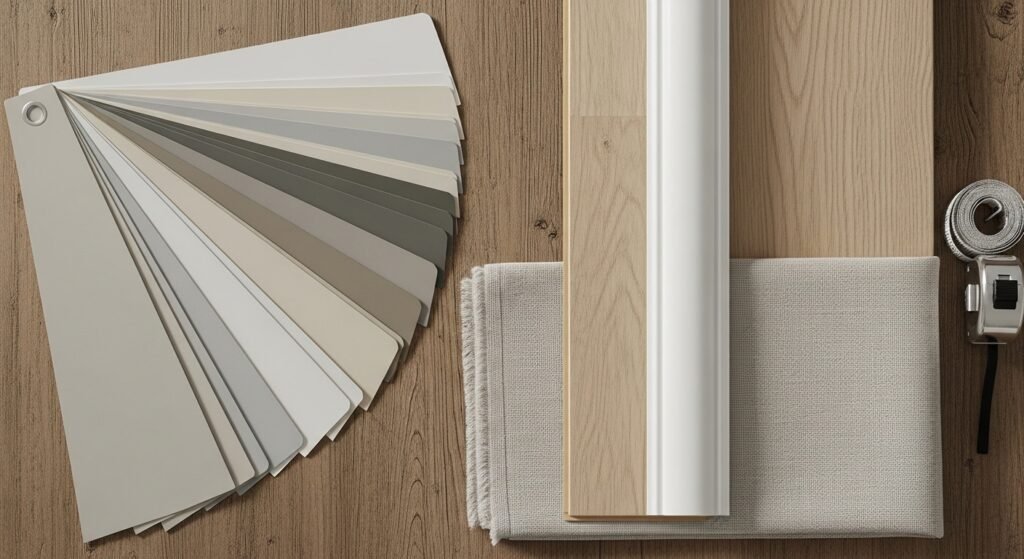
Essential Advice Before You Buy Paint
Picking a color from a tiny paper swatch is a huge mistake. Paint is tricky and can play tricks on your eyes. You need a solid strategy before you swipe your credit card. A little planning now saves you a lot of paint-related regret later. Here is what you need to know before you head to the store.
The Brand Name Trap
You have to be super careful with paint names when you shop. Many different brands use the exact same name for totally different colors. For example, Sherwin Williams and Benjamin Moore both have a color called Alabaster. The Sherwin Williams version is a warm, creamy neutral. The Benjamin Moore one actually has pink undertones that might surprise you. Always double-check the brand and the color code before you buy.
The Importance of Undertones
Undertones are the hidden colors lurking beneath the main gray. They are like a secret ingredient that changes the whole recipe. Some warm grays have a bit of green, blue, violet, or even pink in them. You might not see it on the swatch, but it shows up on the wall. These undertones can clash with your rugs or your sofa. Knowing what is hidden in the paint helps you avoid a major color disaster.
The Chameleon Effect
Warm gray paint colors are famous for being “chameleons”. This means they change their look depending on what is around them. A color might look like a perfect gray in the store but turn tan in your house. It might look green next to a houseplant or purple next to a yellow chair. This happens because neutrals pick up colors from their surroundings. You have to see it in your own space to know the truth.
How Lighting Transforms Warm Gray
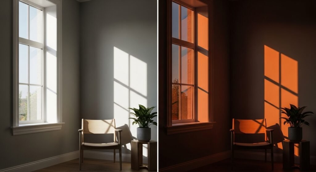
Light is the biggest factor in how your paint actually looks. The same bucket of paint can look like four different colors in four different rooms. Understanding light is the key to mastering warm gray paint colors. You can’t fight the light, so you have to work with it. Here is how different lighting setups change the game.
Natural Light vs. Artificial Light
Sunlight is very different from the lightbulbs in your ceiling. A color that looks amazing at 10:00 AM might look muddy at 8:00 PM. Natural light is usually more blue, while older lightbulbs are more yellow. Modern LED lights can be adjusted, which also changes the paint’s vibe. You need to watch your paint samples throughout the entire day. This ensures you love the color in every single lighting scenario.
Room Orientation and Exposure
- North-Facing Rooms usually get a cool, bluish light all day long. This can make grays look flat or even a bit sad. You often need extra-warm shades here to keep the room from feeling cold.
- South-Facing Rooms are flooded with intense, warm sunlight. This can wash out very light colors or make warm neutrals look too yellow. It is often a great place for a slightly deeper warm gray.
- East/West-Facing Rooms see a big shift in light from morning to evening. A room might be bright and warm in the morning but shadowy and cool by dinner. You have to find a color that can handle both extremes gracefully.
The Golden Rule of Sampling
If you skip sampling, you are basically gambling with your walls. You should never, ever just pick a color and paint the whole room. Buy a small amount or a test sheet first. Put it on different walls to see how the light hits it. This is the only way to be 100% sure about your choice. It is much cheaper than repainting a whole room because you hated the color.
Modern Sampling Strategies
Old-school paint samples were a huge mess and a total pain. Thankfully, things have changed for the better recently. You don’t have to live with twenty different dry paint squares on your wall anymore. There are smarter ways to test warm gray paint colors today. These methods save you time and keep your sanity intact.
The Samplize Hack
Samplize is a total lifesaver for people who hate making a mess. They sell peel-and-stick sheets made with real paint from the big brands. You just peel them off and stick them to your wall like a giant sticker. They give you a perfect look at the color without any cleanup or leftover pots. Plus, you can move them around the room to different walls easily. It is the fastest and cleanest way to test paint.
Avoiding the Sample Pot Mess
Traditional sample pots can actually be pretty misleading sometimes. Painting a small square over a dark wall makes the new color look different than it really is. Plus, you end up with a bunch of tiny plastic jars that you have to throw away. If you do use pots, paint the sample onto a white poster board first. This lets you see the true color without the old wall color bleeding through. It also lets you carry the board around the room.
Testing Locations
- Near Trim to see how the gray looks against your white baseboards or doors.
- In Dark Corners to make sure the color doesn’t turn into a muddy mess in shadows.
- Next to Flooring because your wood or carpet will reflect light onto the walls.
- Behind Furniture to see if it makes your sofa look better or worse.
Top-Rated Warm Gray and Greige Paint Colors
Some colors are just legendary for a very good reason. They have been tested in thousands of homes and they almost always look great. These are the heavy hitters in the world of warm gray paint colors. If you are feeling overwhelmed, start with these popular options. They are the “safe bets” that designers use over and over again.
BM Revere Pewter
- The Industry Standard is easily Benjamin Moore’s Revere Pewter. It is probably the most famous greige color in history.
- Characteristics include a medium tone that feels substantial but not too dark. It has warm brown undertones that keep it very grounded.
- Performance is where it shines, acting as a true chameleon. In bright light, it looks like a crisp gray, but in the shadows, it feels like a warm beige.
SW Agreeable Gray
- The Ultimate Crowd-Pleaser is the top-selling color for Sherwin Williams. It is famous for working in almost any home.
- Characteristics show it as a soft, warm gray with a tiny hint of olive green. This green keeps it from looking too pink or orange.
- Best Use is for open-concept homes or for people getting ready to sell their house. It is a very safe and beautiful choice for large spaces.
BM Edgecomb Gray
- The Classic Greige comes from the Benjamin Moore Historic Collection. It feels timeless and very organic.
- Characteristics make it a bit lighter and creamier than Revere Pewter. It leans a little more toward the beige side of the family.
- Visual Impact is soft and airy, making it perfect for bedrooms and living rooms. It gives you that high-end “hotel” vibe at home.
BM Pale Oak
- The Perfect Light Taupe is a secret weapon for high-end designers. It is very sophisticated and subtle.
- Characteristics provide a delicate balance between a warm white and a light gray. It has enough pigment to show up but stays very bright.
- Best Use is in dark hallways, on kitchen cabinets, or in any room that needs a soft glow.
BM Gray Owl
- The Cooler Warm Gray is for people who want a “true” gray feel. It sits right on the edge of the warm and cool scale.
- Performance can be a bit tricky because it can feel chilly in low light. It is best used in very bright, sunny rooms where the sun can warm it up.
Best Light Warm Grays and Off-Whites
Sometimes you want a room to feel bright and white without being “stark.” These light warm gray paint colors are perfect for that airy look. they give you just a whisper of color on the walls. This creates a clean look that still feels soft and lived-in. Here are the best picks for a light and bright home.
SW Eider White
- The Subtle Neutral is a very popular off-white from Sherwin Williams. It looks like a soft, cloudy white on the wall.
- Characteristics include just enough gray pigment to give the walls some depth.
- Best Use is in rooms that don’t get much natural light. It adds warmth without making the space feel closed in or dark.
SW Aesthetic White
- Soft Contrast is what this color does best. It is an incredibly light gray-beige that feels very modern.
- Characteristics are very neutral, meaning it doesn’t lean too hard into any specific undertone.
- Styling Tip is to pair it with very bright white trim for a “tone-on-tone” look. This makes the subtle gray in the paint really stand out.
BM Classic Gray
- The Refined Choice is a sophisticated off-white that many designers love. It is very elegant and quiet.
- Characteristics often show a tiny bit of green in the background.
- Visual Impact is light and airy, though it can change a lot throughout the day. It is a great “all-over” house color.
BM Balboa Mist
- The Versatile Light Gray is one of the most reliable colors on this list. It is very hard to go wrong with this one.
- The aesthetic is clean, fresh, and works in rooms facing any direction.
- Styling Tip is to use it with crisp white baseboards to show off its beautiful gray tone.
Unique Warm Grays with Distinct Undertones
Some warm gray paint colors have a bit more personality. They have stronger undertones that make them unique. These are great if you want a specific “mood” in your room. However, they require a bit more care when you are decorating. You need to make sure their hidden colors play nice with your stuff.
SW Drift of Mist
- The Cozy Neutral has a distinct brown undertone that feels very earthy.
- Characteristics make it feel like a warm hug for your walls.
- The feel is airy enough to be light, but the brown keeps it feeling grounded and solid.
BM Repose Gray
- The Complex Neutral is a bit cooler than Agreeable Gray. It is a favorite for people who want a “true” gray that isn’t cold.
- Undertones can be a bit sneaky, showing hints of purple, blue, or green.
- Warning is to sample this one very carefully because it changes so much in different light.
BM Collingwood
- The Gentle Gray is a shade darker than Balboa Mist. It feels very soft and easy on the eyes.
- Undertones can lean toward violet or purple in some rooms.
- Styling Warning says to avoid using a lot of yellow or green near it. Those colors will make the purple undertones pop out much more.
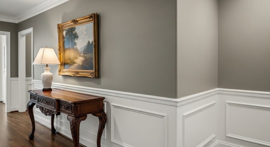
Coordinating Your Warm Gray Colors
Once you pick your paint, you have to think about the rest of the room. Warm gray paint colors need the right partners to look their best. You have to think about your trim, your floors, and your furniture. If you coordinate everything well, your room will look like a professional designed it. Here is how to pull the whole look together.
- Choosing the Right Trim Color is very important for contrast. Bright whites like Benjamin Moore “Chantilly Lace” are great partners. They make the warm gray look crisp and intentional rather than “dirty.”
- Pairing with Flooring requires a bit of balance. Light oak or honey-toned woods look amazing with most greiges. If you have dark walnut floors, go for a lighter warm gray to keep the room from feeling too heavy.
- Furniture and Textiles should be layered for a cozy feel. Use different shades of gray, beige, and cream in your rugs and pillows. This “layered neutral” look is very trendy and feels super comfortable.
Conclusion: Finding Your Perfect Shade
Finding the right warm gray paint colors takes a little bit of work, but it is worth it. These colors transform a house into a home. They provide a beautiful backdrop for all your favorite memories. Just remember to check the brand, watch the light, and always use a sample. If you do those things, you will end up with a room you absolutely love.
Final Checklist for Success
- Check the Brand Name to make sure you have the right version of the color.
- Identify the Undertones so you don’t get a surprise purple or green wall.
- Watch the Light at different times of the day to see how the color shifts.
- Order a Sample from Samplize to save time and avoid a big mess.
- Trust Your Gut because you are the one who has to live in the room every day!
| Paint Color | Brand | Tone | Best Feature |
| Revere Pewter | Benjamin Moore | Medium Greige | Ultimate Chameleon |
| Agreeable Gray | Sherwin Williams | Soft Greige | Works Everywhere |
| Pale Oak | Benjamin Moore | Light Taupe | Very Sophisticated |
| Eider White | Sherwin Williams | Off-White | Brightens Dark Rooms |
| Balboa Mist | Benjamin Moore | Light Gray | Very Reliable |
FAQs About Warm Gray Paint Colors
What exactly is the difference between a warm gray and a cool gray?
Warm grays have a base of red, orange, or yellow, which makes them feel cozy and inviting. Cool grays have a base of blue, green, or purple, making them feel crisp, airy, or sometimes clinical. You can usually tell the difference by holding the paint swatch next to a piece of bright white paper.
Will warm gray paint colors make my ceiling look lower?
Generally, no, especially if you choose a light-to-medium shade. If you are worried about the height of your room, use a very light warm gray or a warm off-white. This keeps the space feeling open while still providing that cozy vibe you want.
Can I use warm gray in a bathroom with no windows?
Yes, you can, but you have to be careful with the lighting. In a windowless room, the artificial light becomes the boss of the color. Go for a lighter shade like SW Eider White or BM Pale Oak to keep the small space from feeling like a cave.
Does warm gray go with honey oak cabinets?
Warm gray paint colors are actually the best choice for honey oak. Since the wood is very warm and orange, a cool gray would clash and look muddy. A nice greige like BM Edgecomb Gray creates a smooth transition and makes the oak look intentional and modern.
What finish should I use for warm gray paint?
For most walls, an eggshell or satin finish is the way to go. It has a slight sheen that reflects light beautifully and is easy to wipe down. For trim and doors, use a semi-gloss to create a nice contrast against the flatter wall color.
Can I mix different warm grays in the same house?
You definitely can, as long as they share similar undertones. You might use a light warm gray in the hallways and a darker version in the dining room. This creates a “monochromatic” look that feels professionally designed and very cohesive.
How do warm grays react to dark wood floors?
They look stunning together. A light warm gray creates a high-contrast look against dark walnut or espresso floors. This prevents the room from feeling too heavy or “closed in.”
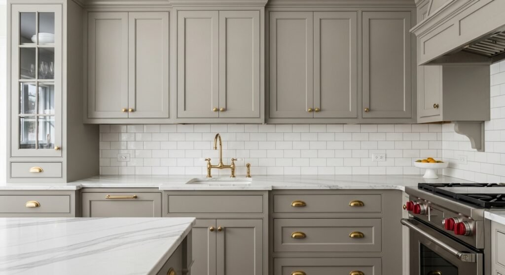
Is warm gray a good color for kitchen cabinets?
It is one of the top trends for kitchens right now. Warm grays like BM Pale Oak or SW Drift of Mist offer a softer look than stark white cabinets. They hide dirt and fingerprints better too, which is a huge plus for busy families.
Will warm gray paint colors make my room look yellow?
If you pick a color with a very strong yellow undertone and put it in a south-facing room, it might. That is why sampling is so important. If you see too much yellow, look for a “stonier” gray that has more black or brown in the base.
What color rug should I pair with warm gray walls?
Natural fiber rugs like jute or sisal look amazing with warm grays. If you want a pattern, look for rugs that include creams, tans, and charcoal. Avoid rugs with very cool blue tones as they might make the walls look “dirty.”
Is it okay to use warm gray in a nursery?
It is a fantastic choice for a nursery. It provides a calm, neutral backdrop that works for any gender. You can easily add pops of color through toys, blankets, and wall art without the room feeling overwhelmed.
Does warm gray work with marble countertops?
Most marble has cool gray veining, so you have to be careful. Look for a warm gray that sits right in the middle, like BM Gray Owl. This bridges the gap between the cool stone and the warm atmosphere of the room.
How many coats of paint do I usually need for warm gray?
Usually, two coats are the magic number for full coverage. Because these colors are neutral, they cover old colors pretty well. However, if you are painting over a very dark red or blue, you might need a primer first.
Can I use warm gray on the exterior of my house?
Absolutely, but keep in mind that colors look much lighter outside in the sun. If you like a color for your interior, go one or two shades darker for your siding. This ensures the color doesn’t just look like “dirty white” once the sun hits it.
Does warm gray hide wall imperfections?
It is better at hiding dings and scratches than pure white is. If your walls have a lot of texture or bumps, choose a “flat” or “matte” finish. These finishes absorb light instead of reflecting it, which makes imperfections less noticeable.
What is the best warm gray for a basement?
Basements usually have low light and low ceilings. Go for something very light and “clean” like BM Classic Gray. It adds enough warmth to fight the basement “chill” without making the space feel cramped.
Can I use warm gray with black hardware?
Black hardware looks incredibly sharp against warm gray paint colors. The black provides a modern, “industrial” contrast that makes the warm tones in the paint feel more current and less traditional.
Does warm gray look good with gold or brass accents?
Gold and brass are warm metals, so they are a match made in heaven for warm grays. They bring out the richness of the paint and make the whole room feel much more luxurious.
Should I paint my ceiling the same warm gray as my walls?
This is a bold move called “color drenching.” It can make a room feel very cozy and high-end. If you do this, use a flat finish for the ceiling and an eggshell finish for the walls to create a subtle difference.
What is the most “neutral” warm gray?
SW Agreeable Gray is often cited as the most neutral. It is the perfect balance of warm and cool, making it a “safe” starting point for almost any project. It rarely leans too far into one specific undertone.