 Skip to content
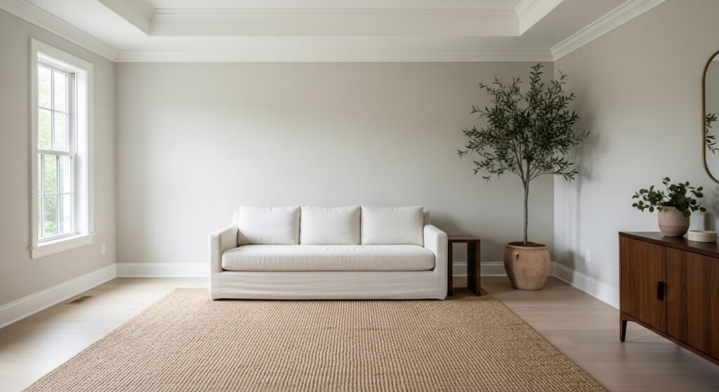
Choosing a paint color is hard. You want something that looks modern but feels cozy. Many people end up with a room that feels too cold. Others pick a beige that looks too yellow. This is where bm edgecomb gray saves the day. It is the perfect middle ground for any home.
Introduction to the Perfect Neutral
The Greige Defined
What exactly is a greige paint color? It is a mix of gray and beige. Gray gives it a modern and clean look. Beige adds warmth and a welcoming feeling. BM edgecomb gray sits right in the center of this mix. It is not too cool like a stormy sky. It is also not too warm like a sandy beach. This balance makes it work in almost any room.
The Stone Aesthetic
Nature has the best color palettes for your home. BM edgecomb gray mimics the look of natural stones. Think of a smooth pebble found in a stream. It has an organic feel that makes a room feel peaceful. This earthy quality helps it stay in style for years. It does not follow short-lived design fads. It feels like a part of the house itself.
Why It Is a Designer Favorite
Interior designers love a color they can trust. BM edgecomb gray is known as a fail-safe option. It works for pros who need a reliable result. It also works for DIYers who are afraid of making a mistake. You can paint an entire house in this color. It creates a flow that makes a home feel bigger. It is the secret weapon for staging houses for sale.
The Psychology of Edgecomb Gray
Colors change how we feel inside a space. This greige promotes a sense of groundedness. It makes a busy living room feel calm. The warmth makes people want to sit and stay. It is not an aggressive or loud color. It acts as a quiet backdrop for your life. Your home will feel like a sanctuary from the world.
Technical Specifications and Color Profile
Light Reflectance Value (LRV)
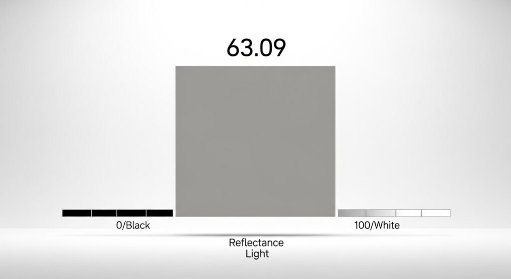
LRV tells you how much light a color reflects. The scale goes from 0 to 100. BM edgecomb gray has an LRV of 63.09. This number means it is a light color. It will help a room feel bright and open. It has enough pigment to show up on the wall. It will not wash out and look like white.
The RGB and Hex Values
If you are designing digitally, you need the numbers. The RGB values are Red 218, Green 211, and Blue 196. The hex code for this color is #DAD3C4. These values show that it has more red and green than blue. That is why it feels so warm on the eyes. It is a complex blend that looks rich. These numbers confirm its position as a light neutral.
The Light Category Performance
Some light colors feel very thin or watery. BM edgecomb gray has what designers call body. It looks substantial even though it is light. It provides a soft contrast against white trim. The walls will look painted rather than just primed. It hides small wall imperfections better than white. This makes it a great choice for older homes.
Munsell Hue Notation
The Munsell system identifies the true root of a color. BM edgecomb gray sits around 2.5Y. This means its core heritage is in the yellow family. This yellow base is what gives it warmth. Because it is close to the green-yellow border, it stays fresh. It does not turn into a muddy orange. Understanding this helps you predict how it will react.
Understanding the Complex Undertones
The Green Core
Almost every greige has a secret undertone. BM edgecomb gray has a soft green-gray foundation. This green is very subtle and hard to see. It helps the color feel very natural and organic. In most rooms, it just looks like a warm gray. The green keeps it from looking too pink. It is a very sophisticated way to add depth.
The Pink or Purple Shift
Sometimes a color can surprise you in a bad way. In certain light, bm edgecomb gray can show taupe tones. This means you might see a flash of pink or violet. This usually happens if you have specific types of light. It can also happen near certain wood floors. Most people do not see this often. It is just something to watch for when sampling.
The Chameleon Effect
This paint is known as a chameleon color. It changes its look depending on the room. In one house it might look quite gray. In the house next door it might look beige. This is why you cannot just trust a photo. You have to see it in your own space. It adapts to the surroundings like a living thing.
The Impact of Surrounding Colors
What is outside your window matters for your walls. If you have many green trees, the walls look greener. A large red rug can bounce pink onto the paint. This is called color bleed in the design world. BM edgecomb gray is very sensitive to these bounces. It picks up the vibe of your furniture and decor. This makes it very easy to coordinate with.
The Impact of Lighting and Exposure
North-Facing Light
North-facing rooms get cool and bluish light. This light can make paint colors look a bit chilly. BM edgecomb gray works well here because it is warm. The blue light will pull out the gray side. In cool light, this color stays soft and muted rather than turning into a cold, icy blue. It keeps its cozy feel even when the sun goes away.
South-Facing and Afternoon West Light
South-facing rooms are bathed in warm, golden light. This light makes the bm edgecomb gray look very beige. It will feel creamy and very sun-kissed here. Late afternoon sun from the west does the same thing. It can make the green undertone pop out more. Most people love this warm and cuddly look. It makes the room feel very high-end.
Low Light and Windowless Spaces
Dark rooms can be tricky for light colors. Without light, bm edgecomb gray can look a bit dingy. It might look like a muddy or dirty gray. You must have good artificial light in these spots. Use bulbs that are around 3000K to 3500K. This keeps the color looking crisp and clean. Avoid very yellow bulbs that hide the gray.
Strategic Use in Home Design
Whole-Home and Open Concept Floor Plans
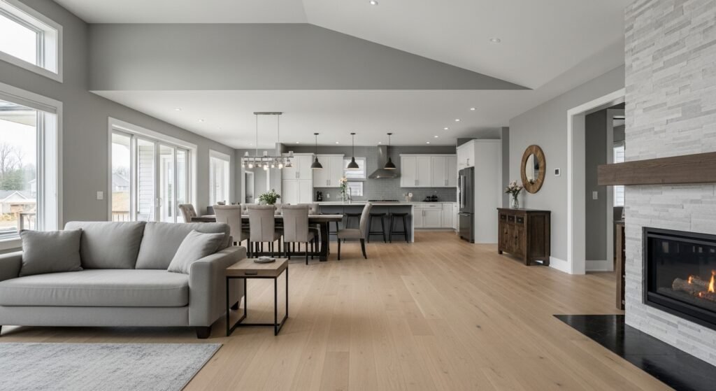
Many modern homes have rooms that flow together. BM edgecomb gray is perfect for these open layouts. It acts as a neutral thread through the house. It connects the kitchen to the living room. It makes the transition between spaces feel very smooth. You won’t feel a jarring change between rooms. It creates a cohesive and professional look.
Kitchen Applications
The kitchen is the heart of the home.
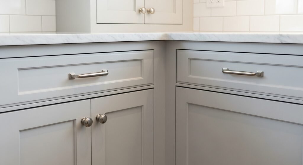
- Cabinetry: Paint your cabinets for a soft mushroom look.
- Backsplashes: It pairs perfectly with white subway tiles.
- Countertops: It looks amazing next to white marble or quartz.
- The Kitchen Island: Use it to ground a white kitchen.
- Walls: It provides a soft contrast to bright white cabinets.
Living and Dining Areas
These are the places where you relax and eat. BM edgecomb gray makes these rooms feel very inviting. It highlights beautiful white trim or crown molding. It provides a soft background for family photos. It feels sophisticated for a formal dining room. It also feels casual enough for a playroom. It is a very versatile choice for living spaces.
Bedrooms and Bathrooms
You want these rooms to feel like a spa.
- Bedrooms: It creates a serene and quiet sleeping space.
- Bathrooms: It looks clean and fresh next to white porcelain.
- Bedding: It works with white, navy, or gray linens.
- Tile: It complements light gray or marble floor tiles.
- Serenity: The warm tones help you wind down.
Hardware, Fixtures, and Metal Finishes
Warm Metal Pairings
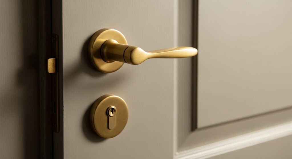
Warm metals are making a big comeback lately.
- Aged Brass: This looks stunning against bm edgecomb gray.
- Unlacquered Brass: It brings out the beige and creamy side.
- Copper: This creates a very earthy and rustic feeling.
- Bronze: It offers a soft and traditional look.
- Gold Tones: They elevate the paint to look very expensive.
Cool Metal Pairings
Cool metals provide a very clean and modern look.
- Polished Nickel: This is the best metal for this paint.
- Chrome: It creates a bright and high-contrast look.
- Brushed Nickel: A very safe and common choice for bathrooms.
- Stainless Steel: It blends perfectly with the gray undertones.
- Modern Feel: These metals keep the room looking fresh.
Modern Accents
If you want a bold look, go for black.
- Matte Black: It provides a sharp and graphic anchor.
- Contrast: Black makes the greige look lighter and crisper.
- Hardware: Use black handles on Edgecomb Gray cabinets.
- Lighting: Black light fixtures look very industrial and cool.
- Focus: It keeps the soft color from looking too mushy.
Architectural Styles and Edgecomb Gray
Modern Farmhouse
The farmhouse look needs to feel cozy. BM edgecomb gray is a great alternative to white. It adds a layer of warmth to the rustic decor. It looks great with reclaimed wood beams. It feels more lived-in than a stark white wall. It is the perfect neutral for this popular style.
Coastal Interiors
Coastal style is all about sand and sea. This color looks like the perfect sandy beach. It pairs beautifully with light blue accents. It works well with wicker and rattan furniture. It makes a home feel like a breezy retreat. It brings the outside colors into your home.
Traditional and Colonial
Older homes have lots of character and wood. BM edgecomb gray respects the history of these homes. It highlights beautiful antique furniture and rugs. It provides a clean backdrop for traditional art. It makes old spaces feel updated and fresh. It bridges the gap between old and new.
Mid-Century Modern
Mid-century homes use lots of teak and walnut. BM edgecomb gray balances these orange wood tones. It provides a neutral base for bold furniture. It keeps the space from feeling too dark. It allows the unique shapes of the furniture to shine. It is a very sophisticated choice for MCM fans.
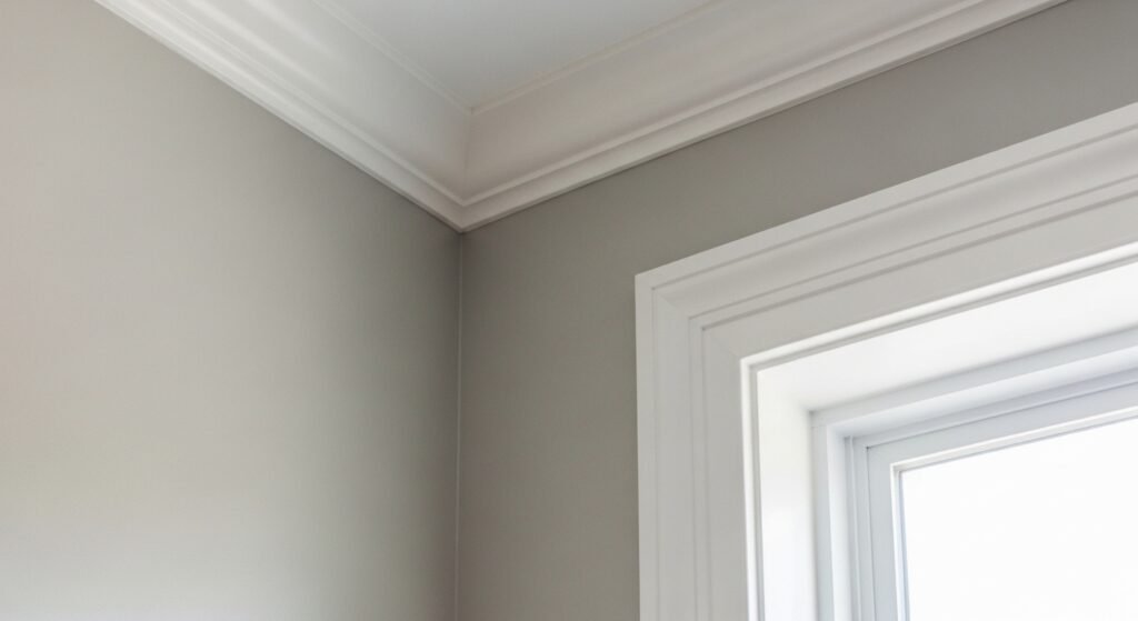
Coordinating Trim and Ceiling Colors
The Best Benjamin Moore Whites for Trim
The right trim color makes the wall pop.
- Chantilly Lace: This is a clean and very bright white.
- Simply White: A soft white that has a hint of warmth.
- Cloud White: This is a very creamy and subtle white.
- White Dove: A classic white that has a soft gray base.
- High Contrast: Use Chantilly Lace for a modern look.
Handling the Ceiling
The ceiling is often called the fifth wall.
- Standard White: Most people just use a flat ceiling white.
- Cut Strength: You can paint it at 50% of the wall color.
- Color Drenching: Paint everything the same color for a mood.
- Continuity: Matching the ceiling can make a room feel taller.
- Shadows: Remember that ceilings always look a bit darker.
Comparison with Similar Greige Competitors
BM Edgecomb Gray vs. Revere Pewter
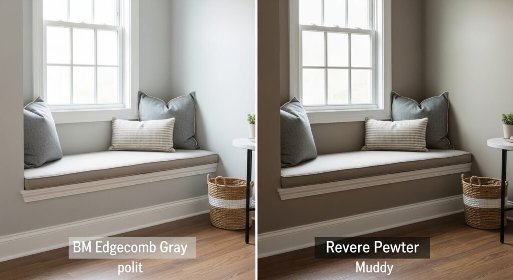
These are the two heavy hitters of greige.
- LRV: Edgecomb Gray (63) is lighter than Revere Pewter (55).
- Depth: Revere Pewter feels much heavier on the wall.
- Undertone: Revere Pewter has a stronger green-gray punch.
- Versatility: Edgecomb Gray works better in smaller rooms.
- Mood: Revere Pewter is more dramatic and moody.
BM Edgecomb Gray vs. Pale Oak
These two are very similar in brightness.
- Undertone: Pale Oak leans toward pink and purple.
- Warmth: Edgecomb Gray is slightly warmer and greener.
- Lighting: Pale Oak can look like an off-white in sun.
- Preference: Choose Pale Oak if you want a cleaner look.
- Balance: Edgecomb Gray feels a bit more grounded.
BM Edgecomb Gray vs. Gray Owl
This is a battle of warm versus cool.
- Vibe: Gray Owl is a cool, crisp, blue-green gray.
- Temperature: Edgecomb Gray is much warmer and cozier.
- Exposure: Use Gray Owl in south light to cool it down.
- Living Rooms: Most people prefer the warmth of Edgecomb here.
- Kitchens: Gray Owl looks very modern and sharp.
BM Edgecomb Gray vs. Classic Gray
When you want something even lighter, look here.
- Category: Classic Gray is a true off-white color.
- Saturation: Edgecomb Gray has much more color and pigment.
- Shadows: Classic Gray can wash out in very bright rooms.
- Trim: Classic Gray needs very white trim to show up.
- Depth: Edgecomb Gray provides a more cozy and solid feel.
| Paint Color Name | LRV (Brightness) | Primary Undertones | Best Lighting Exposure | Overall Vibe |
| BM Edgecomb Gray | 63.09 | Green-Gray / Beige | Versatile (All Light) | Soft, organic, and cozy |
| BM Revere Pewter | 55.05 | Strong Green-Gray | Large, bright rooms | Moody, traditional, and solid |
| BM Pale Oak | 69.89 | Pink / Purple (Taupe) | North or cool light | Elegant, clean, and airy |
| BM Gray Owl | 65.77 | Blue / Green | South or warm light | Crisp, cool, and modern |
| BM Classic Gray | 74.75 | Very Subtle Purple | Darker rooms | Sophisticated off-white |
| BM White Dove | 85.38 | Yellow / Gray | Trim and ceilings | Creamy, soft, and classic |
| BM Balboa Mist | 67.37 | Purple / Violet | South or warm light | Cool-leaning, misty greige |
| BM Manchester Tan | 64.41 | Green / Yellow | North or cool light | Traditional, warm khaki |
Exterior Applications of BM Edgecomb Gray
The Body of the House
Paint looks much lighter outside than inside. BM edgecomb gray will look like an off-white outdoors. It is a very sophisticated choice for a main house color. It looks very high-end and clean in the sun. It does not look blindingly white or stark. It blends well with natural landscapes.
Trim and Accents
You can use it as a trim color too.
- Dark Siding: It looks great with BM Hale Navy siding.
- Soft Contrast: It provides a gentle look against dark gray.
- Garage Doors: Use it here to help them blend in.
- Gutters: It hides dirt better than a bright white does.
- Soffits: It provides a warm glow under the roof line.
Front Doors and Shutters
Your front door is the first thing people see.
- Wood Doors: It looks amazing next to stained wood.
- Shutters: Use it for a tone-on-tone look with white siding.
- Curb Appeal: It creates a very welcoming and classic entrance.
- Hardware: Use black or brass handles for a pop.
- Warmth: It makes the porch feel very inviting.
The Stone and Brick Connection
Many houses have stone or brick parts.
- Limestone: It is a perfect match for light limestone.
- Brick: It softens the look of red or orange brick.
- Mortar: It often matches the color of the mortar lines.
- Cohesion: It makes different materials look like they belong.
- Landscaping: It looks great with pavers and rock walls.
Textiles, Decor, and Flooring
Hardwood Tones
Your floors are a huge part of your room.
- White Oak: This is a match made in design heaven.
- Walnut: The dark wood makes the paint look light and airy.
- Red Oak: The green undertone helps neutralize red wood.
- Honey Oak: It modernizes these dated orange floor tones.
- Flow: The paint and wood together feel very organic.
Upholstery and Rugs
Decorating is easier with a neutral wall.
- Linens: Oatmeal or cream fabrics look very high-end.
- Velvets: Navy or charcoal velvet adds a touch of drama.
- Jute Rugs: These bring out the natural stone vibe.
- Leather: Cognac or brown leather looks amazing here.
- Patterns: Bold patterns won’t clash with this quiet wall.
Professional Tips for Success
Transitioning from Tuscan Styles
Many homes still have dark browns and oranges. BM edgecomb gray is the best way to fix this. it bridges the gap between old and new styles. It is warm enough to work with existing brown trim. It is cool enough to feel like a modern update. It is the easiest way to refresh an old house.
The Sample First Rule
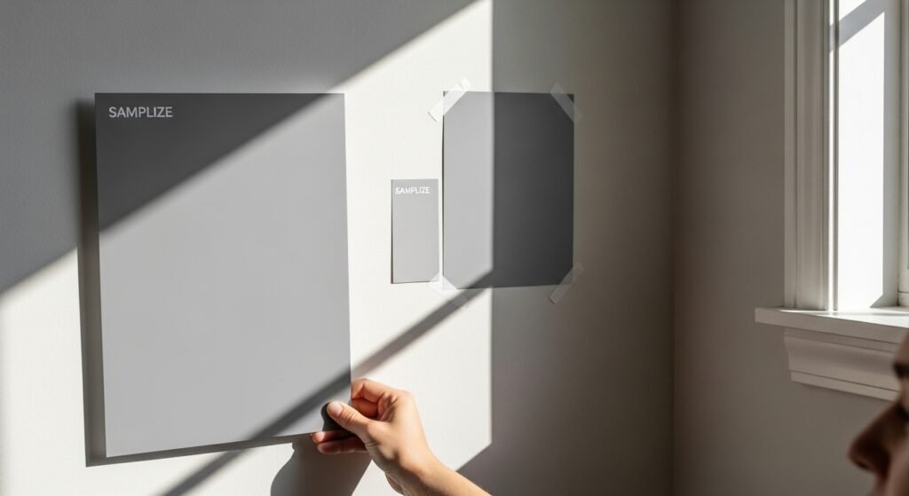
Never buy a whole gallon without a sample.
- Large Boards: Paint a big piece of poster board first.
- Peel-and-Stick: Use a Samplize sheet for an easy test.
- Move It: Put the sample on different walls at different times.
- Shadows: Look at the corners where light is low.
- Trim: Hold it up against your existing white trim.
The Importance of Sheen
The finish of the paint changes the look.
- Matte: Best for hiding bumps on the wall.
- Eggshell: The most popular choice for living rooms.
- Satin: Great for bathrooms and kitchens for easy cleaning.
- Gloss: Use this on trim to make it really stand out.
- Reflection: Shinier paints will show the undertones more.
When to Double-Strength the Color
Sometimes you want a bit more drama. You can ask the paint store for a 150% formula. This makes the color deeper and more saturated. It is great for a large room with very high ceilings. It keeps the color from feeling too thin in big spaces. It adds a custom look to your home.
Final Summary and Verdict
Who Should Choose Edgecomb Gray?
You should pick this color if you want warmth. It is for people who find gray too cold. It is great if you have a lot of wood in your home. It works for anyone who wants a safe and pretty color. It is a winner for almost every room.
Who Should Avoid It?
Avoid it if you have a very dark room. It might look a bit muddy or dingy there. Don’t pick it if you want a true, icy gray. If you hate green undertones, proceed with caution. It is also not for someone looking for a bold statement.
Final Thoughts on Longevity
BM edgecomb gray is a true classic. It has been popular for years and will stay that way. It is a smart investment for your home. It makes spaces feel high-quality and timeless. You really can’t go wrong with this beautiful greige.
FAQs About BM Edgecomb Gray
Does bm edgecomb gray work well in a nursery?
Yes, it is an amazing choice for a nursery. It creates a calm and gender-neutral environment. You can easily add pops of pink, blue, or green as the child grows. It feels much cozier than a sterile white or a cold gray.
Can I use bm edgecomb gray for a tray ceiling?
It looks very sophisticated in a tray ceiling. You can paint the vertical part of the tray a crisp white. Then, apply this greige to the flat top surface. This adds depth without making the ceiling feel like it is falling in on you.
Is bm edgecomb gray a good choice for a hallway with no windows?
It can work, but you need very bright light bulbs. Since hallways are narrow, the color can sometimes feel a bit more enclosed. Make sure your light fixtures have a high lumen count. This keeps the warm stone tones looking fresh instead of shadowy.
How does this color look in a laundry room?
It makes a laundry room feel clean and high-end. Many people use it to make a small utility space feel more like a real room. It hides lint and dust better than a bright white paint. It pairs well with white washer and dryer units.
Can I use bm edgecomb gray on a fireplace mantel?
It is a great choice for a wooden mantel. It provides a soft contrast if your walls are a different shade. If the walls are also the same color, use a semi-gloss sheen on the mantel. This makes the architectural detail stand out through texture rather than color.
Does it look good with black stainless steel appliances?
Absolutely, it looks very modern with black stainless steel. The gray in the paint connects with the metal. The beige in the paint keeps the kitchen from feeling too dark or moody. It is a very balanced look for a contemporary kitchen design.
Is bm edgecomb gray suitable for a home office?
It is one of the best colors for productivity. It is not distracting or too bright. It provides a professional backdrop for video calls. The warmth helps you stay comfortable during long work hours at your desk.
Can I use this color for my interior doors?
Yes, painting interior doors in this shade is a huge trend. It looks great against white walls. It adds a custom, expensive feel to a standard hallway. Use a durable satin or semi-gloss finish for easy cleaning of fingerprints.
Does it coordinate with marble hex floor tiles?
It is a perfect match for marble. Most marble has gray veins that pull out the gray side of the paint. The warm base of the paint prevents the marble from looking too cold. It creates a very classic and timeless bathroom aesthetic.
Is bm edgecomb gray too light for a basement?
It depends on your lighting setup. If your basement has low ceilings and few windows, it might look a bit muted. If you have plenty of pot lights, it will look like a beautiful warm neutral. It is better than a dark color which might make a basement feel like a cave.
How does it look with navy blue furniture?
Navy blue and bm edgecomb gray are a stunning combination. The blue is a cool tone that makes the warm greige pop. It feels very coastal or “New England” in style. This is a very popular color palette for living rooms and dens.
Can I use it on a front porch ceiling?
While many people use “Haint Blue,” this greige is a sophisticated alternative. It makes a porch feel like an extension of the indoor living space. It looks great with white columns and black porch furniture. It hides outdoor dust better than a stark white ceiling.
Does it work with honey-colored wicker furniture?
It works beautifully with natural fibers. The beige tones in the paint harmonize with the wicker. It creates an organic, boho-chemical look. This is perfect for sunrooms or casual sitting areas.
Is bm edgecomb gray a good staging color for selling a home?
It is one of the top staging colors in the real estate industry. It is neutral enough that buyers can imagine their own furniture in the space. It looks great in online listing photos. It makes the home feel well-maintained and updated.
Does it look good with gold picture frames?
Yes, gold and brass frames look very elegant against this backdrop. The yellow-green undertone of the paint loves the warmth of the gold. It creates a gallery look that feels curated and expensive.
Can I use bm edgecomb gray in a mid-century modern home?
It is a fantastic neutral for mid-century styles. It balances the heavy wood tones often found in teak or walnut furniture. It provides a soft background for iconic furniture shapes and bold accent colors.
How does it react to “soft white” 2700K light bulbs?
At 2700K, the color will lean very heavily into its beige and yellow side. It will feel very warm and cozy, almost like a light tan. If you want it to look more gray, switch to a “cool white” or “daylight” bulb.
Is it a good color for a walk-in closet?
It is a great choice because it doesn’t distort the color of your clothes. Some yellows or blues can make it hard to see the true color of your outfits. This neutral keeps things looking accurate while providing a nice glow.
Can I use bm edgecomb gray for a brick fireplace wash?
You can dilute the paint with water to create a “limewash” look on brick. It softens the red tones of the brick significantly. This is a great way to update a room without completely hiding the texture of the masonry.
Does it work with concrete floors?
It works very well with polished concrete. The concrete pulls out the gray tones. The paint adds a much-needed layer of warmth to the industrial look. It makes a modern space feel much more livable and less like a garage.