
Choosing the right paint color can feel like a huge chore. You want something that looks fresh but also feels cozy. Many homeowners struggle to find that perfect balance between a cold gray and a boring beige. Sherwin Williams Repose Gray (SW 7015) is the answer many people are looking for. It is a soft, beautiful neutral that works in almost any home. This color has stayed popular for years because it is so easy to live with. In this guide, we will break down everything you need to know about SW repose gray. We will look at why it works and how to use it in your own space.
Understanding Sherwin Williams Repose Gray: The Modern Gray
Many people are starting to feel a bit tired of the gray trend. You might feel like you have seen gray on every single wall for the last decade. However, SW repose gray is different from those flat, icy grays of the past. It belongs to a group of colors that designers love because they have depth. It does not just sit on the wall looking like cold concrete. Instead, it adds a layer of sophistication to a room without taking over the whole vibe.
A Timeless Favorite
Repose Gray is a top seller for Sherwin Williams for a very good reason. It is a safe bet for people who want a modern look that won’t go out of style next year. Trends come and go, but balanced neutrals like this one tend to stick around. It provides a clean backdrop that lets your life and your furniture be the stars of the show. Whether you are painting a nursery or a high-end kitchen, this color fits right in.
The “Anti-Gray” Gray
What makes SW repose gray the “anti-gray” is its complex mix of tones. It is not a simple mix of black and white. It has a soul that prevents it from feeling sterile or industrial. Some grays can make a room feel like a basement or a hospital wing. Repose Gray avoids this by leaning into its subtle warmth. It feels like a hug for your walls rather than a cold shoulder. This makes it a great choice for families who want a home that feels lived-in and welcoming.
Versatility in Design
This color is like a chameleon in the design world. It looks amazing in a modern farmhouse with rustic wood beams. It also looks sleek in a minimalist apartment with metal accents. Transitional and traditional homes benefit from its steady, calming presence. No matter your personal style, SW repose gray acts as the perfect foundation. It bridges the gap between different textures and materials effortlessly.
The Science of the Shade: Technical Breakdown
To really understand a paint color, you have to look at the math behind it. Every paint color is made of specific amounts of light and pigment. Understanding these numbers helps you predict how the color will look in your home. You won’t have to guess if the color will be too dark or too light. The science tells the real story of SW repose gray.
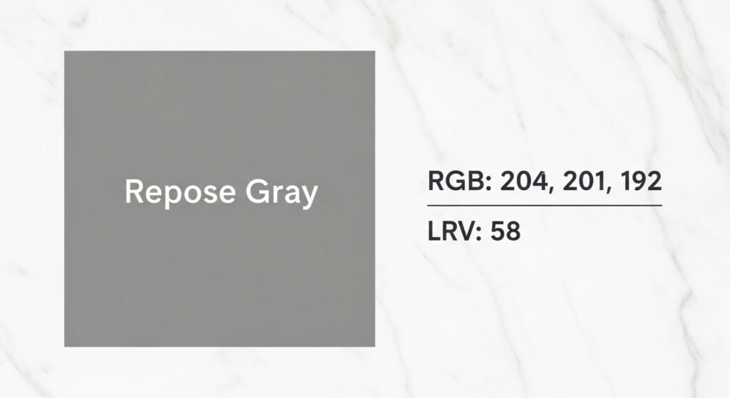
RGB Values (204 / 201 / 192)
The RGB values tell us how much Red, Green, and Blue are in the color. For SW repose gray, the red and green levels are higher than the blue. This specific mix is what gives the color its famous warmth. Because there is more red and green, it stays away from those chilly blue or purple undertones. It stays firmly in the “warm neutral” category. This balance is why it looks so good with natural materials like wood and stone.
Light Reflectivity Value (LRV) Explained
The LRV scale goes from 0 to 100. A value of 0 is absolute black, and 100 is pure white. SW repose gray has an LRV of 58. This means it reflects about 58% of the light that hits it. It sits right in the middle of the gray spectrum. It is light enough to make a room feel open and airy. However, it is dark enough to provide some actual color on the walls. It won’t get washed out and look like plain white in a bright room.
The HEX Code (#CCC9C0)
If you are working with an interior designer or using a room visualizer app, you might need the HEX code. The code for SW repose gray is #CCC9C0. This digital signature allows you to see the color on your computer screen accurately. It is also helpful if you are trying to match the color for digital projects or custom orders. Having this code ensures you are getting the exact shade you want.
Is Sherwin Williams Repose Gray Cool or Warm?
The biggest question people ask about SW repose gray is whether it is warm or cool. The answer is that it is a very balanced neutral. It does not lean too far in either direction, which is its greatest strength. However, if you look closely, you will see it has a heart of gold—literally.
The Neutral Balance
Sherwin Williams officially calls this a neutral paint color. It is designed to be the middle ground for your home. It provides enough warmth to feel cozy but stays cool enough to look modern. This balance makes it the ultimate “safe” color for whole-house painting. You don’t have to worry about it clashing with your existing decor. It plays well with almost everything.
The Subtle Undertone
While it is neutral, SW repose gray leans slightly warm. It has a tiny bit of brown or “greige” in it. This prevents the color from looking like a blue-gray or a silver. Many homeowners prefer this because it makes a room feel more inviting. It mimics the natural tones found in the world around us. It feels organic and soft rather than harsh or manufactured.
The “Chameleon” Effect
This color is famous for changing its look based on what is around it. This is called a chameleon effect. If you put it next to a warm beige, it might look more gray. If you put it next to a cool blue, it might look more like a warm greige. It shifts and moves throughout the day as the sun moves across the sky. This makes the color interesting and dynamic instead of boring.
How Repose Gray Reacts to Different Lighting
Lighting is the most important factor in how paint looks. A color can look perfect in the store but totally different in your living room. SW repose gray is very sensitive to the light it receives. You need to know how it will behave in your specific space before you start painting.
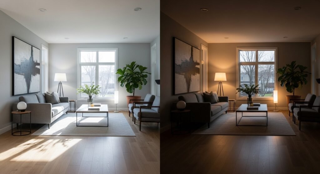
Bright Natural Light
In rooms with big windows and lots of sunshine, SW repose gray shines. It looks like a very soft, airy gray. The warmth stays subtle, and the color feels very fresh. It creates a crisp look that makes the room feel larger than it actually is. It is a great choice for sunrooms or open-concept living areas.
North-Facing Rooms
North-facing rooms usually get a cool, bluish light. This can make some grays look very cold or even a bit purple. Because SW repose gray has those warm red and green undertones, it holds its own. It stays a true gray without becoming a block of ice. It provides the necessary warmth to balance out that chilly northern light.
Darker or South-Facing Rooms
In rooms with less natural light, the warmer side of SW repose gray comes out to play. It starts to look a bit cozier and deeper. In south-facing rooms, the intense afternoon sun can make the warmth even more apparent. It might lean a little more toward a light tan or beige in these conditions. This is perfect if you want a room that feels like a snug retreat.
Artificial Lighting Impact
- Cool LED Bulbs: These bulbs can make SW repose gray look a bit more silver or “true gray”.
- Warm Incandescent Bulbs: These will pull out the greige and taupe notes in the paint.
- Recessed Lighting: Overhead lights often cast shadows that make the color look a bit deeper and cooler.
- Sconces and Lamps: Soft, eye-level lighting brings out the comforting warmth of the color.
Choosing the Best White Trim Colors for Repose Gray
Trim color is the “frame” for your wall color. The right white can make SW repose gray pop. The wrong white can make your walls look dirty or dingy. You want to pick a trim that complements the balanced nature of the paint.
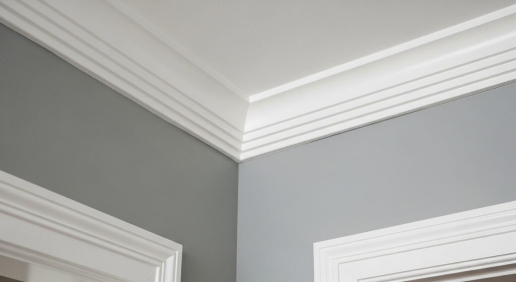
High Contrast Options
If you want a very clean and modern look, go with a high-contrast white. Sherwin Williams Extra White is a popular choice for this. It is a very bright, cool white that makes SW repose gray look defined. This is a great look for baseboards and crown molding in a formal living room. It makes the gray feel more intentional and sharp.
Soft and Subtle Pairings
- Sherwin Williams Pure White: This is a favorite because it isn’t too stark. It has a tiny bit of warmth that matches the warmth in the gray.
- Aesthetic White: This creates a very soft, low-contrast look. The author of the source used this for a cohesive feel in their garage project.
- Alabaster: This is a very creamy white that makes the whole room feel soft and glowing.
The Modern Monochromatic Look
A huge trend right now is painting the trim the same color as the walls. You use SW repose gray on the walls in an eggshell finish. Then, you use the same color on the trim in a semi-gloss finish. This blurs the lines of the room and makes it feel very custom. It lets the architectural details like windows and doors stand out without being broken up by white lines.
Finishing Touches
Don’t forget the small details like outlet covers and switch plates. Bright white plastic covers can look cheap against a sophisticated gray wall. You can actually paint these covers to match your walls. This makes them disappear so they don’t break up the beautiful flow of the color. It is a small step that makes a huge difference in how polished your home looks.
Coordinating Colors and Palettes
SW repose gray is a team player. It does not try to be the only star in the room. It works beautifully with a wide range of other colors. Whether you like neutrals or bold pops of color, this gray can handle it.
The Neutral Foundation
If you want a calm, monochromatic home, stick with other neutrals. SW repose gray pairs perfectly with darker grays and warm whites.
- Iron Ore: A very dark charcoal that provides a dramatic accent.
- Felted Wool: A medium-toned neutral that adds a layer of depth.
- Shoji White: A creamy off-white that keeps things looking light and airy.
Adding Color Depth
If you want a little more excitement, look toward nature-inspired colors.
- Pewter Green: This earthy green looks stunning next to the gray. It feels organic and very “on-trend.”
- Debonair: A soft, sophisticated blue that pulls out the cooler side of the gray.
- Navy Blue: A classic choice that creates a timeless, nautical, or traditional feel.
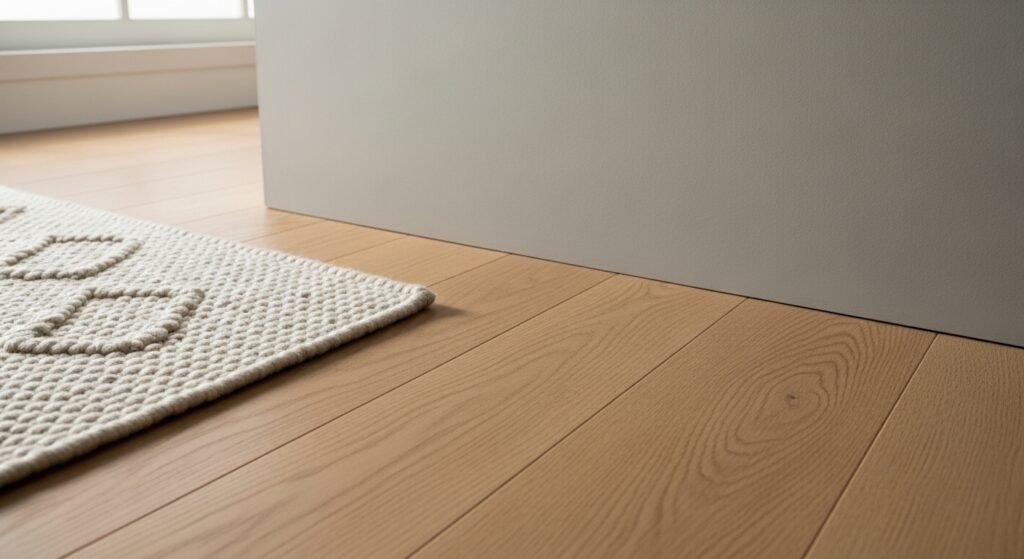
Wood Tone Compatibility
The warmth in SW repose gray makes it a dream for wood accents. It looks great with light oak floors for a Scandinavian vibe. It also works with dark walnut furniture for a more formal look. Reclaimed wood looks extra rustic and textured against this smooth gray backdrop. It is one of the few grays that won’t make your wood furniture look “orange.”
Comparing the Giants: Repose Gray vs. Agreeable Gray
In the world of paint, these two colors are the biggest rivals. They are both warm grays, and they are both top sellers. Many people have a hard time choosing between them. Let’s look at how they stack up.
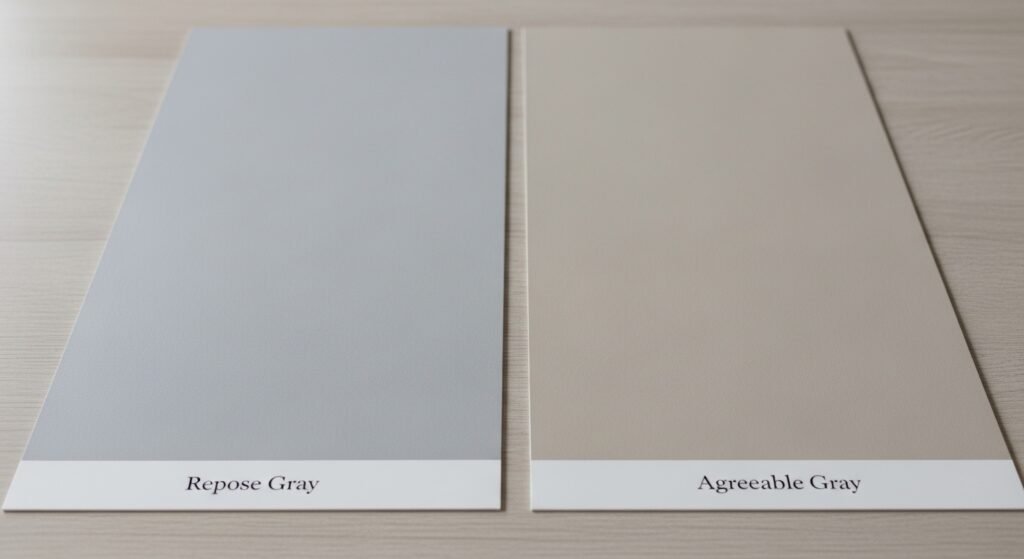
The LRV Difference
Agreeable Gray has an LRV of 60, while SW repose gray has an LRV of 58. This means Agreeable Gray is just a tiny bit lighter. In a very dark room, that small difference might matter. However, in most spaces, they appear to have a similar “weight” on the wall. They are both excellent mid-tone options.
Undertone Showdown
- Repose Gray: This color is more balanced. It has a touch of coolness that keeps it looking like a true gray. It is for the person who wants gray but fears the cold.
- Agreeable Gray: This color tips much further into the “beige” territory. It is a true greige. It is for the person who wants beige but wants it to look modern.
Which to Choose?
If your home has a lot of cool tones like blue or silver, go with SW repose gray. If your home is full of very warm tones like gold and tan, Agreeable Gray might be better. Look at your flooring and your most expensive piece of furniture. If those items are cool, choose Repose. If they are warm, choose Agreeable.
Practical Applications: Where to Use Repose Gray
You can use this color almost anywhere. It is durable in its look and its feel. Here are some of the best places to put SW repose gray to work in your house.
Living and Social Spaces
The living room is where everyone gathers. You want a color that makes people feel relaxed. SW repose gray is perfect because it isn’t distracting. It creates a peaceful environment where you can focus on conversation. It also makes a great background for a gallery wall of family photos.
Kitchens and Cabinetry
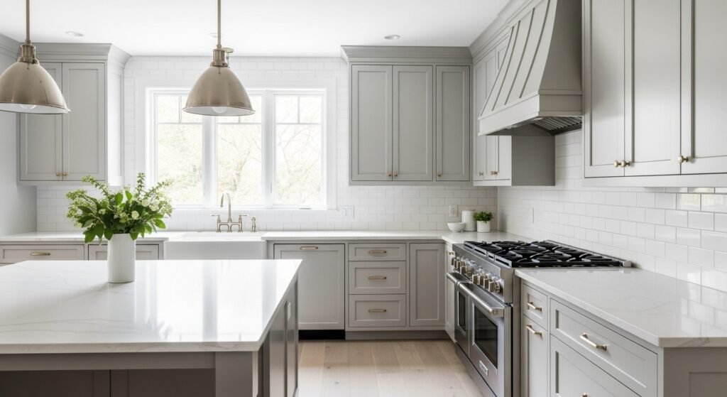
White kitchens are classic, but they can be hard to keep clean. SW repose gray cabinets are a fantastic alternative. They look high-end and custom. The color is light enough to keep the kitchen feeling bright. However, it hides a bit more “life” than a stark white cabinet would. It pairs beautifully with marble or quartz countertops.
Bedrooms
Your bedroom should be a sanctuary. The calming, balanced nature of SW repose gray helps lower the energy of the room. It feels cozy at night under the glow of a bedside lamp. During the day, it feels fresh and clean when you wake up. It is a very restful color that won’t overwhelm your senses.
Utilitarian Spaces
Don’t ignore the “working” parts of your house. The author used this color in a garage remodel. It turned a cluttered, messy space into something that looked intentional and clean. It is also a great choice for laundry rooms, mudrooms, and hallways. These high-traffic areas benefit from a color that looks organized and bright.
Exterior Use
If you use SW repose gray outside, remember that the sun is very strong. When used outdoors, this color looks much lighter and may even appear off-white in bright sunlight. It is an excellent choice for siding if you want a subtle and sophisticated appearance. Just make sure to test a large patch on the outside of your house first.
Impact of Flooring on Repose Gray
Your floor is the largest “color block” in your room besides the walls. It reflects light directly onto your paint. You have to consider how your flooring will change the look of SW repose gray.
Hardwood Floors
- Warm Oak: The yellow and orange tones in light oak will pull out the warmth in the paint.
- Espresso Stains: Dark, cool floors will make the gray look more crisp and modern.
- Gray-Washed Wood: This creates a very “cool” monochromatic look that is popular in coastal homes.
Luxury Vinyl Plank (LVP)
Many modern LVP floors have a mix of gray and tan. SW repose gray is the perfect match for these “greige” floors. It picks up the different tones in the wood grain. This creates a very cohesive look from the ground up.
Carpeting and Textiles
If you have wall-to-wall carpet, SW repose gray works best with neutral tones. Think oatmeal, cream, or light gray carpets. A bold colored carpet might reflect its own color onto the walls. For example, a red rug might make your gray walls look a bit pink. Stick to neutrals for the best result.
Tile and Stone
In bathrooms and kitchens, this color looks amazing with natural stone.
- Carrara Marble: The gray veining in the marble matches the paint perfectly.
- Slate: Dark slate floors provide a grounded, earthy contrast to the light walls.
- Travertine: The beige tones in travertine will bring out the “greige” side of the paint.
Hardware and Metal Finishes
The jewelry of your home—your faucets, handles, and lights—matters too. Different metals will change the “temperature” of SW repose gray.
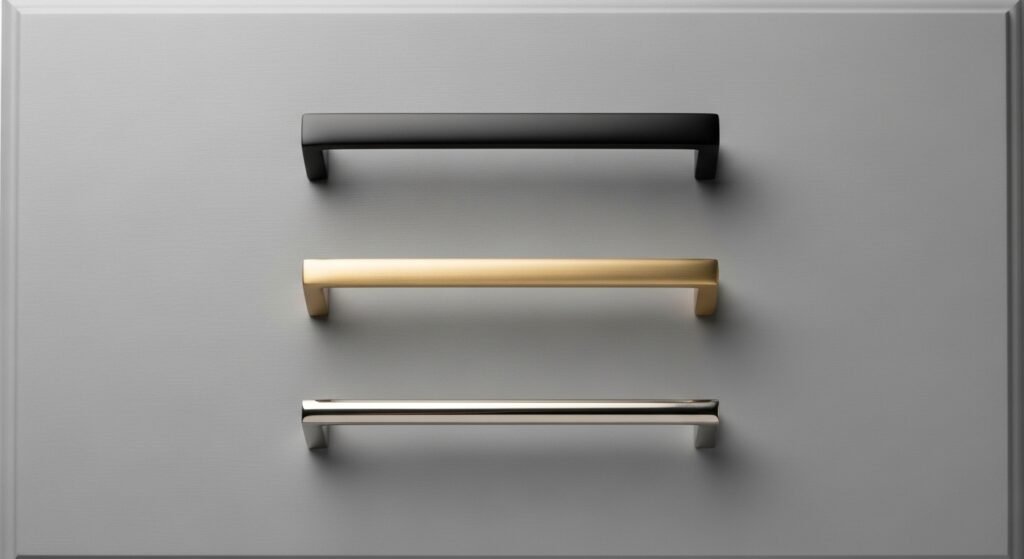
Brushed Gold and Brass
Gold is a very warm metal. When you put gold hardware against SW repose gray, it highlights the warmth in the paint. This is a very popular look for modern bathrooms. It feels expensive and trendy but also very welcoming.
Matte Black
Black is the ultimate contrast. It makes SW repose gray look very sharp and clean. This is the “Modern Farmhouse” look. It is bold and graphic. If you want your home to look like it belongs in a magazine, matte black is a great choice.
Polished Chrome and Nickel
These are cooler metals. They will bring out the “true gray” side of SW repose gray. This is a classic look that never goes out of style. It feels very clean and “sparkly” in a kitchen or a bathroom. It is a great choice for a more traditional or formal home.
Furniture and Decor Coordination
Now that your walls are painted, how do you decorate? SW repose gray is the perfect canvas for your personal style.
Upholstery Choices
- Linen: Creamy linen sofas look incredible against these walls. It feels very high-end and comfortable.
- Leather: A cognac leather chair provides a beautiful warm contrast to the gray.
- Velvet: Jewel-toned velvet (like navy or emerald) pops beautifully against this neutral backdrop.
Wood Furniture
You don’t have to worry about matching all your wood. Mid-century modern teak pieces look great because of their warm orange tones. Traditional mahogany or cherry pieces also work because the gray is balanced enough to handle the red in the wood. It is a very forgiving color for furniture lovers.
Statement Pieces
If you have a large piece of colorful art, SW repose gray is the best background. It does not compete with the art for attention. The same goes for colorful pillows or rugs. You can change your accent colors every season without ever having to repaint your walls.
Color-Matching and Accessibility
What if you don’t have a Sherwin Williams store nearby? You can still get this look.
Non-Sherwin Williams Stores
Most paint stores have the “recipe” for SW repose gray in their computer. You can walk into a Benjamin Moore or a Home Depot and ask for a match. This makes the color very accessible no matter where you live.
Consistency Issues
Be careful, though. Every paint brand uses different bases and pigments. A match might not be 100% perfect. If you are painting a whole house, try to stick to the original Sherwin Williams product if you can. If you must match it, buy all your paint at once from the same store to ensure the color is consistent.
Expert Tips for a Successful Paint Project
Painting is an investment of time and money. You want to get it right the first time. Here are some pro tips for using SW repose gray.
The Power of Sampling
Never buy five gallons of paint based on a tiny paper swatch. Paint a large sample on several walls in your room. Look at it in the morning, the afternoon, and at night. This is the only way to see the “chameleon” effect in action. You might be surprised at how much it changes!
Sheen Selection (Paint Sheens 101)
- Flat/Matte: Best for ceilings or walls with lots of bumps. It hides mistakes but is hard to clean.
- Eggshell/Satin: The “goldilocks” of sheens. It has a tiny bit of shine and is easy to wipe down. Great for living rooms and bedrooms.
- Semi-Gloss: Use this for trim, doors, and cabinets. It is very durable and easy to clean.
Design Starter Sessions
If you are still feeling stuck, consider a professional consultation. A designer can look at your lighting and your furniture and tell you exactly if SW repose gray will work. It can save you a lot of stress and a potential repainting job later on.
Final Review: Is Repose Gray Right for Your Home?
At the end of the day, SW repose gray is a workhorse color. It is reliable, beautiful, and flexible.
Setting the Stage
This color acts as the “quiet background” for your life. It doesn’t scream for attention. Instead, it makes everything else in your home look better. Your plants will look greener, your white trim will look whiter, and your wood will look richer.
Timelessness vs. Trend
While some grays are fading from fashion, SW repose gray has enough warmth to stay relevant. It is a smart investment for your home’s value. It appeals to a wide range of people, making it great for resale as well.
Are you ready to transform your space? Go grab a sample of SW repose gray today. Paint it on your walls and watch how it changes your home’s energy. It might just be the perfect neutral you have been searching for.
Frequently Asked Questions About SW Repose Gray
Does SW repose gray look purple?
While it is a very balanced neutral, some people see a tiny flash of purple in very specific lighting. This usually happens in rooms with northern light or if you have a lot of blue and red decor nearby. Testing a sample on every wall helps you see if this undertone pops up in your home.
Can I use SW repose gray on my front door?
Yes, it looks great on a front door for a modern and clean look. Keep in mind that outdoor light is very bright, so the color will look much lighter than it does inside. Pair it with black hardware for a sharp, trendy entrance.
Is SW repose gray good for a nursery?
This is one of the best colors for a nursery because it is so calming. It works for both boys and girls, making it a perfect choice if you are waiting to find out the gender. It looks beautiful with light wood cribs and soft white textiles.
How does SW repose gray look with marble countertops?
It is a match made in heaven for marble. Most marble has gray veining that leans toward the same tone as SW repose gray. This combination creates a high-end, classic kitchen or bathroom feel.
What is the best ceiling color for SW repose gray walls?
Most designers suggest a bright white like Sherwin Williams High Reflective White. A clean white ceiling makes the gray walls look crisp and prevents the room from feeling closed in. You can also paint the ceiling the same color as the walls for a cozy, wrap-around effect.
Does SW repose gray hide dirt well?
Since it is a mid-tone color, it hides small scuffs and dust better than pure white. However, it is still light enough that major stains will show. Choosing a satin or eggshell finish will make it easier to wipe the walls clean.
Is SW repose gray too dark for a small bathroom?
Not at all. With an LRV of 58, it reflects enough light to keep a small space feeling open. If the bathroom has no windows, just make sure you have good artificial lighting to keep the color from looking muddy.
Can I use SW repose gray for a basement?
Yes, but you need to be careful with your light bulbs. Basements often lack natural light, which can make gray paint look a bit flat. Use “daylight” or “cool white” LED bulbs to keep the color looking fresh and bright underground.
Does SW repose gray work with honey oak trim?
It is one of the few grays that actually looks decent with older honey oak wood. The warm undertones in the paint help bridge the gap between the modern gray and the orange-toned wood. It helps tone down the “orange” look of the trim.
What color furniture goes best with SW repose gray?
Since it is a neutral, you can use almost any color. Navy blue, emerald green, and even burnt orange look fantastic against these walls. For a more relaxed look, stick with cream, tan, and light wood furniture.
Is SW repose gray a “true” gray?
It is not a true, “cold” gray. True grays are just black and white mixed together. SW repose gray has a bit of red and green, which makes it a “warm gray” or a “greige.”
Should I use SW repose gray on my exterior siding?
It is a very popular choice for home exteriors. It gives the house a sophisticated look that isn’t as harsh as bright white or as dark as charcoal. It pairs perfectly with white trim and a black or wood-toned front door.
Does SW repose gray look green?
It has a tiny bit of green in its formula, but it rarely “looks” green on the wall. However, if you have a lot of green trees outside your window, the light bouncing off the leaves might give the paint a slight green tint.
Can I use SW repose gray in a coastal-style home?
Absolutely. It looks great with seafoam greens, light blues, and sandy tones. It provides a more modern take on the coastal look compared to traditional beiges or tans.
Is SW repose gray a good color for selling a house?
Yes, real estate agents often recommend this color. It is neutral enough that buyers can imagine their own furniture in the space. It makes the home look updated and well-maintained.
How many coats of paint do I need for SW repose gray?
In most cases, two coats will give you a perfect, even finish. If you are painting over a very dark color, you might need a primer first to make sure the gray looks accurate.
Does SW repose gray work with gold hardware?
Yes, gold and brass hardware are very popular right now with this color. The gold brings out the hidden warmth in the paint, making the room feel luxurious and cozy.
What is the difference between SW repose gray and mindful gray?
Mindful Gray is the next step up on the same color strip. It is darker and moodier than SW repose gray. If Repose feels too light for your taste, Mindful Gray is the perfect darker alternative.
Is SW repose gray cool enough for a modern office?
Yes, it provides a very professional and clean look for an office. It isn’t as distracting as a bright color, which helps with focus. It looks great with glass desks and black office chairs.
Can I use SW repose gray on a brick fireplace?
Painting a brick fireplace SW repose gray is a great way to update a room. It softens the look of the brick and makes the fireplace a beautiful focal point without being too heavy or dark.