
Natural Linen Sherwin Williams is the paint color you need if you want a home that feels like a permanent vacation. This shade is the ultimate beachy beige because it brings a light and airy vibe to any room. It acts as a bridge between the old-school tans of the past and the modern creams of today. Many homeowners are tired of the cold and sterile look of gray. They are moving toward warmth and wellness in their interior design. Natural Linen Sherwin Williams is the perfect choice for this shift because it feels grounded yet incredibly bright. It gives your walls a sun-kissed glow that is both timeless and breathable.
Introduction to Sherwin Williams Natural Linen
Sherwin Williams Natural Linen is a versatile and modern neutral that works in almost any setting. It is not just another boring beige paint color. I call it a beachy beige because it has a light feel that brings instant brightness to a space. It still feels very grounded and solid which is why it is so popular. Many people use it in lake houses or coastal homes to get that relaxed feel. It is the safe middle ground for anyone who wants a warm home without it looking too yellow.
- SW 9109 is the official identification number for this specific paint color.
- Natural Linen creates a soft white look that is much warmer than a standard gallery white.
- Earthy tones are a huge part of its appeal as it mimics the look of raw fibers.
- Light-filled rooms are enhanced by this color because it does not absorb too much energy.
The Science of the Shade: Technical Specifications
Understanding the technical side of Natural Linen Sherwin Williams helps you see how it will act on your walls. Paint is essentially a mix of different colors that create a final result. The RGB values tell us exactly how much Red, Green, and Blue are in the mix. For Natural Linen, the values are 223 / 211 / 195. This means there is more red and green in the formula than blue. This makeup is why the color is technically classified as a yellow paint.
Understanding the RGB Makeup
The RGB breakdown of 223 / 211 / 195 shows a strong presence of warm pigments. These numbers explain why the color feels so cozy and inviting. The higher red and green values prevent the color from ever feeling cold or blue. It stays firmly in the warm category because of this specific balance. Knowing these values allows professionals to understand the color before even opening the can.
Color Family Classification
Even though it looks like a soft beige, it belongs to the yellow hue family. This classification is important for choosing accent colors later. Colors in the yellow family provide a natural warmth that mimics sunlight. It does not mean your room will look bright yellow like a lemon. It just means the base of the color is built on a sunny foundation. This yellow base provides the “glow” that people love about Natural Linen Sherwin Williams.
The Hex Code
If you are a digital designer or need a custom match, the Hex code is #DFD3C3. This code is the digital fingerprint for the color. You can use this code to see how the color looks in room visualizers. It is also helpful for matching the paint at a different store if Sherwin Williams is far away. Just keep in mind that every brand has a slightly different base paint.
Light Reflectance Value (LRV) and Its Impact
The Light Reflectance Value or LRV is a scale from 0 to 100. A value of 0 is absolute black and 100 is pure white. Natural Linen Sherwin Williams has an LRV of 66. This is slightly above the middle point for reflective value. It means the color reflects a good amount of light back into the room. It is high enough to keep things bright but low enough to show some real color on the walls.
- LRV 66 means this is a light-medium neutral that offers great flexibility.
- Reflective power helps prevent the room from feeling like a dark cave.
- Saturation level is high enough that the color won’t just look like a dirty white.
- Brightness is maintained even in rooms that don’t have huge windows.
Brightness vs. Depth
With an LRV of 66, this color strikes a perfect balance between brightness and depth. It avoids looking washed out because it has enough pigment to stand its ground. At the same time, it keeps the room feeling airy and light. It is the perfect choice for someone who wants color but is afraid of anything too dark. You get the warmth of a beige without the heavy feel of a traditional tan.
Room Size Perception
Using a color with a 66 LRV can actually make your room feel bigger. Because it reflects a lot of light, the walls seem to recede slightly. This is great for small bedrooms or tight hallways. It provides a sense of openness that darker colors simply cannot offer. It is much more forgiving than a stark white which can sometimes highlight every flaw in a small space.
Analyzing the Undertones
Undertones are the sneaky colors that show up when you least expect them. Natural Linen Sherwin Williams is mostly a balanced cream and beige. However, it does have a few hidden secrets depending on your light. It is known for having a very clean look that doesn’t go too muddy. But you should always be aware of what might pop out on your specific walls.
The Primary Beige-Cream Base
The main vibe of this color is a sandy and soft beige-cream. It stays very consistent in most normal lighting conditions. This base is what gives it that linen-like quality that looks natural and earthy. It feels very organic and works well with other natural materials like wood and stone. This is why it is often called a “true” neutral for warm-leaning homes.
The Subtle Shift
Depending on the environment, you might see a subtle shift in the color. Some people notice a very faint yellow or even pink undertone. This shift is usually very light and does not overwhelm the room. It happens because of how the red and green pigments react to the light around them. This is why testing the paint in your own home is so important.
The Peach Factor
In some very specific warm lights, a tiny bit of peach can emerge. This prevents the color from ever looking flat or lifeless. The peach factor adds a layer of richness that makes the walls look high-end. It is a very soft warmth that makes people feel comfortable as soon as they walk in. It is far better than a gray paint that can sometimes look like cold concrete.
The Impact of Lighting on Natural Linen
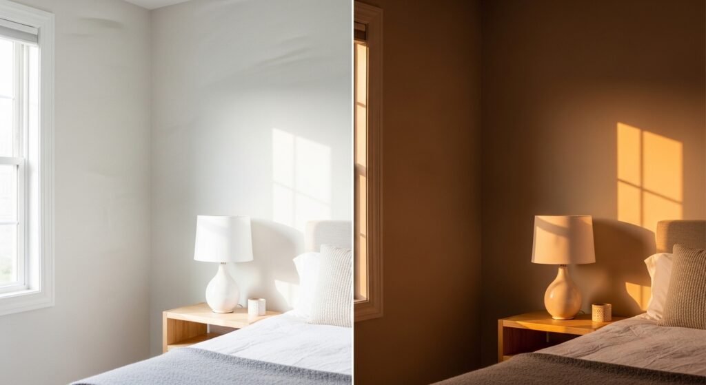
Lighting is the most important factor when choosing a paint color. It can make a color look totally different from one room to the next. Natural Linen Sherwin Williams is no exception to this rule. You need to see how the sun hits your walls at different times of the day. The color will change as the sun moves across the sky.
- Morning light tends to be cooler and can make the color look more neutral.
- Afternoon light is very warm and will bring out the golden and yellow tones.
- Artificial light from warm bulbs will emphasize the cozy beige side of the paint.
- Natural lighting will always show the most accurate version of the shade.
Natural Light Influence
North-facing rooms have a cooler, bluish light that can make warm colors look flatter. In these rooms, Natural Linen Sherwin Williams will look like a very balanced, soft neutral. South-facing rooms get warm, intense light all day. In these spaces, the color will glow and show off its yellow and cream base. East and west-facing rooms will see the color change drastically from morning to night.
Artificial Lighting
The light bulbs you choose will change how your walls look at night. If you use 2700K bulbs, which are very warm, the color will look much more tan or golden. If you use 4000K daylight bulbs, the color will look more like a crisp, light cream. Most designers suggest a 3000K bulb for the best balance with this paint color. It keeps the warmth without making the room look too orange.
Time of Day Shifts
You should watch your paint samples at different times of the day. In the morning, the color might look very bright and airy. By the evening, it might turn into a cozy and deep beige. This “breathing” quality is what makes the color so interesting. It never feels static or boring because it reacts to the world around it. It makes your home feel more connected to the natural rhythms of the day.
Is Natural Linen Warm or Cool?
Natural Linen Sherwin Williams is definitely a warm neutral. It is designed to bring a sense of heat and comfort to a space. It is the perfect safe middle ground for anyone moving away from cool tones. It doesn’t have the “dirty” look that some old beiges have. It feels very clean and intentional.
- Warm neutral describes this color perfectly as it avoids all blue or cool gray tones.
- Modern feel comes from the balanced pigments that don’t look like dated 90s tans.
- Safe choice for open floor plans because it is easy to live with for a long time.
- Cozy vibe is immediate as soon as you paint the first wall.
The Warm Neutral Verdict
The verdict is that this is one of the best warm neutrals on the market today. It provides enough warmth to feel inviting but stays light enough to feel modern. It is a great choice for families who want a home that feels like a hug. It works well with many different wood tones and furniture styles. You won’t regret choosing this if you want to avoid a cold-feeling house.
Modern vs. Dated
Many people are afraid of beige because it reminds them of dated homes from thirty years ago. Natural Linen Sherwin Williams is different because of its high LRV and clean base. It doesn’t have the heavy gold or brown undertones that made old paints look muddy. It feels fresh and works perfectly with the “organic modern” style that is popular now. It is a timeless choice that will still look great ten years from now.
Sherwin Williams Natural Linen vs. Accessible Beige
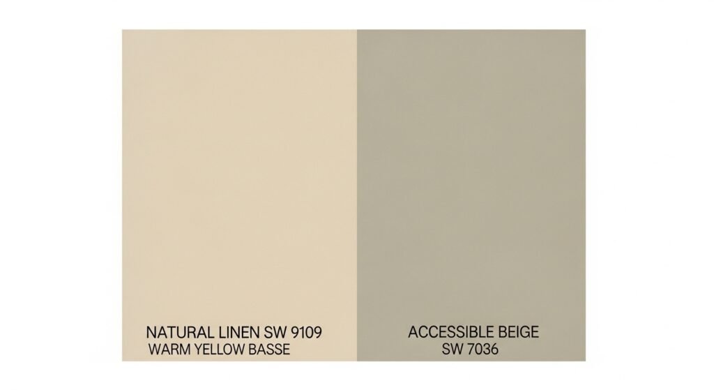
People often compare Natural Linen to the famous Accessible Beige. While they are both popular neutrals, they are quite different. Accessible Beige is often called a “greige” because it has a lot of gray in it. Natural Linen is a much warmer, yellow-based beige. Choosing between them depends on how much warmth you really want in your home.
- Natural Linen is lighter and brighter with an LRV of 66.
- Accessible Beige is a bit darker and more muted with a lower LRV.
- Undertones in Natural Linen are yellow and cream, while Accessible Beige is more gray-green.
- Category for Natural Linen is the yellow family, but Accessible Beige is the neutral umbrella.
Direct Comparison
When you put them side by side, Natural Linen looks much “sunnier”. Accessible Beige looks much more “shadowy” or gray. If you have a room with very little light, Accessible Beige might look a bit dingy. Natural Linen will help bounce more light around because it is lighter. It is the better choice if you want to avoid gray entirely.
The Undertone Battle
The battle of undertones is where these two really separate. Natural Linen’s yellow base makes it feel very organic and earthy. Accessible Beige’s gray base makes it feel more industrial or transitional. If your furniture has a lot of warm wood, Natural Linen will likely be the winner. If you have a lot of cool blues and grays, Accessible Beige might fit better.
LRV Comparison
Natural Linen’s LRV of 66 makes it significantly brighter than Accessible Beige. This difference is very noticeable in dark hallways or basements. A higher LRV means less work for your light fixtures. It helps the space feel more open and less confined. For most modern homes, the extra brightness of Natural Linen is a major plus.
Best Practices for Using Natural Linen in Your Home
Using Natural Linen Sherwin Williams correctly involves thinking about the whole room. You can use it on walls, trim, or even cabinets. It is a very flexible color that doesn’t demand too much attention. It works best when it is allowed to be the calm backdrop for your life. You can use it to create a very cohesive and peaceful environment.
Using Natural Linen on Walls
Putting this color on your walls is the most common way to use it. It creates a soft and enveloping feel that works in every room from the living room to the nursery. It is a great “workhorse” color for big, open-concept spaces. It ties different areas together without feeling overwhelming. It is much more interesting than a basic white wall.
Natural Linen on Doors and Trim
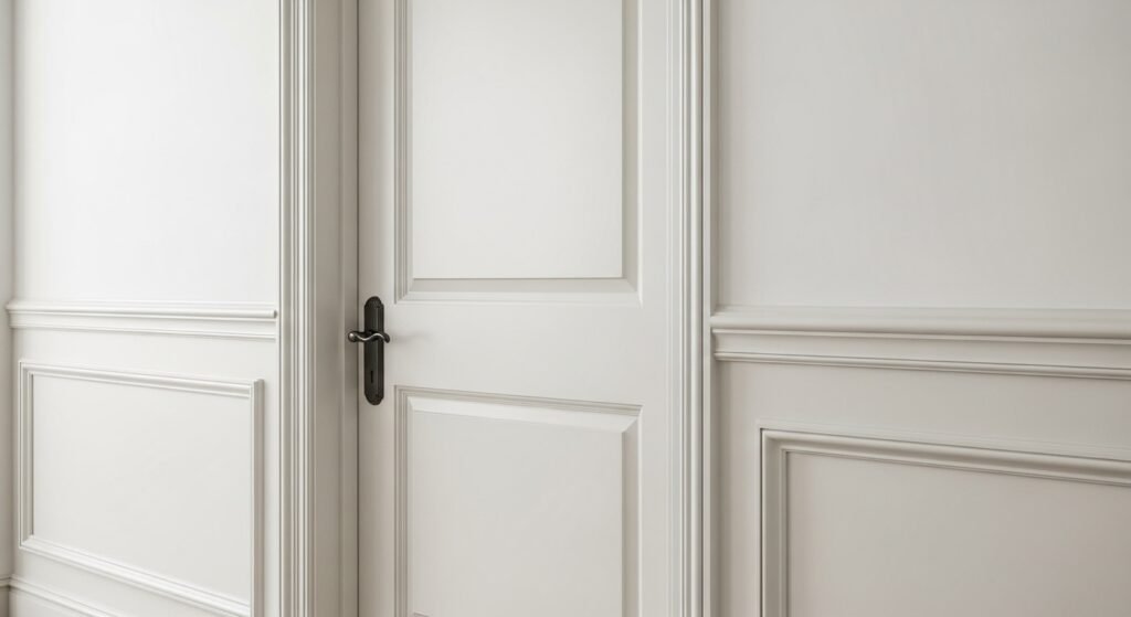
One cool trend is using Natural Linen for doors and trim work. This creates a very sophisticated and high-end look. You can pair it with white walls for a subtle bit of contrast. This is often called a “reverse” trim look. It makes the architectural details of your home stand out in a soft way. It is a great way to add character to a standard suburban house.
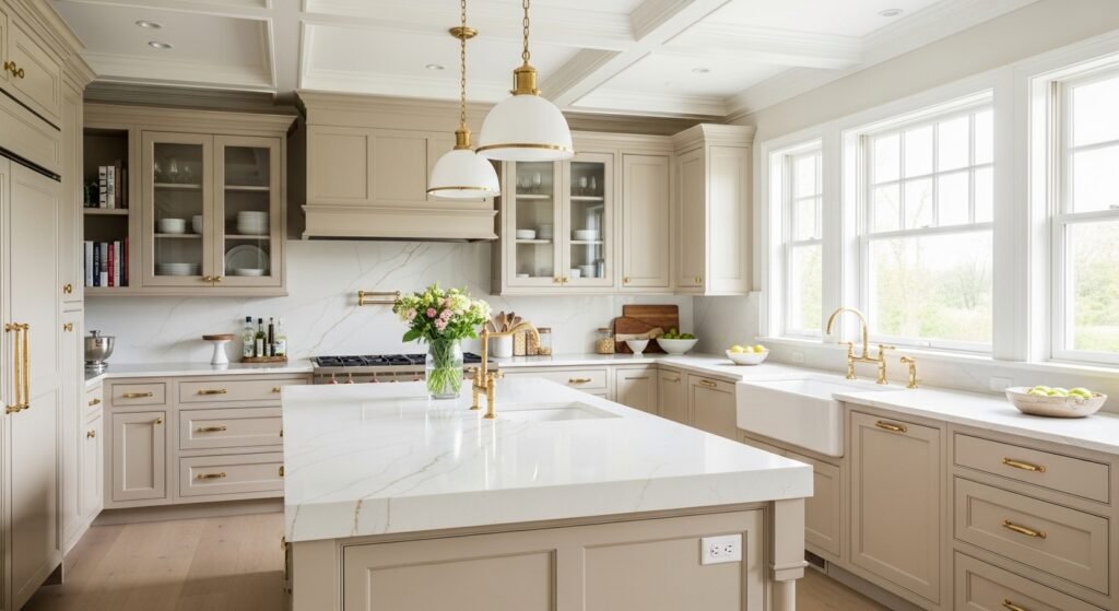
Kitchen and Cabinetry Applications
Natural Linen Sherwin Williams looks amazing on kitchen cabinets. It gives a “lived-in luxury” feel that is very popular in high-end design. It pairs beautifully with marble or white quartz countertops. It is a softer alternative to bright white cabinets which can sometimes feel too sterile in a kitchen. It makes the heart of the home feel very warm and welcoming.
Which Whites Pair Best with Natural Linen?
Choosing the right white to pair with Natural Linen is crucial. If you pick a white that is too cool, it will make the beige look dirty. You need a white that has a bit of warmth to match the vibe of the walls. Sherwin Williams has several great options that work perfectly every time.
- Alabaster (SW 6241) is a top-tier choice because it is a very soft, creamy white.
- Greek Villa (SW 7551) is another favorite that provides a seamless, warm transition.
- Pure White (SW 7005) is a bit cleaner and provides a nice contrast without being too stark.
- Shoji White (SW 7042) is a very warm white that almost blurs the line with the beige.
SW Alabaster (6241)
Alabaster is one of the most popular whites for a reason. It has a tiny bit of warmth that keeps it from looking like a hospital wall. When you use it with Natural Linen, the two colors flow together beautifully. It is perfect for trim, baseboards, and ceilings. It creates a soft transition that is very easy on the eyes.
SW Greek Villa (7551)
Greek Villa is even creamier than Alabaster. It is the go-to white for many designers who use Natural Linen Sherwin Williams. In the author’s lake house, Greek Villa was used on the walls while Natural Linen was on the trim. This created a very high-end, tonal look that feels incredibly expensive. It is a foolproof combination for any home.
SW Pure White (7005)
If you want a bit more “pop” for your trim, Pure White is the answer. It is a neutral white that doesn’t lean too hard in any direction. It provides a crisp border for the warm Natural Linen walls. It is a great choice if you want your home to look very clean and updated. It is less “creamy” than the other options but still not cold.
The Danger of Cool Whites
You should really avoid using very cool, blue-toned whites with this paint. Whites like High Reflective White or Extra White can clash with the warmth of Natural Linen. The contrast can be too sharp and make the beige look like it has a yellow stain. Always lean toward the warm side of the white spectrum for the best results.
Building a Color Palette: Complimentary Shades
A great paint color is only part of the puzzle. You also need a full palette of colors that work together. Natural Linen Sherwin Williams is very friendly and plays well with many different shades. You can go for a coastal look, an earthy vibe, or a minimalist aesthetic. Here are some of the best colors to pair with it.
- Topsail (SW 6217) is a light blue that creates a perfect coastal feeling.
- Acacia Haze (SW 9132) is a muted green-gray that feels very earthy and natural.
- Pewter Green (SW 6208) is a deep, dark green that provides amazing contrast.
- Shoji White (SW 7042) can be used as a lighter accent color in the same room.
The Coastal Palette
To get that lake house or beach vibe, pair Natural Linen with soft blues and whites. Using colors like Topsail or Watery will make the room feel like a breath of fresh air. This palette is all about relaxation and light. It works best with light wood floors and plenty of natural textures like woven baskets.
The Earthy/Nature Palette
If you want a more grounded feel, look toward greens and terracottas. Acacia Haze is a fantastic partner for Natural Linen because it brings in a sense of the outdoors. This combination feels very modern organic. It is perfect for bedrooms or home offices where you want to feel focused and calm.
The Soft Minimalist Palette
For a clean, “quiet luxury” look, keep everything in the same color family. Use Natural Linen with Shoji White and Balanced Beige. This tonal approach creates a very peaceful environment. It is all about the subtle differences in shade and texture. This palette looks very high-end and is very popular in modern home design.
Flooring Considerations and Coordination
The floor is the “fifth wall” and it takes up a lot of visual space. You need to make sure your flooring doesn’t fight with your walls. Natural Linen Sherwin Williams is generally very easy to match with floors. It has enough warmth to work with wood but enough neutrality to work with stone.
Natural Wood Flooring
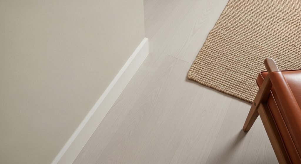
White oak is the absolute best wood to pair with this paint. The light, wheat-like tones of white oak perfectly match the beachy beige of the walls. It creates a very cohesive and airy look. If you have dark walnut or espresso floors, the paint will provide a beautiful, light contrast. The only tricky area is red oak, which can sometimes bring out too much pink in the beige.
Tile and Stone Pairings
Natural stone like travertine or limestone looks amazing with this color. They share the same earthy, organic DNA. For a more modern look, you can pair it with creamy marbles that have warm veining. In mudrooms or bathrooms, dark slate tiles provide a grounded base that makes the walls look even lighter.
Carpet and Luxury Vinyl Plank (LVP)
If you are using LVP, look for shades like “Fresh Oak” which maintain that light and bright vibe. For carpet, go with a textured loop or a “linen” style weave. Avoid carpets that are too gray, as they can make the walls look yellow. A warm, oatmeal-colored carpet is usually the safest and most beautiful bet.
Furniture and Textile Selection
The furniture you put in the room will change how the paint feels. Since Natural Linen is a soft neutral, it lets your furniture take center stage. You can use it to highlight a bold piece or to create a very calm, monochromatic space.
Fabric Textures and Materials
Linen and bouclé fabrics are the perfect match for this paint. They mimic the texture and feel of the color’s name. Cognac or tan leather accents also look great because they pull out the richness of the beige. For a bit of depth, you can add velvet pillows in navy or forest green.
Furniture Styles
In an organic modern home, use light wood frames and soft, curved furniture. The paint will enhance the natural feeling of the room. If you like traditional style, the warm walls will highlight your antique wood pieces beautifully. Even industrial spaces can benefit from this color by softening the cold metal and concrete elements.
Hardware and Metal Finish Guide
Don’t forget about your light fixtures and cabinet pulls. The metal you choose will act as jewelry for your room. Natural Linen Sherwin Williams works with almost any finish, but some are better than others.
- Warm Brass or unlacquered brass enhances the natural glow of the paint.
- Matte Black provides a sharp, modern contrast that looks very updated.
- Brushed Nickel is a softer alternative to chrome that feels more high-end.
- Champagne Bronze is a very elegant choice for a spa-like bathroom.
Natural Linen Across Architectural Styles
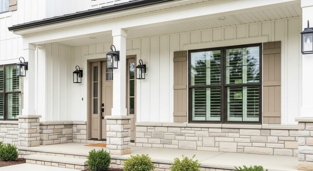
This color isn’t just for beach houses. It works in many different types of homes across the USA. Its versatility is why it is becoming a go-to for professional designers.
- Coastal & Lake House is the most obvious choice for this airy and relaxed color.
- Modern Farmhouse uses it as a softer alternative to the “all-white” look.
- Spanish Colonial homes love this shade because it complements stucco and terra cotta.
- Mid-Century Modern spaces use it as a neutral canvas for bold, funky furniture.
Real-World Application: The Lake House Case Study
One designer used Natural Linen Sherwin Williams in their lake house to get a coastal feeling. They paired it with Greek Villa on the walls to keep things light. Natural Linen was used on the doors and the trim for a touch of warmth. The result was a home that felt like a permanent vacation spot. It shows how the color can be used in a sophisticated, layered way.
Color-Matching and Accessibility
If you don’t have a Sherwin Williams store nearby, you can still get this look. Most paint stores like Benjamin Moore or Behr can do a custom color match. You just need the name or the Hex code #DFD3C3. Be careful, though, because the base paint matters. A match might not be 100% perfect, so always test it first.
Tips for Success with Beige Paint
Beige can be tricky, so you need a plan before you start painting. It is all about the details and the lighting. If you follow a few simple steps, you will get a great result every time.
The Importance of Sampling
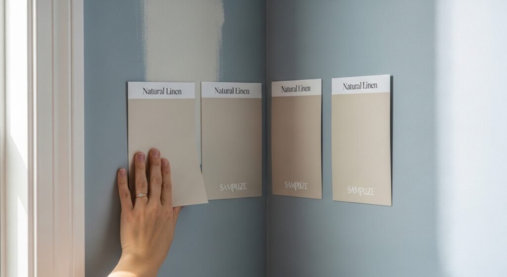
Never buy a whole gallon of paint based on a tiny paper chip. Use “peel and stick” samples like Samplize. They are made with real paint and you can move them around the room. Watch the sample in the corners of the room where shadows fall. This is where you will see the true character of the color.
Room-by-Room Breakdown
In the living room, use it to create a welcoming space for guests. In bedrooms, it provides a serene and restful backdrop for sleep. For bathrooms, it gives a clean, spa-like warmth that isn’t too cold. Even entryways can benefit from this color by setting a soft and inviting tone as soon as you walk in.
Who is Sherwin Williams Natural Linen For?
This color is for anyone who wants a home that feels warm and modern. It is for the person who is tired of gray but isn’t ready for bold colors. It is for fans of the “clean girl” or “organic modern” aesthetic. If you want a timeless choice that makes your home feel brighter and more inviting, this is the paint for you.
Conclusion: Why Natural Linen is a Timeless Choice
Sherwin Williams Natural Linen is more than just a paint color. It is a way to make your home feel grounded, bright, and incredibly cozy. Its high LRV and warm undertones make it one of the most versatile neutrals on the market. Whether you are doing a full renovation or just a weekend room transformation, this color is a winner. It will turn any space into a beautiful, sun-kissed retreat.
- Versatility is the biggest strength of this beachy beige.
- Warmth without the muddy look is what sets it apart from other paints.
- Timelessness ensures that your home will look great for years to come.
- Brightness is guaranteed thanks to the reflective power of LRV 66.
FAQs About Sherwin Williams Natural Linen
Is Natural Linen suitable for the exterior of a house?
Yes, it is a fantastic choice for home exteriors, especially for siding or stucco. Because it has an LRV of 66, it will look much brighter and closer to an off-white under direct sunlight. It provides a warm, inviting curb appeal that feels more organic than a stark, bright white.
Can I use Natural Linen in a basement with no windows?
You can, but you must be careful with your artificial lighting. In a windowless basement, the yellow undertones may become more prominent because there is no cool natural light to balance them out. Use bulbs in the 3000K to 3500K range to keep the color looking like a clean beige rather than a dingy yellow.
Does Natural Linen work for a nursery or kids’ room?
This is a top-tier choice for nurseries because it creates a calm and gender-neutral environment. It pairs beautifully with soft pastels, muted earth tones, and natural wood cribs. It provides a serene backdrop that can grow with the child as their room decor changes over the years.
How does Natural Linen compare to Benjamin Moore Shaker Beige?
Shaker Beige is much darker and carries a heavier orange-brown undertone compared to Natural Linen. Natural Linen is significantly lighter and feels more modern and airy. If you want a classic tan, go with Shaker Beige; if you want a fresh, beachy vibe, Natural Linen is the winner.
What is the best ceiling color for Natural Linen walls?
The safest and most common choice is a flat white or a slightly warm white like Sherwin Williams Alabaster. However, if you want a cozy, high-end look, you can paint the ceiling the same color as the walls in a flat finish. This makes the ceiling feel higher because the line where the wall ends is blurred.
Is Natural Linen a good color for staging a home to sell?
It is one of the best colors for home staging. It feels warmer and more “homey” than gray but remains neutral enough to appeal to almost any buyer. It makes spaces look clean, well-lit, and well-maintained, which are all key factors in selling a property.
Does this color look good on bathroom vanities?
Yes, it is a beautiful choice for cabinetry if you want a break from white or navy. It looks especially sophisticated when paired with a white marble countertop and brushed gold hardware. It gives the bathroom a high-end furniture feel rather than a standard utility look.
How does Natural Linen look next to red brick fireplaces?
It works surprisingly well with red brick because the warmth in the paint complements the warm tones in the clay. It helps soften the look of a heavy brick fireplace and makes the room feel more integrated. The slight yellow in the paint prevents the brick from looking too orange by comparison.
Can Natural Linen be used in a laundry room?
Laundry rooms often lack windows, and Natural Linen helps keep the space from feeling like a closet. It makes the room feel clean and organized. It pairs perfectly with white appliances and woven laundry baskets for a cohesive, functional look.
Is Natural Linen considered a “Greige” paint?
While some people lump it in with greiges, it is truly a warm beige. A true greige, like Agreeable Gray, has more visible gray or green pigments. Natural Linen stays firmly in the cream-beige-yellow family, making it much warmer than your average greige.
What sheen is best for Natural Linen in a high-traffic hallway?
For hallways, an eggshell or satin finish is best. These sheens provide enough durability to be wiped down if there are scuffs or fingerprints. Because Natural Linen is a lighter color, a slight sheen will also help bounce light down the length of a long hallway.
How does it look against dark wood trim?
Natural Linen looks stunning against dark wood, such as walnut or stained oak. The light walls provide a beautiful contrast that makes the wood grain pop. It is a great way to modernize a home that has a lot of traditional dark wood architectural details.
Does Natural Linen look pink in certain lights?
In rare cases, particularly during sunset or in rooms with very warm, red-toned wood floors, a slight pinkish-peach glow can appear. This is due to the red pigments in the RGB formula. Most users find this warmth pleasant rather than distracting.
Is Natural Linen too light for an accent wall?
It is usually too light to be a stand-alone accent wall if the other walls are white. It works best when used on all four walls to create a cohesive mood. If you want an accent wall, consider using a darker shade like SW Balanced Beige or a deep green like SW Pewter Green.
What color curtains go with Natural Linen walls?
For a seamless look, go with linen or cotton curtains in an off-white or oatmeal color. If you want contrast, navy blue, olive green, or even a charcoal gray can look very striking against the warm beige background.
Does it hide imperfections on old walls?
Because it is a light color with a decent amount of reflection, it does not hide major flaws as well as a darker, matte color would. However, because it is not a stark white, it is more forgiving than a bright gallery white. Using a flat or matte finish will help hide bumps and textures.
Is Natural Linen a good choice for kitchen backsplashes?
If you are choosing a tile for the backsplash, a cream or off-white subway tile is a great match. Avoid stark white tiles that might make the Natural Linen paint look too yellow. A natural stone backsplash with beige veining is also a perfect companion.
How does it react to “cool” North-facing light?
In North-facing rooms, the light is bluish and weak. Natural Linen will hold its warmth better than most grays, but it will look more like a muted, sandy neutral. It won’t look as “sunny” as it does in a South-facing room, but it will still prevent the room from feeling cold.
Can I use Natural Linen for a “Monochromatic” design?
Absolutely. This color is a staple for monochromatic rooms. You can layer different textures like a wool rug, a linen sofa, and velvet pillows, all in varying shades of beige and cream. This creates a very sophisticated and calming “Quiet Luxury” aesthetic.
Is it a good color for a home office?
Natural Linen is an excellent office color because it is not distracting. It provides a warm, steady environment that is easy on the eyes during long hours of work. It also provides a professional and clean background for video calls.