")
The search for the perfect neutral can feel like a never-ending quest. You want something that feels warm but not yellow. You want something modern but not cold like a sterile hospital room. Enter Sherwin Williams taupe of the morning. This color is a real game-changer in the world of interior design. It belongs to the exclusive Emerald Designer Edition. This means it has a level of sophistication that is hard to beat. Many homeowners are ditching the basic grays for something with more soul. This color offers exactly that kind of organic vibe. It is soft, stony, and looks amazing in almost any home. If you want a space that feels cozy yet airy, this is your color.
Introduction to Sherwin Williams Taupe of the Morning
Finding a paint that works in every room is like finding a needle in a haystack. Sherwin Williams’ taupe of the morning makes that search much easier for everyone. This shade is a beautiful blend of beige and gray. It is often called a “stony” neutral because it feels very natural. Unlike some older beiges, it does not look dated or muddy. It has a fresh and clean look that fits today’s styles. Many people use it to create a peaceful sanctuary in their homes. It is the kind of color that makes you want to curl up with a book. You will find that it brings a sense of calm to busy living areas.
Defining the Color
Taupe of the morning is a unique neutral that bridges two worlds. It sits right in the middle of the warm and cool spectrum. Most people see it as a very light tan or a warm gray. It has an organic feel that reminds you of smooth river stones. This makes it perfect for a modern farmhouse or a minimalist home. It provides enough color to see a difference against white trim. However, it is light enough to keep things feeling very open. It is a sophisticated choice for someone who wants more than just plain white. You get the warmth of a traditional home with a modern twist.
The Emerald Designer Edition
This specific color is part of the Sherwin Williams Emerald Designer Edition line. This collection is known for having very fine pigments and excellent coverage. You usually find these colors in a special fan deck at the paint store. Because it is a designer color, it feels more curated and intentional. It was created to offer higher-end options for interior designers and picky homeowners. The paint itself is high quality and provides a very smooth finish. It is durable enough for high-traffic areas like hallways or kitchens. Choosing a designer color means you are getting a tried-and-true shade. It has been tested to look great in a variety of professional settings.
First Impressions
When you first see the taupe of the morning on a wall, it feels very inviting. It is a trending alternative to the “millennial gray” that everyone is tired of. People are moving toward warmer colors that feel more like home. This shade provides that warmth without feeling heavy or dark. It looks especially stunning in large, open-concept spaces. The color has a way of making high ceilings feel a bit more intimate. It creates a backdrop that lets your furniture and decor really shine. Most homeowners fall in love with its soft and airy presence immediately. It is a timeless choice that won’t go out of style next year.
Technical Specifications and Color Profile
Understanding the “math” behind a paint color helps you predict how it will look. Every paint has a specific DNA that determines its behavior on your walls. For taupe of the morning, this DNA is quite balanced and versatile. It is not just a random mix of colors in a can. It follows a specific formula that ensures it stays bright and clean. Knowing these specs helps you compare it to other popular neutrals on the market. It also tells you how much light it will reflect back into your room. This is key for small spaces or rooms with tiny windows. Let’s look at what makes this color tick under the surface.
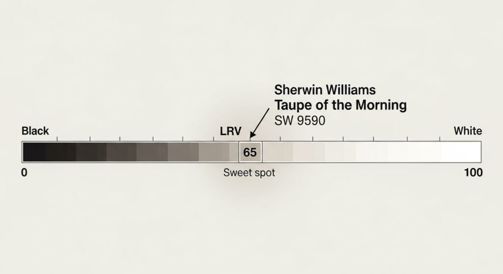
Light Reflectance Value (LRV)
The Light Reflectance Value, or LRV, is a scale from 0 to 100. A score of 0 is absolute black, and 100 is pure white. Taupe of the morning has an LRV of 65. This is considered the “sweet spot” for interior paint colors. It is light enough to keep a room feeling bright and spacious. However, it has enough pigment to provide a nice contrast against white trim. At 65, it won’t wash out completely in a very bright room. It still holds its shape and color even when hit with direct sun. This makes it a very safe bet for most standard-sized rooms in a house.
The Taupe Definition
A true taupe is a mix of gray and brown with a hint of another color. Taupe of the morning fits this definition perfectly because it isn’t quite a greige. Greiges are usually more gray and green-leaning. This color feels more like a soft mushroom or a sandy beach. It has a complexity that makes it look different throughout the day. In some lights, you see the gray, and in others, the warm tan peaks through. This depth is what makes it a designer favorite for high-end projects. It provides a rich look that flat colors simply cannot achieve. It feels expensive and well-thought-out on any surface.
Warmth vs. Coolness
This color is classified as a warm-leaning neutral. However, it is a very “clean” warmth that does not turn orange. It feels cozy like a warm blanket but remains fresh and modern. The gray content keeps the warmth in check so it doesn’t get too loud. This balance is why it is called a “versatile” neutral by many pros. It can work with cool blues or warm wood tones quite easily. If you have a room that feels a bit cold, this can heat it up. If your room is already very warm, it acts as a soft anchor. It is a chameleon that adapts to the mood of the space.
Identifying the Complex Undertones
Undertones are the “secret” colors hiding beneath the surface of your paint. They are the reason a gray can suddenly look blue or green on your wall. Taupe of the morning has some very specific undertones you need to know about. These colors are what give the paint its unique character and charm. If you don’t account for them, you might be surprised by the final result. Most taupes have a tendency to lean in a certain direction when applied. Understanding this helps you pick the right furniture and rugs to match. It also helps you avoid any “color disasters” during your renovation.
The “Hidden” Pink-Violet Influence
The most important thing to know is its pink-violet undertone. Most taupes are created using a bit of red or violet pigment. This gives them that “stony” and organic feel that people love. In most homes, this undertone stays hidden and just provides warmth. However, it is there, and it is part of what makes the color so pretty. It prevents the paint from looking like a boring, flat beige. This violet influence is what gives it a sophisticated, designer edge. It makes the color feel more alive and less like a standard builder grade. You should expect this slight “blush” to appear in certain situations.
The Risk of “Flashing”
”Flashing” is when a color suddenly shows its undertone very strongly. For taupe of the morning, this usually means it looks a bit more purple. This often happens in rooms with very specific lighting conditions. It might only happen for an hour or two during the day. If you have lots of greenery outside, it can also affect the color. The green from the grass can sometimes push the pinks to stand out more. It is not a bad thing, but it is something you should be aware of. Most people actually enjoy the slight change as it adds interest to the room. It makes the wall feel more like a piece of art than a flat surface.
Avoiding the “Muddy” Look
Many greiges can look a bit “muddy” or “swampy” because of green undertones. The Taupe of the morning stays cleaner because it lacks those green pigments. It remains a very clear and crisp neutral even in darker spaces. This is a huge advantage if you want a clean-looking home. It doesn’t get that “dirty” look that some tans have in the shadows. Instead, it just looks like a deeper version of its beautiful self. This clarity is why it works so well in modern and transitional homes. It keeps the energy of the room high and the vibes very positive. You get a neutral that feels pure and intentional in every corner.
The Impact of Lighting on Taupe of the Morning
Lighting is the most powerful force that changes how paint looks. It can make a color look totally different from one room to the next. The Taupe of the morning is very sensitive to the light it receives. Whether you have big windows or small lamps, the light will play with the paint. You need to look at your samples at different times of the day. This ensures you love the color in the morning and at night. Every home has a unique “light profile” that will affect the final result. Let’s break down how different directions of light impact this specific shade.
North-Facing Light
North-facing rooms get a very cool, blue-ish light throughout the day. This light tends to bring out the cool side of any paint color. For taupe of the morning, this cool light often highlights the violet-gray side. The paint might look a little more “stony” and a bit less warm. It won’t look cold, but it will definitely feel more neutral. This is a great look if you want a very calm and serene bedroom. The blue light and the violet undertone play very nicely together. It creates a mood that is very relaxing and easy on the eyes. Just be prepared for it to look a bit more “gray-taupe” in these rooms.
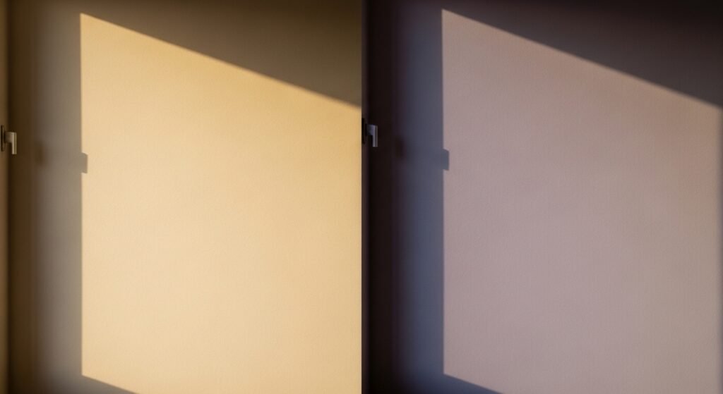
South-Facing and Bright Sunlight
South-facing rooms are a paint color’s best friend. They get warm, golden light for most of the day. This warm light helps neutralize the violet undertones in the paint. In this lighting, the taupe of the morning looks like a soft, creamy neutral. It glows with a beautiful warmth that feels very high-end. It is the perfect setting for this color to show its true potential. The sunlight makes the tan pigments pop and keeps the room feeling bright. It looks very “clean” and sophisticated under the bright sun. You will likely see the least amount of “purple” in these sunny spaces.
East and West Transitions
East-facing rooms are bright in the morning and shadowy in the evening. West-facing rooms are the opposite, with warm, orange light in the late afternoon.
- Morning Light: In the early hours, the color will look crisp and very light.
- Afternoon Glow: In a West-facing room, the orange sunset light can make it look very warm.
- Evening Shadows: As the sun goes down, the color will deepen and look more “mushroom-like.”
- Mid-Day Shift: During the middle of the day, it usually looks like its most neutral self.
Artificial Lighting Considerations
The bulbs you choose in your lamps will also change the color.
- Warm White Bulbs: These will bring out the cozy, beige side of the paint.
- Cool White Bulbs: These will emphasize the gray and violet undertones.
- Daylight Bulbs: These try to mimic natural light and show the color accurately.
- Smart Bulbs: You can adjust the “warmth” of your light to make the paint look exactly how you want.
Working with Fixed Elements and Materials
You probably aren’t replacing everything in your house just to paint. You have floors, cabinets, and counters that are staying put. These are called “fixed elements,” and they are very important. They act like a background for your new paint color. The Taupe of the morning needs to get along with these existing materials. If they clash, the whole room will feel “off.” Luckily, this color is quite friendly and works with many finishes. It especially loves natural textures and organic materials. Let’s see how it plays with common home features.
Matching with Flooring
Your floor is the largest surface next to your walls. It has a massive impact on how your paint looks.
- Cool-Toned Wood: Gray or ash-toned woods look amazing with this color.
- Natural Stone: Slate, marble, or travertine tiles are a perfect match.
- Light Oak: Very light, modern oak floors keep the look airy and fresh.
- Medium Browns: Traditional brown wood floors provide a classic and cozy contrast.
Countertops and Cabinetry
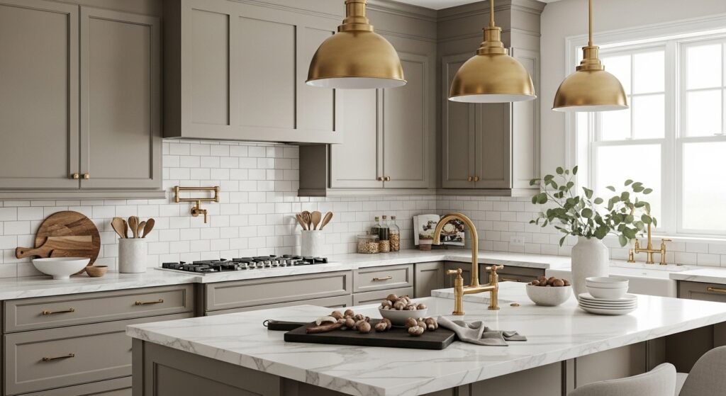
In a kitchen or bathroom, the counters are a big focal point. Taupe of the morning is a fantastic partner for many popular styles. It looks very elegant next to white quartz or marble with gray veins. The gray in the stone talks to the gray in the paint. If you have dark granite, this color can help lighten up the space. It also works well on the cabinets themselves for a trendy “mushroom” kitchen. It provides a soft alternative to the standard white cabinet look. Many people use it on an island to create a nice accent. It feels organic and high-end in a culinary space.
Compatibility with Hardware
The “jewelry” of your home—your knobs and faucets—can change the vibe.
- Matte Black: This creates a modern and sharp contrast against the soft taupe.
- Brushed Gold: This adds a touch of luxury and brings out the warmth.
- Polished Nickel: This is a classic choice that leans into the sophisticated side.
- Oil Rubbed Bronze: For a more traditional or rustic feel, this dark hardware works well.
Best Trim and Ceiling Paint Pairings
Choosing a trim color is just as important as the wall color. The trim acts as a frame for your beautiful new paint. If you pick the wrong white, the walls can look dirty or yellow. The Taupe of the morning needs a clean white to help it pop. You want a white that shares a similar “clean” vibe. Most people prefer a white that isn’t too creamy or too blue. The right trim can make your ceilings look higher and your room look polished. Here are the best options from Sherwin Williams to pair with this shade.
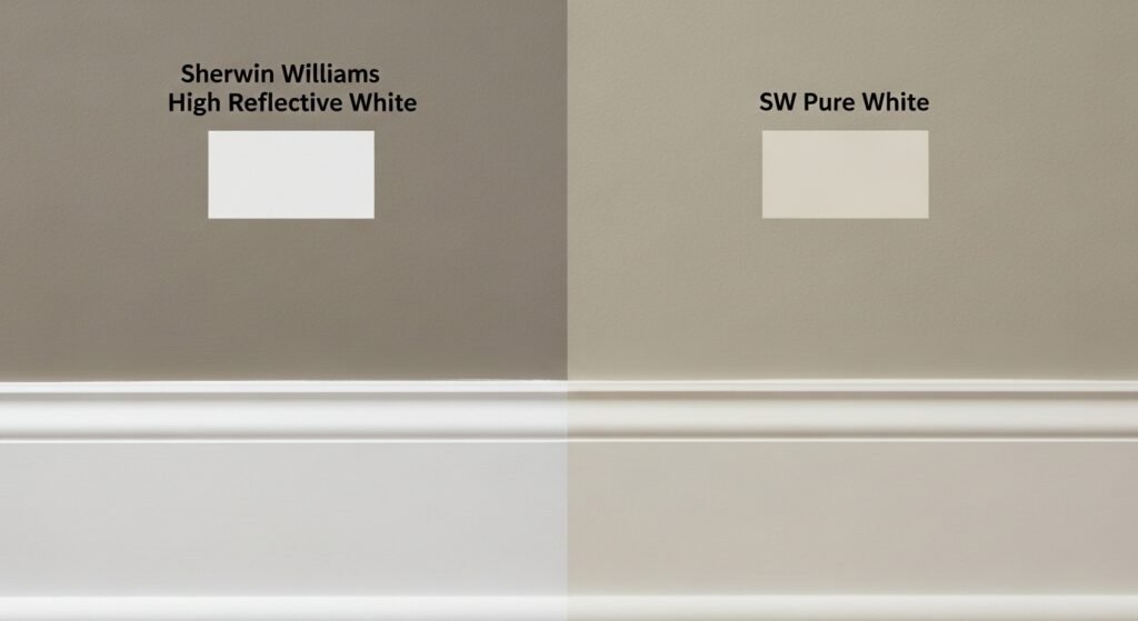
High Reflective White (SW 7757)
If you want a very modern and “crisp” look, this is the one. It is a very pure white with almost no undertones of its own. It provides a sharp contrast against the taupe of the morning. This makes the wall color look very intentional and clear. It is great for a minimalist or contemporary home. It keeps the energy of the room very high and bright. You will clearly see the difference between the trim and the walls. It is a foolproof choice for anyone who loves a clean aesthetic.
Pure White (SW 7005)
Pure White is a top favorite because it offers a soft look without being too bright. Its subtle warmth prevents the room from feeling cold or like a clinical hospital. This shade pairs perfectly with the cozy tones found in Taupe of the Morning. Many homeowners pick it as a safe option that brings a relaxed vibe to any space. It creates a beautiful contrast that highlights your walls without overwhelming the overall design.
Alabaster (SW 7008)
Alabaster is a very famous, creamy white. However, you should use it with caution here. Because it is quite warm, it can sometimes make the violet in the walls look stronger. It can also make the trim look a bit yellow next to the “stony” taupe. If you love a very warm and cozy look, it can still work. Just be sure to test them together in your specific lighting. Some people find the combination a bit too “muddy” for their taste. It works best in traditional homes where a warm glow is desired.
Monochromatic Approaches
A very trendy look right now is called “color drenching.” This is when you paint the walls, trim, and even the ceiling the same color.
- Seamless Look: It makes a small room feel much larger and taller.
- High-End Feel: It creates a very custom, designer look that feels expensive.
- Simplified Choices: You don’t have to worry about finding a matching white.
- Cozy Atmosphere: It wraps the whole room in a soft, soothing hug.
Comparative Analysis: Taupe of the Morning vs. Popular Neutrals
It helps to see how this color stacks up against the “heavy hitters.” There are thousands of neutrals out there, but only a few are truly famous. Comparing them side-by-side helps you see the unique “personality” of each. You might think they all look the same on a tiny chip. However, on a large wall, the differences are huge. One might look green while the other looks purple. One might feel much darker in a small room. Let’s see how taupe of the morning compares to the biggest names in the business.
Taupe of the Morning vs. Accessible Beige
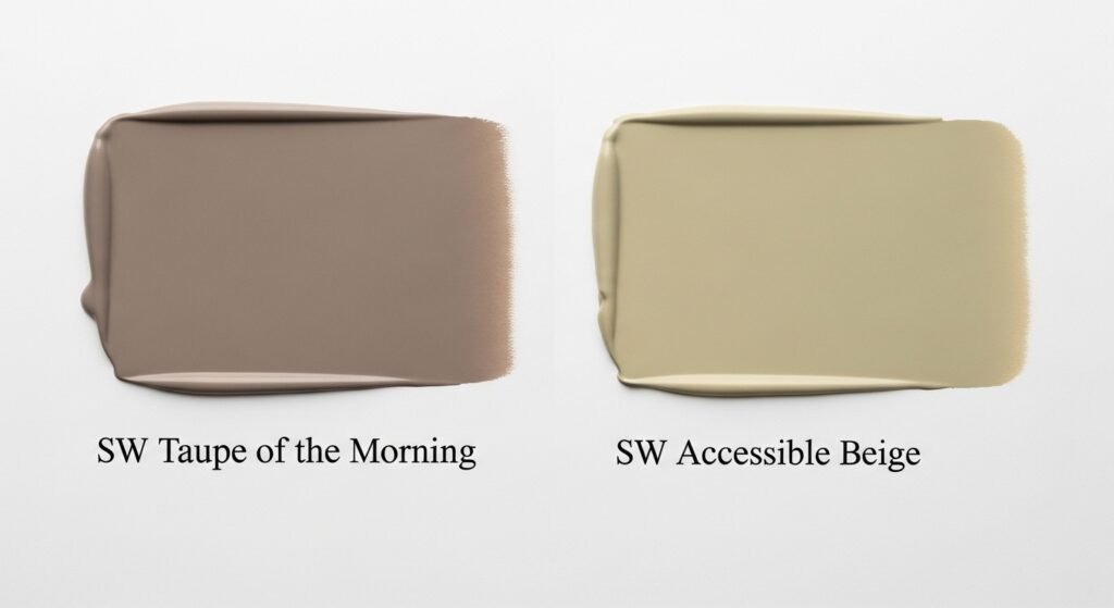
Accessible Beige is one of the best-selling colors of all time. However, it is a very different animal than taupe of the morning.
- Undertones: Accessible Beige has a definite yellow-green undertone.
- Cleanliness: Taupe of the morning looks “cleaner” and less muddy.
- Vibe: Accessible Beige is more of a traditional “greige,” while Taupe is more “stony.”
- Depth: Both have similar LRVs, but Taupe feels a bit more modern.
Taupe of the Morning vs. Balanced Beige
Balanced Beige is a much deeper and moodier color.
- Darkness: Balanced Beige is significantly darker and richer.
- Warmth: Balanced Beige leans much harder into the brown/tan side.
- Usage: Use Balanced Beige for a cozy den; use Taupe for a whole-house neutral.
- Weight: Balanced Beige feels heavier on the walls than the airy Taupe.
Taupe of the Morning vs. White Sesame
White Sesame is another beautiful light neutral from Sherwin Williams.
- Traditional Feel: White Sesame feels more like a classic, soft beige.
- Complexity: Taupe of the morning has more gray and violet, making it more complex.
- Modernity: Taupe of the morning is generally seen as the more “updated” choice.
- Contrast: White Sesame is a bit lighter and might offer less contrast against white.
Taupe of the Morning vs. 5 Best Light Taupes
There are many great taupes, but this one stands out for its clarity. It usually ranks high because it isn’t too “fleshy” or “pink.” Some taupes can look like a giant band-aid on your walls. Taupe of the morning avoids this by having enough gray to ground it. It is lighter than many standard taupes, which makes it more usable for average homes. It sits in a “Goldilocks” zone—not too dark, not too light. This balance is why it is often cited as a top-tier designer pick. It offers the sophistication of a taupe with the ease of a light neutral.
Application Ideas for Every Room
This color is a true workhorse that can go anywhere in your home. It isn’t just for one specific room type. Because it is neutral, it acts as a flexible foundation. You can change your decor style over the years, and the paint will still work. It moves easily from a nursery to a home office. It can handle the bright light of a kitchen or the shadows of a hallway. If you want a cohesive look, you can even use it throughout your entire house. Here is how to make it work in different spaces.
Kitchens
Kitchens are the heart of the home, and they deserve a great color.
- Cabinets: Use it on cabinets for a sophisticated, “mushroom” kitchen look.
- Walls: It looks great behind white cabinets and dark hardware.
- Island Accent: Paint just the island this color for a subtle pop of interest.
- Backsplash: It pairs perfectly with white subway tiles or natural stone.
Living Rooms
The living room is where you want people to feel welcome and relaxed.
- Open Concept: It is perfect for large spaces that flow into each other.
- Cozy Vibes: It provides a warm backdrop for movie nights and gatherings.
- Art Display: Its neutral nature makes it a perfect gallery wall for your art.
- Textured Decor: It loves linen sofas, wool rugs, and wood coffee tables.
Bedrooms
In the bedroom, you want a color that helps you wind down at night.
- Soothing Effect: The violet undertone adds a peaceful and restful quality.
- Light and Airy: It keeps the room feeling fresh and clean when you wake up.
- Versatile Bedding: It works with white, navy, sage green, or blush pink linens.
- Soft Lighting: Under warm lamps, it creates a very intimate and cozy mood.
Bathrooms
Bathrooms can often feel cold and sterile because of all the tile.
- Spa-Like: Taupe of the morning adds warmth and an organic, earthy feel.
- White Fixtures: It provides a soft contrast against white tubs and toilets.
- Natural Elements: It looks amazing with bamboo mats and wooden vanities.
- Vanity Color: It is a beautiful choice for a painted bathroom vanity.
Hallways and Entryways
These areas often lack natural light, making paint choice very tricky.
- Brightness: The LRV of 65 helps keep these transitional spaces from feeling like caves.
- Flow: It creates a nice transition between different rooms with different colors.
- Durability: In the Emerald Designer finish, it stands up to scuffs in high-traffic halls.
- Warm Welcome: It gives guests a soft and inviting first impression of your home.
Professional Tips for Success
Even the best paint color can fail if you don’t apply it correctly. There are a few “pro secrets” that make a huge difference in the final look. These tips help you avoid the common mistakes that homeowners make. You want your house to look like a professional designed it. By following these steps, you ensure you get the most out of your investment. Paint is cheap compared to furniture, but it’s hard to fix if you do it wrong. Take your time and do the prep work to get that perfect finish. Here is what the experts suggest.
The Importance of Large Scale Sampling
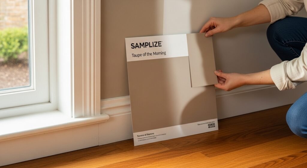
Never pick a color from a tiny 2-inch square in a store. You need to see the color on a large scale in your actual home.
- Samplize: Use these peel-and-stick samples to see the color on different walls.
- Large Boards: Paint a big piece of poster board and move it around.
- Check the Corners: See how the color looks in the dark corners of your room.
- Time of Day: Look at the sample in the morning, noon, and evening light.
The Role of a Color Consultant
If you are really stuck, a pro can help you feel confident. Experts like Jacob Owens specialize in finding the right “fixed element” matches. They can look at your floors and tell you exactly which taupe will work. This can save you hundreds of dollars in “wrong” paint and time. They understand the science of light and how it interacts with different finishes. A consultation is like insurance for your home’s aesthetic. It takes the guesswork out of the process. You get a cohesive plan that makes your whole house look intentional and polished.
Achieving Balance with Decor
You can actually “control” the undertones of your paint with your decor.
- Greenery: Adding plants can help balance out the pink-violet tones.
- Rugs: A rug with a bit of gray or tan can ground the wall color.
- Textiles: Use pillows and blankets to introduce complementary colors like soft blues.
- Wood Tones: Be careful with very orange woods; try to use more neutral or cool wood.
Conclusion and Final Verdict
Sherwin Williams taupe of the morning is a fantastic choice for the modern home. It offers a level of sophistication and warmth that is hard to find in basic neutrals. While it has a tricky violet undertone, it is also what makes it beautiful. If you have the right light and floors, it can transform your space into a designer sanctuary. It is versatile enough for any room and timeless enough to last for years. It is a clean, organic, and elegant paint that bridges the gap between old and new. If you are tired of gray and afraid of beige, this is your perfect middle ground.
Is it Right for Your Home?
Before you head to the store, do a final check of your space.
- Check Your Floors: Do you have “stony” or cool-toned floors?
- Check Your Light: Do you have plenty of natural light to keep it bright?
- Check Your Style: Are you looking for a modern, organic, or transitional vibe?
- Sample First: Have you seen a large sample in your specific room?
Summary of Benefits
This color is a winner for several key reasons.
- High LRV: It keeps rooms feeling spacious and light.
- Designer Quality: Part of the premium Emerald collection for a better finish.
- Sophisticated: Offers a complex look that feels much more expensive than a flat tan.
- Versatile: Works on walls, cabinets, and even exteriors in the right setting.
Frequently Asked Questions
Does Taupe of the Morning work for home exteriors?
Yes, it is a sophisticated choice for exterior siding or trim. Because natural sunlight is so intense, the color will appear much lighter and closer to an off-white or very light stone. It provides a beautiful, organic contrast against dark bronze windows or natural wood front doors.
What is the RGB value for SW 9590?
The RGB values for this specific shade are Red: 219, Green: 211, and Blue: 199. This numerical breakdown shows a higher concentration of red and green, which explains why the color maintains its warmth while the blue keeps it from becoming too orange or yellow.
Can I use this color in a basement with no windows?
You can, but you must be careful with your artificial lighting. In a windowless basement, the violet undertones may become more dominant because there is no natural yellow sunlight to balance them out. Use 3000K to 3500K LED bulbs to keep the color looking like a true neutral rather than a pale lavender.
How does Taupe of the Morning handle high-gloss finishes?
When used in a high-gloss finish, such as on a front door or an accent piece of furniture, the color reflects more light and can look a bit more “silvery.” For walls, a flat or eggshell finish is usually preferred to maintain that soft, stony, organic look that the color is famous for.
Is Taupe of the Morning considered a “cool” greige?
Technically, it is a warm-leaning taupe, but it can behave like a cool greige in certain environments. If your room is filled with blue decor and cool northern light, it will lean into its gray side. However, compared to a true cool gray, it will always feel significantly warmer.
Does this color work with Mediterranean or Tuscan styles?
Surprisingly, yes. While those styles often use heavy ochres and golds, Taupe of the Morning acts as a modern update for these homes. it pairs beautifully with terracotta tiles and wrought iron, bringing a “dusty stone” feel that refreshes the space without clashing with the architecture.
What is the HEX code for digital design or matching?
The HEX code for Taupe of the Morning is #DBD3C7. This is useful if you are using a digital room visualizer or trying to match home accessories like pillows or curtains to your wall color before purchasing them.
Will it make my small hallway feel like a cave?
Not at all. With an LRV of 65, it is well above the “mid-point” of 50. It reflects a significant amount of light, which helps to push the walls out visually. It is a great choice for narrow hallways where you want color but need to maintain a sense of openness.
Can I pair Taupe of the Morning with navy blue?
Navy blue is one of the best accent colors for this paint. The deep coolness of the navy provides a striking contrast that actually helps neutralize the pink/violet undertones in the taupe. It creates a classic, coastal, or “stunningly preppy” look that feels very high-end.
Is it a good color for “color drenching” a ceiling?
It is an excellent candidate for color drenching. Because it is light and airy, painting the ceiling the same color as the walls creates a seamless, infinite look. This is especially effective in bedrooms to create a cocoon-like environment that feels incredibly soothing.
How does it compare to Sherwin Williams Poised Taupe?
Poised Taupe is much darker and more saturated with a very strong violet-brown presence. Taupe of the Morning is like the “whisper” version of Poised Taupe. If you love the vibe of Poised Taupe but find it too heavy for a whole room, Taupe of the Morning is the perfect alternative.
Does it look good with honey oak cabinets?
This is a tricky combination. Honey oak has a lot of orange and yellow. Since violet is the opposite of yellow on the color wheel, the orange/yellow in the wood will likely pull the violet out of the paint. If you want to avoid a “purple” look, you might want to choose a more green-based greige for honey oak.
Is Taupe of the Morning a “one-coat” paint?
While the Emerald Designer Edition has excellent coverage, a “one-coat” finish is rarely recommended for the best results. To get the true depth of the taupe and ensure the undertones are consistent, you should always apply two coats over a properly primed surface.
What wood species pair best with this color?
- Walnut: The dark, rich tones create a sophisticated contrast.
- White Oak: Maintains the light, airy, and organic feel of the room.
- Birch: Offers a clean, Scandinavian look.
- Maple: Works well as long as the maple hasn’t yellowed too much over time.
Can I use Taupe of the Morning for a nursery?
It is a wonderful nursery color. It is gender-neutral and grows with the child. It feels much more modern than traditional baby blue or pink and provides a calm, quiet backdrop for all the colorful toys and books that will eventually fill the room.
Does it work with gold or brass plumbing fixtures?
Yes, brushed gold or champagne bronze fixtures look stunning against this color. The warmth of the metal complements the warm beige side of the paint, creating a very “luxe” and updated bathroom or kitchen aesthetic.
Is this color available in the standard Sherwin Williams lines?
Because it is part of the Emerald Designer Edition, it is technically formulated for that specific high-end base. However, most Sherwin Williams stores can “color match” it into their other lines like Duration or Cashmere, though the final color may vary slightly due to different pigment bases.
Does it hide scuffs and fingerprints well?
The color itself is mid-range, so it hides dust and light scuffs better than a stark white would. However, the durability mostly depends on the finish you choose. An eggshell or satin finish in the Emerald line will be very easy to wipe down in high-traffic areas.
What is the “Chroma” of Taupe of the Morning?
The chroma (or saturation) of this color is relatively low, which is why it feels so neutral. It isn’t a “bright” color; it is muted and grayed-down. This low saturation is exactly what makes it so versatile and easy to live with in large quantities.
Can I use it for my trim if my walls are a darker color?
Yes, it makes a beautiful “mid-tone” trim color. If you have dark charcoal or deep forest green walls, using Taupe of the Morning on the trim instead of a bright white creates a softer, more sophisticated transition that is very popular in European design.