
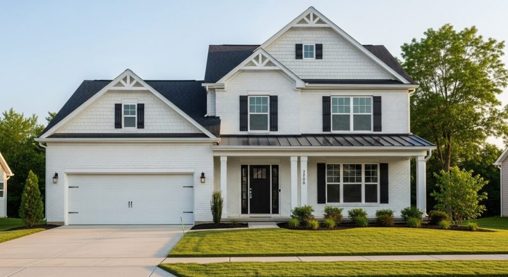
Choosing the right paint is a big deal for your home. You might think all white paints look the same. That is a huge mistake that many homeowners make. Two of the most famous colors are Sherwin-Williams Pure White and Extra White. People love them because they make rooms look fresh and clean. This guide will help you pick the winner for your space. We will look at every detail to make your choice easy.
Introduction to the White Paint Dilemma
Picking a white paint color is actually pretty hard. There are hundreds of options with different vibes. Some look blue while others look like old paper. If you pick the wrong one, your room might feel like a cold hospital. Or it might look like a yellowed antique. That is why everyone talks about Sherwin-Williams pure white vs extra white. These two colors are the gold standard for modern homes. They are the top picks for designers and builders everywhere.
White paint changes how you feel in your house. It can make a tiny room feel much bigger than it is. It also helps your furniture and art stand out. The right white adds a lot of value to your property. It makes everything look updated and well-maintained. We are going to dive deep into these two heavy hitters today. You will learn exactly which one fits your unique style.
Understanding Sherwin-Williams Extra White (SW 7006)
Extra White is known as the true white of the paint world. It is a very bright and sharp color. Many people call it the contractor white because it is so common. It comes in the bucket at the store without any extra tint added. This makes it easy to find and buy in bulk. It has a very clean profile that works in many settings. This color is meant to look pure and untouched.
- Light Reflectance Value: It has an LRV of 86.
- Technical Makeup: This is a cool-toned white with high brightness.
- Overall Vibe: It feels very modern, crisp, and energetic.
- Common Use: Most new homes use this for trim and doors by default.
Understanding Sherwin-Williams Pure White (SW 7005)
Pure White is the softer sibling in the Sherwin-Williams family. It is not quite as bright as Extra White. It has a tiny bit of warmth that makes it feel cozy. Most designers pick this when they want a white that feels like a home. It is versatile and works with almost any other color. It does not feel as harsh or clinical as other whites. Many people consider it the safest choice for any project.
- Light Reflectance Value: It sits at an LRV of 84.
- Technical Makeup: It contains a tiny drop of yellow and black.
- Overall Vibe: The color feels approachable, soft, and very balanced.
- Popularity: It is often the top-selling white for interior walls.
Technical Comparison: LRV (Light Reflectance Value)
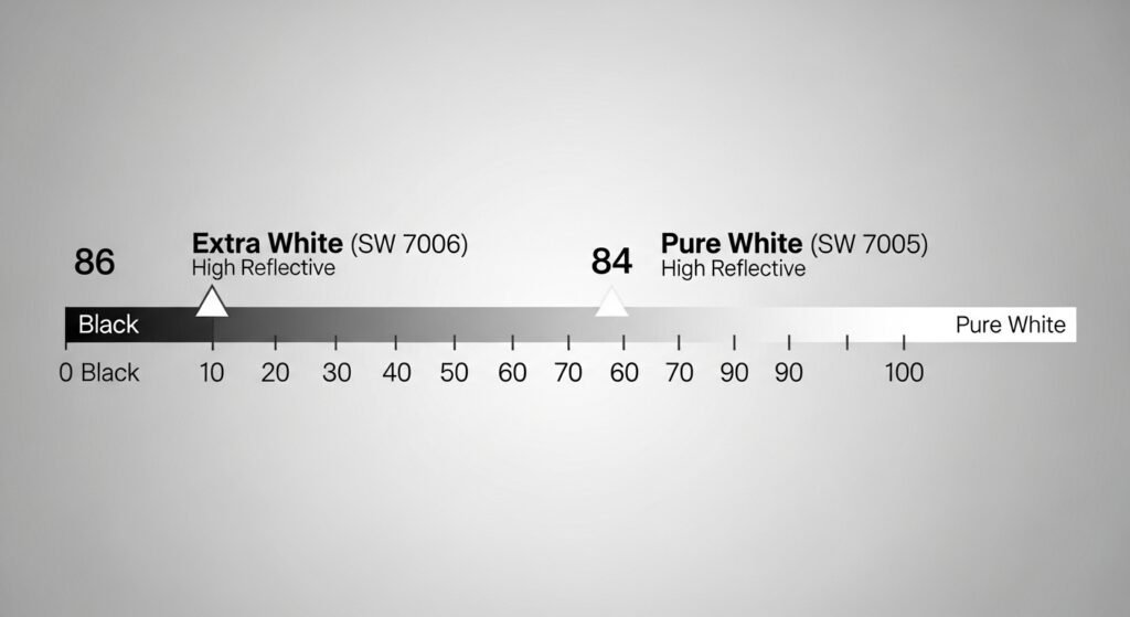
LRV stands for Light Reflectance Value. It measures how much light a paint color reflects. A score of 100 is a perfect white that reflects all light. A score of 0 is a deep black that absorbs everything. In the Sherwin-Williams pure white vs extra white debate, LRV is key. Both of these colors have very high scores. This means they will make your home feel much brighter.
Extra White has an LRV of 86. Pure White is just a bit lower at 84. A two-point difference might seem very small to you. However, you can see it once the paint is on the wall. Extra White will bounce more light around the room. This makes it look a bit more intense. Pure White absorbs just enough light to look softer. It won’t hurt your eyes on a sunny day.
Deep Dive into Chroma and Hue Angle
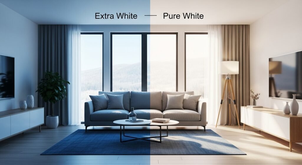
Chroma tells us how colorful a white paint actually is. Extra White has very low chroma. This means it is very close to being a neutral gray-white. Pure White has a bit more chroma because of the yellow tint. This gives it more “body” and presence on your walls. It doesn’t look like a blank sheet of paper. Instead, it looks like a finished architectural element.
The hue angle helps us see where the color leans. Extra White leans toward the cool side of the scale. Pure White leans toward the warmer side. This is why they feel so different in your hand. Even though they are both white, their “DNA” is unique. Understanding this helps you match them to your flooring. It also helps you pick the right furniture fabrics.
Analyzing the Undertones
Undertones are the hidden colors inside your paint. They usually show up when the sun hits the wall. In the battle of Sherwin-Williams pure white vs extra white, undertones matter most. They decide if your room feels warm or cold. You need to know what is hiding in that can of paint. This prevents a nasty surprise after you finish the job.
Extra White Undertones
- Cool Blue: There is a very slight blue tint in this color.
- Crisp Green: In some lights, it might show a tiny hint of green.
- Stark Finish: These cool tones make the white look very bright.
- Modern Edge: The blue keeps it from ever looking yellow or old.
Pure White Undertones
- Warm Yellow: A tiny drop of gold makes it feel very welcoming.
- Gray/Black Pigment: This keeps the yellow from becoming too loud.
- Neutral Balance: It stays white without leaning too far in any direction.
- Smudged Softness: The gray helps it blend into the shadows of a room.
Lighting Conditions and Their Effects
Light is the most important factor for paint. A color can look different in every room. This is because the sun changes position all day. You must test your paint in different lights. What looks good at noon might look bad at night. Let’s see how these whites handle the sun.
North-Facing Rooms
North-facing rooms get cool, bluish light all day long. Extra White can look very chilly in these spaces. It might even look a bit like ice or a hospital. Pure White is much better for these rooms. Its warm undertone fights off the blue light. It keeps the space from feeling like a walk-in freezer. It makes a dark room feel much more pleasant.
South-Facing Rooms
South-facing rooms get a ton of warm, bright sunlight. Extra White can be almost blinding in this light. It reflects so much that you might need sunglasses. Pure White looks amazing in south-facing light. The sun brings out its beautiful, creamy nature. It feels glowing and soft instead of harsh. It handles the intense heat of the sun very well.
East and West-Facing Rooms
East-facing rooms are bright in the morning and dark later. West-facing rooms are the exact opposite of that. Extra White will look very crisp during its peak sun hours. Pure White will feel more consistent as the day goes on. It doesn’t change its personality as much as Extra White. This makes it a great choice for bedrooms. It feels fresh when you wake up and cozy at night.
Artificial Lighting
Your light bulbs change your paint color, too. Warm LED bulbs make Pure White look even warmer. Cool daylight bulbs can make Extra White look very blue. Most people prefer a 3000k bulb for a homey feel. This temperature works perfectly with Pure White. If you want a lab-clean look, use 5000k bulbs with Extra White. Always check your paint under your specific light bulbs.
The Role of Metamerism
Metamerism is when colors look different under different lights. This happens a lot with white paints. A sample might look perfect at the paint store. Then it looks totally different when you get home. This is why you must use real paint samples. Paper chips from the store are often not accurate. Use a peel-and-stick sample on every wall of your room.
Comparing Whites in Interior Applications
How you use the paint matters as much as the color. Walls, trim, and cabinets all have different needs. You want a cohesive look throughout your whole house. Let’s look at the best ways to apply these whites.
The Best White for Interior Walls
Pure White is usually the king of interior walls. It provides a soft backdrop for your life. It doesn’t compete with your decor or your rugs. Extra White can work for walls if you want a museum vibe. It creates a very sharp and airy atmosphere. Most families find Pure White to be more “livable” over time. It hides small scuffs a little better than stark white.
Trim, Baseboards, and Crown Molding
Extra White is the gold standard for trim. It creates a beautiful pop against any wall color. It makes your baseboards look very clean and new. Pure White is great for trim if your walls are also white. This creates a soft, monochromatic look that is very trendy. It doesn’t have that sharp “break” between the wall and the floor.
Kitchen Cabinets and Islands
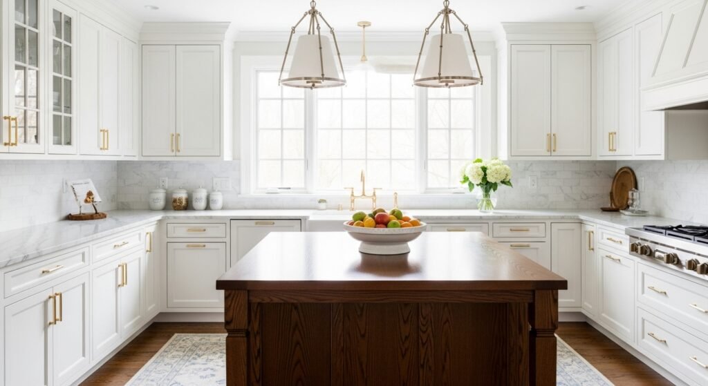
- Modern Kitchens: Use Extra White for a sleek and high-tech appearance.
- Farmhouse Style: Pure White is the go-to for a classic, cozy kitchen.
- Countertop Matching: Extra White looks great with cool marble or gray quartz.
- Warm Accents: Pure White pairs better with gold hardware and wood shelves.
Ceilings
Most people just use Extra White for ceilings and forget it. It is the most common ceiling color in the world. It reflects light down into the room very effectively. If you use Pure White on the walls, you can use it on the ceiling too. This makes the room feel taller because the eyes don’t stop at the top. It removes the harsh line where the wall meets the ceiling.
The Impact of Sheen and Finish
The “shine” of your paint changes the color. A flat paint looks different than a glossy one. You need to pick the right sheen for each area. This affects how easy it is to clean your walls later.
Flat and Matte Finishes
Flat paint has no shine at all. It is great for hiding bumps on your walls. Pure White looks very sophisticated in a matte finish. It looks like velvet on the walls of a bedroom. Extra White in flat is perfect for ceilings. It stops the ceiling from reflecting light like a mirror. Just remember that flat paint is harder to scrub.
Satin and Semi-Gloss
Satin is the most popular choice for interior walls. It has a tiny bit of glow but isn’t shiny. It makes both colors look very rich and deep. Semi-gloss is used for trim and bathroom walls. It is very tough and can be wiped down easily. Extra White in semi-gloss is very bright and reflective. It makes your doors and windows really stand out.
High Gloss for Modern Accents
High gloss is very shiny and looks like glass. Some people use Extra White high gloss on furniture. It gives an old dresser a very modern and expensive look. It is very hard to apply because it shows every mistake. If you want a high-end look, this is the way to go. It makes a small accent piece look very high-fashion.
Exterior Paint Applications
Painting the outside of your house is a massive job. You don’t want to get the color wrong. In the sun, white paint looks much brighter than indoors.
- Curb Appeal: Pure White is often preferred for a whole-house exterior.
- Glare Control: Extra White can be too bright for neighbors to look at.
- Trim Contrast: Extra White is excellent for exterior window frames.
- Durability: Both colors hold up well against the sun’s harsh rays.
Substrate Considerations for Exterior
Brick looks amazing when painted with Pure White. It fills the pores and gives a classic cottage feel. Siding works well with both, but Extra White looks very “new.” If you have a lot of stone, Pure White usually matches better. The natural colors in stone, like the warmth of Pure White. Always test a large patch on the outside of your house.
The Design Aesthetic: Choosing Your Style
Your personal style should lead your paint choice. Some people love a minimalist home. Others want a house that feels like a warm hug.
Modern and Minimalist
Extra White is the ideal choice for those who love clean lines and a high-contrast home. By pairing perfectly with glass and black metal, it creates a sophisticated “art gallery” atmosphere. This bright shade effectively makes any room feel more open, airy, and completely uncluttered.
Transitional and Farmhouse
Pure White has become the top choice for farmhouse-style designs because it pairs perfectly with shiplap and rustic wood. It creates a soft modern aesthetic that remains a very popular trend for today’s homeowners. This specific shade feels timeless and classic rather than fading quickly like other passing styles. Additionally, it is a very forgiving color that works beautifully to enhance the character of older homes.
Traditional and Classic
If you have antiques, Pure White is your best friend. It respects the history of old furniture and rugs. Extra White can sometimes make old things look “dirty” or “yellowed.” Pure White bridges the gap between old and new perfectly. It makes a traditional home feel updated but not stripped of its soul.
Industrial and Coastal
Industrial lofts look great with the sharpness of Extra White. It mimics the feel of a clean warehouse or studio. Coastal homes often use Pure White to match the sand and sun. It feels breezy and relaxed like a vacation home. It pairs beautifully with light blue and tan colors.
Coordinating Color Palettes
White paint never lives alone in a house. It has to play nice with your other colors.
Colors that pair best with Extra White
- Navy Blue: This creates a classic, nautical look that never fails.
- Cool Grays: It keeps the room feeling sleek and unified.
- Black: The ultimate high-contrast duo for a modern vibe.
- Emerald Green: A bold color that pops against the crisp white.
Colors that pair best with Pure White
- Greige: This is a mix of gray and beige that looks very high-end.
- Sage Green: A natural, earthy pairing that feels very calm.
- Terracotta: Warm tones love the soft yellow in Pure White.
- Warm Woods: Oak and Walnut look incredible next to this paint.
The Golden Rule: Mixing Extra White and Pure White
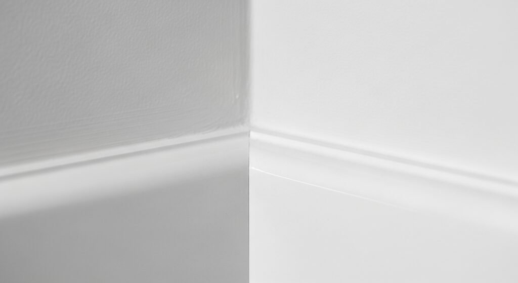
This is the most important lesson in this guide. Do not mix these two colors in the same room. If you put Pure White on the walls and Extra White on the trim, you will be sad. The Extra White will look so clean that the Pure White will look “off”. It will make your beautiful walls look like they need a wash.
If you want a white-on-white look, use the same color. Just change the sheen for the trim and the walls. Use Satin on the walls and Semi-Gloss on the trim. This creates a subtle difference without any color clashing. It is a pro secret for a perfect interior.
Comparisons with Other Popular Sherwin-Williams Whites
- High Reflective White: This is even brighter than Extra White.
- Alabaster: This is much creamier and warmer than Pure White.
- Snowbound: This has a pink/taupe undertone that can be tricky.
- Chantilly Lace: This Benjamin Moore color is a close rival to Extra White.
Comprehensive Comparison: Extra White vs. Pure White
| Feature / Category | Extra White (SW 7006) | Pure White (SW 7005) |
| LRV (Light Reflectance Value) | 86 (Brighter and more reflective) | 84 (Slightly softer and more absorbent) |
| Undertones | Subtle cool blue or green undertones. | A drop of yellow for warmth and a smidge of black/gray for neutrality. |
| Visual Look | Crisp, clinical, “paper-white,” and very sharp. | Soft, creamy (but not yellow), approachable, and balanced. |
| Primary Benefit | Provides the highest contrast against other colors. | Extreme versatility; works with almost any decor or lighting. |
| Best Wall Application | High-energy spaces, modern galleries, or very dark rooms. | Living rooms, bedrooms, and open-concept “whole home” walls. |
| Best Trim/Ceiling Use | The industry standard for a clean, “off-the-shelf” white pop. | Ideal for a soft, integrated look where “starkness” is unwanted. |
| Lighting Reaction | Can look “icy” or blue in north-facing light. | Remains stable; fights off “cold” blue light with its hidden warmth. |
| Cabinetry Vibe | Sleek, modern, and high-tech; looks great with marble. | Transitional, farmhouse, and classic; looks great with wood. |
| Exterior Appearance | Can be blindingly bright in direct sunlight. | Softens the glare; looks more sophisticated on siding or brick. |
| Color Pairings | Best with cool grays, navy, black, and cool jewel tones. | Best with greige, earth tones, warm woods, and sage greens. |
| Hardware Match | Pairs perfectly with Chrome, Nickel, and Matte Black. | Pairs beautifully with Gold, Champagne Bronze, and Brass. |
| Coating/Coverage | May require 3 coats due to lower pigment density. | Generally achieves full coverage in 2 coats thanks to the gray/black tint. |
| Atmosphere | Energetic, sterile, and fresh. | Cozy, inviting, and calm. |
| Architectural Style | Ultra-Modern, Industrial, and Minimalist. | Craftsman, Transitional, Farmhouse, and Traditional. |
| Common Perception | Often seen as “The True White.” | Often seen as “The Perfect White.” |
| Maintenance | Shows scuffs easily due to its high brightness. | Slightly more forgiving with fingerprints and daily wear. |
| Design Rule | Avoid using next to “creamy” whites (makes them look yellow). | Avoid using next to “true” whites (can look “dingy” by comparison). |
Professional Painter Insights and Application Tips
Pros know things that most homeowners don’t. White paint can be hard to apply evenly.
Coverage and Opacity Issues
Extra White can sometimes be a bit “thin.” This means you might need three coats to cover a dark wall. Pure White has a bit more pigment in it. This helps it cover the old paint much better. It usually takes two solid coats for a perfect finish. This can save you time and money on a big project.
Priming for Success
Always use a good primer if you are changing colors. If you go from dark red to white, you need a white primer. This gives the paint a clean base to sit on. It ensures that the color you see in the can is the color you get on the wall. It also helps the paint stick better for a long-lasting finish.
Practical Tips for Testing Paint
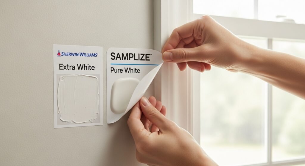
- Use Samplize: These are large stickers made with real paint.
- Check Every Wall: Light hits every wall differently throughout the day.
- Test Near Flooring: Your carpet or wood will reflect color onto the white.
- Look at Night: Artificial light changes everything, so don’t skip this.
Final Verdict: Which One Should You Choose?
Choose Extra White if you want a house that feels brand new and very sharp. It is perfect for modern fans and high-contrast designs. It is the best choice for a clean, energized workspace or a sleek bathroom.
Choose Pure White if you want a home that feels warm and inviting. It is the best all-around choice for living rooms and bedrooms. It is safe, versatile, and looks great in almost any lighting situation.
Choosing between Sherwin-Williams pure white vs extra white doesn’t have to be stressful. Just look at your lighting and your furniture. Once you pick, you will have a beautiful, fresh home that you love.
Frequently Asked Questions
Is Pure White or Extra White better for a farmhouse style?
Pure White is the superior choice for farmhouse designs. Its soft warmth pairs perfectly with rustic wood and linen textures. Extra White can feel too sharp and modern for this specific cozy aesthetic.
Which color should I pick for a dark hallway with no windows?
Pure White helps a dark hallway feel less like a cave. The tiny drop of warmth prevents the walls from looking dingy or gray in shadows. Extra White might look cold and “dead” without natural light to activate it.
Does Extra White require more coats than Pure White?
Yes, Extra White often requires three coats for full coverage. It has less pigment than Pure White, making it more translucent. Pure White usually achieves a perfect finish in just two coats.
Can I use these colors for a “cluttercore” or maximalist home?
Pure White is the better backdrop for busy, colorful rooms. It provides a soft landing for the eyes amidst many patterns. Extra White can make a crowded room feel overwhelming or frantic.
Which white paint looks best with marble countertops?
Extra White highlights the cool gray veining in Carrara or Calacatta marble. It creates a seamless, high-end look in luxury kitchens. Pure White can sometimes make cool-toned marble look slightly blue by comparison.
Is one of these colors better for painting brick fireplaces?
Pure White is a fan favorite for interior brick. It softens the rough texture of the masonry for a timeless look. Extra White on brick can look a bit like a commercial warehouse finish.
How do these colors react to red or orange wood floors?
Pure White balances out the “heat” of red oak or cherry wood floors. Its neutrality prevents the room from feeling too orange. Extra White can create a jarring contrast that makes the floors look even redder.
Which color is easier to find for quick touch-ups?
Extra White is the easiest to source because it is often a pre-mixed base. You can usually grab a gallon off the shelf without waiting for the tint machine. Pure White must always be mixed by a store associate.
Do these colors look different in a basement?
Basement lighting is often poor, making Extra White look quite blue or gray. Pure White maintains its “white” appearance better in underground spaces. It helps compensate for the lack of vitamin D and sun.
Which color is better for a nursery or kids’ room?
Pure White offers a gentler vibe that is perfect for a sleeping baby. It feels calming and safe rather than energetic. Extra White might feel a bit too high-energy for a space meant for rest.
Can I use these paints on my ceiling if my walls are a dark color?
Extra White is the traditional choice for high-contrast ceilings. It creates a crisp “cap” on the room that defines the space. Use it if you want your dark wall colors to really pop.
Does the age of my home matter when choosing between them?
Pure White is more forgiving in historic homes with wavy walls or imperfections. Extra White’s brightness tends to highlight every bump and crack in old plaster. Stick to softer whites for vintage properties.
Which white is better for a home office or studio?
Extra White provides a clean, high-focus environment for work. It mimics the feel of a professional studio or gallery. It keeps you feeling alert and productive throughout the day.
Will these colors turn yellow over time?
Neither color is prone to yellowing, but Pure White has a head start on warmth. Oil-based paints yellow more than the latex versions of these colors. Always choose high-quality water-based formulas to stay bright.
Which one should I use for my exterior front door?
Extra White makes a front door look incredibly clean and inviting from the street. It provides a sharp frame for any wreath or decor. Pure White works better if the rest of your house is painted in earth tones.
Are these colors good for a “shabby chic” interior?
Pure White is the ideal match for the distressed wood and pastels of shabby chic. It looks intentional and soft. Extra White is too aggressive for this specific vintage-inspired style.
Which color is better for a ceiling with a lot of texture?
Pure White in a flat finish helps hide the shadows created by heavy ceiling texture. Extra White can make the “peaks and valleys” of the texture more visible. Use the softer white to mask an ugly ceiling.
Do these colors work well with gold or brass hardware?
Pure White is a stunning partner for gold, brass, and copper. The warmth in the paint speaks to the warmth in the metal. Extra White works better with silver, chrome, or black hardware.
Can I use these whites for a “monochromatic” room?
Pure White is easier to use for a full monochromatic room. You can layer different textures of the same color without it feeling clinical. Extra White can feel a bit “flat” if used on every single surface.
Which color is best for a laundry room or mudroom?
Extra White feels exceptionally clean and “sanitary” for a laundry space. It gives you that fresh-folded-laundry feeling. It makes even a small, utilitarian room feel bright and organized.